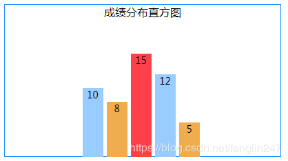
以下是一个用Flex布局的柱状图:
HTML:
|
1
2
3
4
5
6
7
8
9
10
|
<div class="his_box"> <div>成绩分布直方图</div> <div class="histogram"> <div><div>10</div></div> <div><div>8</div></div> <div><div>15</div></div> <div><div>12</div></div> <div><div>5</div></div> </div></div> |
CSS:
|
1
2
3
4
5
6
7
8
9
10
11
12
13
14
15
16
17
18
19
20
21
22
23
24
25
26
27
28
29
30
31
32
33
34
35
36
37
38
39
40
41
42
43
44
|
.his_box{ /*盒子*/ width: 400px; height: 220px; border: solid 1px #1E90FF; display: flex; flex-direction: column; align-items: center; } .histogram{ /*直方图*/ display: flex; } .histogram>div{ /*一条图块*/ width: 30px; height: 200px; /*100%时的块高度*/ font-size: 14px; text-align: center; margin-right: 5px; display: flex; flex-direction: column-reverse; } .histogram>div:nth-child(3n) div{ /*图块颜色*/ background-color: #ff404b; } .histogram>div:nth-child(3n+1) div{ background-color: #99CCFF; } .histogram>div:nth-child(3n+2) div{ background-color: #F0AD4E; } .histogram>div:nth-child(1) div{ flex: 0 0 50%; /*20为100%,50%就是10*/ } .histogram>div:nth-child(2) div{ flex: 0 0 40%; /*8/20*/ } .histogram>div:nth-child(3) div{ flex: 0 0 75%; /*15/20*/ } .histogram>div:nth-child(4) div{ flex: 0 0 60%; /*12/20*/ } .histogram>div:nth-child(5) div{ flex: 0 0 25%; /*5/20*/ } |
本例中,图块的最高点为20,每条柱子的高度按比例定义:第1条数据为10,高度是50%;第2条数据为8,高度为40%,以此类推。
图块颜色采用3色循环使用。
布局时,最外层容器使用了align-items: center;使容器内元素整体居中。
直方图模块使用了display: flex;让模块中的柱子横向排列。
每条柱子也是flex模块,但它的布局方向是纵向的,且方向是从下到上的 flex-direction: column-reverse;
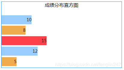
如果想做成纵向排列的直方图:
CSS:
|
1
2
3
4
5
6
7
8
9
10
11
12
13
14
15
16
17
18
19
20
21
22
23
24
25
26
27
28
29
30
31
32
33
34
35
36
37
38
39
40
41
42
43
44
45
46
47
48
|
.his_box{ /*盒子*/ width: 400px; height: 220px; border: solid 1px #1E90FF; display: flex; flex-direction: column; justify-content: space-between; } .his_box>div{ text-align: center; } .histogram{ /*直方图*/ display: flex; flex-direction: column; } .histogram>div{ /*一条图块*/ height: 30px; width: 200px; /*100%时的块宽度*/ line-height: 30px; font-size: 14px; text-align: right; margin-bottom: 5px; display: flex; } .histogram>div:nth-child(3n) div{ /*图块颜色*/ background-color: #ff404b; } .histogram>div:nth-child(3n+1) div{ background-color: #99CCFF; } .histogram>div:nth-child(3n+2) div{ background-color: #F0AD4E; } .histogram>div:nth-child(1) div{ flex: 0 0 50%; /*20为100%,50%就是10*/ } .histogram>div:nth-child(2) div{ flex: 0 0 40%; /*8/20*/ } .histogram>div:nth-child(3) div{ flex: 0 0 75%; /*15/20*/ } .histogram>div:nth-child(4) div{ flex: 0 0 60%; /*12/20*/ } .histogram>div:nth-child(5) div{ flex: 0 0 25%; /*5/20*/ } |
原文链接:https://www.jb51.net/css/716577.html
相关文章


