一、普通背景模糊
代码:
|
1
2
3
4
5
6
7
8
9
10
11
12
13
14
15
16
17
18
19
20
21
22
23
24
25
26
27
28
29
30
31
32
33
34
35
36
37
38
39
40
41
42
|
<Style> html, body { width: 100%; height: 100%; } * { margin: 0; padding: 0; } /*背景模糊*/ .bg { width: 100%; height: 100%; position: relative; background: url("./bg.jpg") no-repeat fixed; background-size: cover; box-sizing: border-box; filter: blur(2px); z-index: 1; } .content { position: absolute; left: 50%; top: 50%; transform: translate(-50%, -50%); width: 200px; height: 200px; text-align: center; z-index: 2; } </Style></head><body> <div class="bg"> <div class="content">背景模糊</div> </div></body> |
效果如下所示:

这样写会使整个div的后代模糊并且还会出现白边,导致页面非常不美观,要想解决这个问题,我们可以使用伪元素,因为伪元素的模糊度不会被父元素的子代继承。
代码:
|
1
2
3
4
5
6
7
8
9
10
11
12
13
14
15
16
17
18
19
20
21
22
23
24
25
26
27
28
29
30
31
32
33
34
35
36
37
38
39
40
41
42
43
44
45
46
47
48
49
50
51
52
53
54
55
|
<Style> html, body { width: 100%; height: 100%; } * { margin: 0; padding: 0; } /*背景模糊*/ .bg { width: 100%; height: 100%; position: relative; background: url("./bg.jpg") no-repeat fixed; background-size: cover; box-sizing: border-box; z-index: 1; } .bg:after { content: ""; width: 100%; height: 100%; position: absolute; left: 0; top: 0; /* 从父元素继承 background 属性的设置 */ background: inherit; filter: blur(2px); z-index: 2; } .content { position: absolute; left: 50%; top: 50%; transform: translate(-50%, -50%); width: 200px; height: 200px; text-align: center; z-index: 3; } </Style></head><body> <div class="bg"> <div class="content">背景模糊</div> </div></body> |
效果如下所示:

二、背景局部模糊
上一个效果会了之后,局部模糊效果就比较简单了。
代码:
|
1
2
3
4
5
6
7
8
9
10
11
12
13
14
15
16
17
18
19
20
21
22
23
24
25
26
27
28
29
30
31
32
33
34
35
36
37
38
39
40
41
42
43
44
45
46
47
48
49
50
51
52
53
54
55
56
57
58
59
60
61
62
63
64
65
66
67
|
<Style> html, body { width: 100%; height: 100%; } * { margin: 0; padding: 0; } /*背景模糊*/ .bg { width: 100%; height: 100%; position: relative; background: url("./bg.jpg") no-repeat fixed; background-size: cover; box-sizing: border-box; z-index: 1; } .content { position: absolute; left: 50%; top: 50%; transform: translate(-50%, -50%); width: 200px; height: 200px; background: inherit; z-index: 2; } .content:after { content: ""; width: 100%; height: 100%; position: absolute; left: 0; top: 0; background: inherit; filter: blur(15px); /*为了模糊更明显,调高模糊度*/ z-index: 3; } .content>div { width: 100%; height: 100%; text-align: center; line-height: 200px; position: absolute; left: 0; top: 0; z-index: 4; } </Style></head><body> <div class="bg"> <div class="content"> <div>背景局部模糊</div> </div> </div></body> |
效果如下图所示:

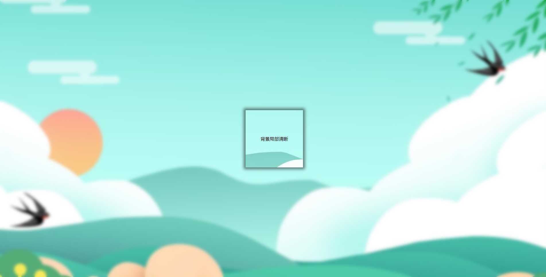
三、背景局部清晰
代码:
|
1
2
3
4
5
6
7
8
9
10
11
12
13
14
15
16
17
18
19
20
21
22
23
24
25
26
27
28
29
30
31
32
33
34
35
36
37
38
39
40
41
42
43
44
45
46
47
48
49
50
51
52
53
54
55
56
57
|
<Style> html, body { width: 100%; height: 100%; } * { margin: 0; padding: 0; } /*背景模糊*/ .bg { width: 100%; height: 100%; position: relative; background: url("./bg.jpg") no-repeat fixed; background-size: cover; box-sizing: border-box; z-index: 1; } .bg:after { content: ""; width: 100%; height: 100%; position: absolute; left: 0; top: 0; background: inherit; filter: blur(5px); z-index: 2; } .content { position: absolute; left: 50%; top: 50%; transform: translate(-50%, -50%); width: 200px; line-height: 200px; text-align: center; background: inherit; z-index: 3; box-shadow: 0 0 10px 6px rgba(0, 0, 0, .5); } </Style></head><body> <div class="bg"> <div class="content"> <div>背景局部清晰</div> </div> </div></body> |
效果如下图所示:
原文链接:https://www.jb51.net/css/725508.html
相关文章


