css3中通过transition属性可以实现一些简单的动画过渡效果~
1、语法
|
1 |
transition: property duration timing-function delay; |
transition 属性设置元素当过渡效果,是一个复合属性,包括四个简写属性:
transition-property:指定CSS属性的name,transition效果(默认值:all)
transition-duration(必须):过渡效果持续时间(不指定默认为0,不会有任何效果)
transition-timing-function:指定过渡效果的转速曲线(默认值:ease)
transition-delay:指定过渡延迟开始时间(默认为0)
注意:IE9及以下不支持该属性,safari3.1-6、IOS3.2-6.1、android2.1-4.3需要添加-webkit-前缀;而其余高版本浏览器支持标准写法
|
1 2 3 4 5 6 7 8 9 10 11 12 13 14 15 16 17 18 19 20 21 22 23 24 25 26 27 |
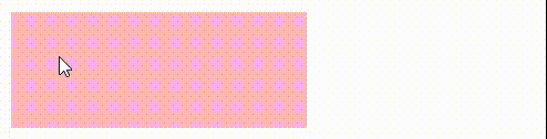
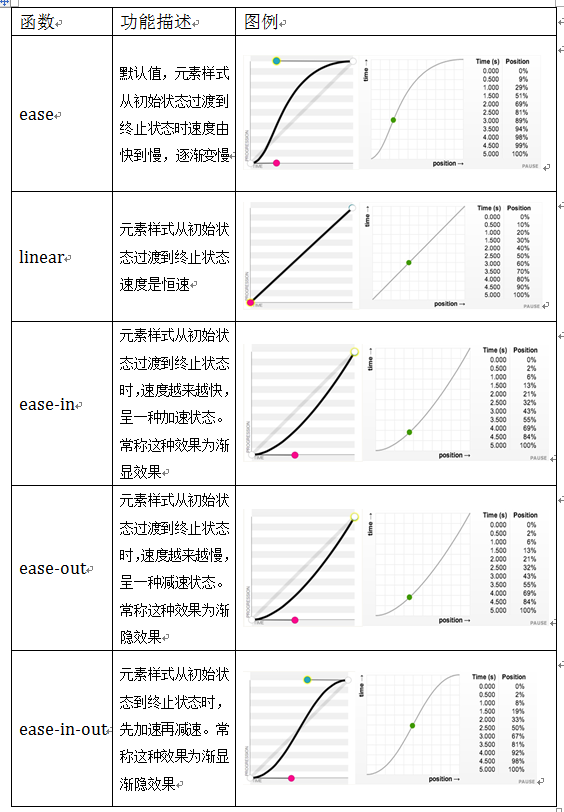
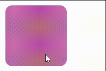
<!DOCTYPE html> <html> <head> <meta charset="utf-8"> <title></title> <style type="text/css"> .tra{ width: 50px; height: 50px; background-color: lightcoral; /* 复合属性 */ transition: all 2s ease 0s; /* 采用以下分属性也是可以的 */ transition-duration: 2s; transition-property: all; transition-timing-function: ease; transition-delay: 0s; } .tra:hover{ width: 200px; } </style> </head> <body> <div class="tra"></div> </body> </html> |
运行效果:

注意:在使用transition复合属性时,各个属性用空格隔开,不能使用,
2、分属性
(1)transition-property
transition-property属性可以指定需要过渡的css属性,默认值为all表示所有属性都过渡(不写该属性值也表示all),如果为none则没有任何属性存在过渡效果
|
1 2 3 4 5 6 7 8 9 10 11 |
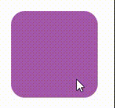
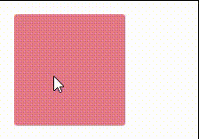
.tra{ width: 50px; height: 50px; background-color: lightcoral; /* 指定 width 属性过渡 */ transition: width 2s ease 0s; } .tra:hover{ width: 200px; height: 100px; } |
|
1 |
<div class="tra"></div> |
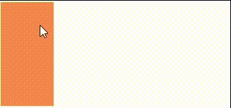
只指定width属性过渡,height属性未指定
注意:并不是所有css属性都可以过渡,只有具备中间值的属性才有过渡效果,比如display:block不能过渡为display:none
(2)transition-duration
transition-duration属性可以用来设置一个属性过渡所需要的时间,也就是该属性从旧值到新值过渡所需时间(持续时间),默认值为0s,不指定就没有过渡效果
|
1 2 3 4 5 6 7 8 9 10 11 12 13 |
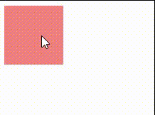
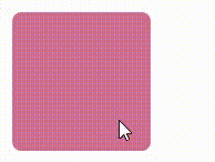
.tra{ width: 50px; height: 50px; display: block; background-color: lightcoral; /* 此处transition-property省略,默认为all */ /* 指定过渡时间为2s */ transition: 2s ease 0s; } .tra:hover{ width: 100px; height: 100px; } |
注意:
- 不能为负值
- 必须带上单位,单独一个数字无效该值为单值时,即所有过渡属性都对应同样时间;
- 该值为多值时,过渡属性按照顺序对应持续时间
|
1 2 3 4 5 6 7 8 9 10 11 12 13 14 15 16 |
.tra{ width: 50px; height: 50px; display: block; background-color: lightcoral;
transition-property: width,background; transition-timing-function: ease; transition-duration: 5s, 2s; /* 以上分属性等价于下面复合属性写法 */ transition: width 5s ease 0, background 2s ease 0; } .tra:hover{ width: 100px; background-color: blue; } |
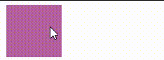
当该值为多值时,过渡属性按照顺序对应持续时间
(3)transition-timing-function
transition-timing-function属性指的是过渡的“缓动函数”,用来指定属性过渡时动画运动形式,值可以是关键字、贝塞尔曲线(bezier),默认值为ease
关键字:linear| ease| ease-in| ease-out| ease-in-out|
贝塞尔:cubic-bezier(n,n,n,n);
|
1 2 3 4 5 6 7 8 9 10 11 12 |
.tra{ width: 50px; height: 50px; display: block; background-color: lightcoral; /* transition-timing-function默认值为ease */ transition: 1s linear| ease| ease-in| ease-out| ease-in-out|; } .tra:hover{ border-radius: 50%; background-color: blue; } |
ease:开始和结束慢,中间快
linear:匀速
ease-in:开始慢,越来越快
ease-out:结束慢,越来越慢
ease-in-out:先加速后减速,与ease类似,但比ease幅度大
cubic-bezier(n,n,n,n)贝塞尔曲线中4个值随意调整,就会得到不同的效果
|
1 2 3 4 5 6 7 8 9 10 11 |
.tra{ width: 50px; height: 50px; display: block; background-color: lightcoral; transition: 1s cubic-bezier(.75,2.03,0,.14); } .tra:hover{ border-radius: 50%; background-color: blue; } |
(4)transition-delay
transition-delay属性指定过渡开始前的延迟时间
|
1 2 3 4 5 6 7 8 9 10 11 12 |
.tra{ width: 50px; height: 50px; display: block; background-color: lightcoral; /* 2s过后过渡才开始执行 */ transition: 1s cubic-bezier(.75,2.03,0,.14) 2s; } .tra:hover{ border-radius: 50%; background-color: blue; } |
3、结束语
最后再说明补充两点内容:
1、触发方式:transition属性并非只有hover才能触发,其他比如【点击事件】【获得/失去焦点】【长按】等操作都可以触发transition属性过渡
2、事件回调:transition属性只有一个事件,那就是transitionend事件,它在过渡事件完成后触发
|
1 2 3 4 5 6 7 8 9 10 11 12 13 14 15 16 17 18 19 20 21 22 23 24 25 26 27 28 29 30 31 |
<!DOCTYPE html> <html> <head> <meta charset="utf-8"> <title></title> <style> #test{ height: 60px; width: 60px; background-color: lightpink; transition: width 1.5s; font-size: 12px; } #test:hover{ width: 250px; } </style> </head> <body> <div id="test"></div> </body> <script> //监听 transitionend 事件 test.addEventListener("transitionend", myFunction); // 回调函数 function myFunction(e){ e = e || event; test.innerHTML = "过渡结束,执行事件回调内容" } </script> </html> |