今天小编给大家推荐一个超强交互式可视化绘制工具-python-highcharts,熟悉HightCharts绘图软件的小伙伴对这个不会陌生,python-highcharts就是使用Python进行Highcharts项目绘制,简单的说就是实现Python和Javascript之间的简单转换层,话不多说,我们直接进行介绍,具体包括以下几个方面:
python-highcharts库的简单介绍
python-highcharts 具体案例
python-highcharts库的简单介绍
python-highcharts库作为优秀的第三方库,其实现了对HightCharts项目的Python封装应用,里面关于图表细节的设置还是基于Javascript代码,但较简单,可以进行随意更改。
需要注意的是,由于HightCharts可以免费用于非商业用途,所以使用python-highcharts绘制也是如此,商业用途需要购买单独的许可证。我们这里当作练习即可~~
python-highcharts库绘制的图形主要包括如下类别:
- Highcharts:绘制如折线图、散点图等常规图表;
- Highstock:绘制股价走势图表;
- Highmaps:绘制地图;
python-highcharts 具体案例
这一部分,小编分别主要介绍Highcharts的样例,因为Highstock和Highmaps使用较少,且反应较慢,这里不做介绍哈。详细内容如下:
「样例一」
|
1 2 3 4 5 6 7 8 9 |
from highcharts import Highchart H = Highchart()
data = list(range(1,20)) data2 = list(range(20,1,-1)) #绘制 H.add_data_set(data2,'line') H.add_data_set(data, 'line') H |
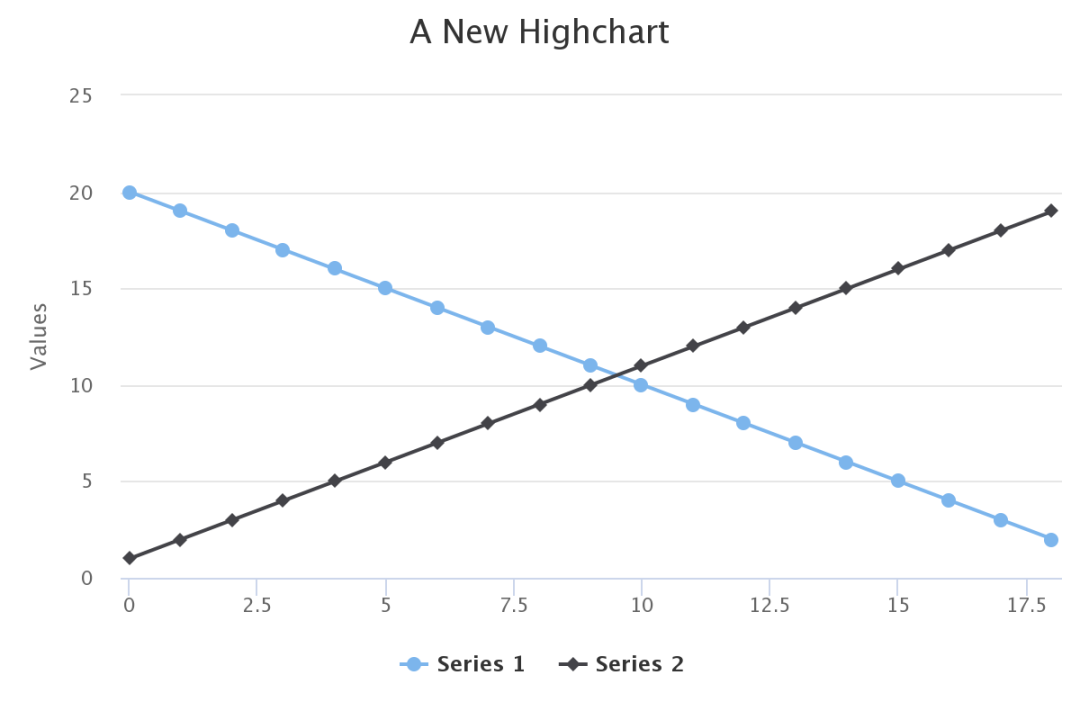
Example01 Of Highchart
备注:所有图表都是交互式的,这里展示的为静态图片。
你还可以通过添加交互点击时的状态,如下:
|
1 2 3 4 5 6 7 8 9 10 11 12 13 14 15 16 17 18 19 20 21 22 23 24 25 26 27 |
H.add_data_set(data2,'line') H.add_data_set(data, 'line', marker={ 'states': { 'hover': { 'enabled': True, 'fillColor': 'white', 'lineColor': 'red', 'lineWidth': 2 } } }, events={ 'click': "function (event) { alert(this.name + ' clicked\\n' + 'Alt: ' + event.altKey + '\\n' + \ 'Control: ' + event.ctrlKey + '\\n' + 'Shift: ' + event.shiftKey + '\\n');}"}, dashStyle='ShortDash' )
options = { 'xAxis':{ 'plotBands': [{'color': '#FCFFC5', 'from': 2, 'to': 4}, {'color': '#FCFFC5', 'from': 6, 'to': 8}, {'color': '#FCFFC5', 'from': 10, 'to': 12}] } } H.set_dict_options(options) |
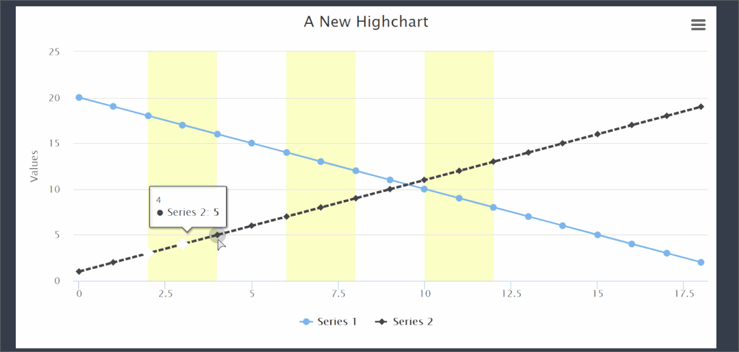
Example02 Of Highchart
样例二
这个例子小编获取Highcharts官网样例进行再现,详细如下:
|
1 2 3 4 5 6 7 8 9 10 11 12 13 14 15 16 17 18 19 20 21 22 23 24 25 26 27 28 29 30 31 |
from highcharts import Highchart chart = Highchart()
data01 = [43934, 52503, 57177, 69658, 97031, 119931, 137133, 154175] data02 =[24916, 24064, 29742, 29851, 32490, 30282, 38121, 40434] data03 =[11744, 17722, 16005, 19771, 20185, 24377, 32147, 39387] data04 = [550, 780, 7988, 12169, 15112, 22452, 34400, 34227] data05 = [12908, 5948, 8105, 11248, 8989, 11816, 18274, 18111]
chart.add_data_set(data01,'line',name='安装,实施人员') chart.add_data_set(data02, 'line', name='工人') chart.add_data_set(data03,'line',name='销售') chart.add_data_set(data04, 'line', name='项目开发') chart.add_data_set(data05,'line',name='其他')
options = { "title": { "text": '2010 ~ 2016 年太阳能行业就业人员发展情况'}, "subtitle": { "text": '数据来源:thesolarfoundation.com'}, "yAxis": { "title": { "text": '就业人数' }}, "legend": { "layout": 'vertical', "align": 'right', "verticalAlign": 'middle' }} chart.set_dict_options(options) chart |
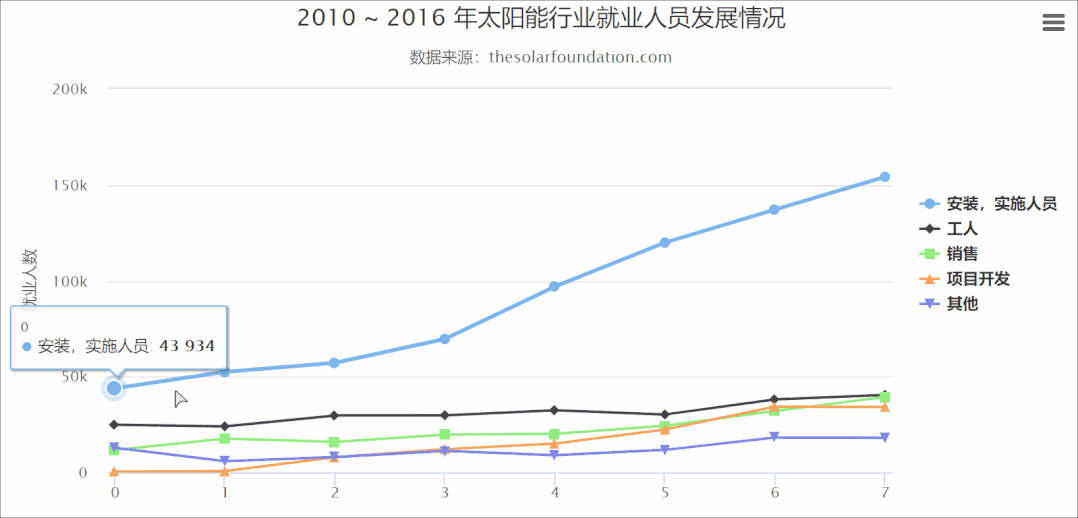
Example03 Of Highchart
「样例二」
|
1 2 3 4 5 6 7 8 9 10 11 12 13 14 15 16 17 18 19 20 21 22 23 24 25 26 27 28 29 30 31 32 33 34 35 36 37 38 39 40 41 42 43 44 45 46 47 48 49 50 51 52 53 54 55 56 57 58 59 60 61 62 63 64 65 66 67 68 69 70 71 72 73 74 75 76 77 78 79 80 81 82 83 84 85 86 87 88 89 90 91 92 93 94 95 96 97 98 99 100 101 102 103 104 105 106 107 108 109 110 111 112 113 114 115 116 117 118 119 120 121 122 123 124 125 126 127 128 129 130 131 132 133 134 |
from highcharts import Highchart chart = Highchart()
#name: 'Hestavollane', data01 = [4.3, 5.1, 4.3, 5.2, 5.4, 4.7, 3.5, 4.1, 5.6, 7.4, 6.9, 7.1, 7.9, 7.9, 7.5, 6.7, 7.7, 7.7, 7.4, 7.0, 7.1, 5.8, 5.9, 7.4, 8.2, 8.5, 9.4, 8.1, 10.9, 10.4, 10.9, 12.4, 12.1, 9.5, 7.5, 7.1, 7.5, 8.1, 6.8, 3.4, 2.1, 1.9, 2.8, 2.9, 1.3, 4.4, 4.2, 3.0, 3.0]
#name: 'Voll', data02 = [0.0, 0.0, 0.0, 0.0, 0.0, 0.0, 0.0, 0.0, 0.1, 0.0, 0.3, 0.0, 0.0, 0.4, 0.0, 0.1, 0.0, 0.0, 0.0, 0.0, 0.0, 0.0, 0.0, 0.0, 0.0, 0.6, 1.2, 1.7, 0.7, 2.9, 4.1, 2.6, 3.7, 3.9, 1.7, 2.3, 3.0, 3.3, 4.8, 5.0, 4.8, 5.0, 3.2, 2.0, 0.9, 0.4, 0.3, 0.5, 0.4]
chart.add_data_set(data01,'spline',name='Hestavollane') chart.add_data_set(data02, 'spline', name='Voll') options = { "title": { "text": '风速变化趋势图' }, "subtitle": { "text": '2009年10月6日和7日两地风速情况' }, "xAxis": { "type": 'datetime', "labels": { "overflow": 'justify' } }, "yAxis": { "title": { "text": '风 速 (m/s)' }, "min": 0, "minorGridLineWidth": 0, "gridLineWidth": 0, "alternateGridColor": None, "plotBands": [{ #// Light air "from": 0.3, "to": 1.5, "color": 'rgba(68, 170, 213, 0.1)', "label": { "text": '轻空气', "style": { "color": '#606060' } } }, { #// Light breeze "from": 1.5, "to": 3.3, "color": 'rgba(0, 0, 0, 0)', "label": { "text": '微风', "style": { "color": '#606060' } } }, { #// Gentle breeze "from": 3.3, "to": 5.5, "color": 'rgba(68, 170, 213, 0.1)', "label": { "text": '柔和风', "style": { "color": '#606060' } } }, { #// Moderate breeze "from": 5.5, "to": 8, "color": 'rgba(0, 0, 0, 0)', "label": { "text": '温和风', "style": { "color": '#606060' } } }, { #// Fresh breeze "from": 8, "to": 11, "color": 'rgba(68, 170, 213, 0.1)', "label": { "text": '清新风', "style": { "color": '#606060' } } }, { #// Strong breeze "from": 11, "to": 14, "color": 'rgba(0, 0, 0, 0)', "label": { "text": '强风', "style": { "color": '#606060' } } }, { #// High wind "from": 14, "to": 15, "color": 'rgba(68, 170, 213, 0.1)', "label": { "text": '狂风', "style": { "color": '#606060' } } }] }, "tooltip": { "valueSuffix": ' m/s' }, "plotOptions": { "spline": { "lineWidth": 4, "states": { "hover": { "lineWidth": 5 } }, "marker": { "enabled": False }, "pointInterval": 3600000, #// one hour
} } }
chart.set_dict_options(options) chart |
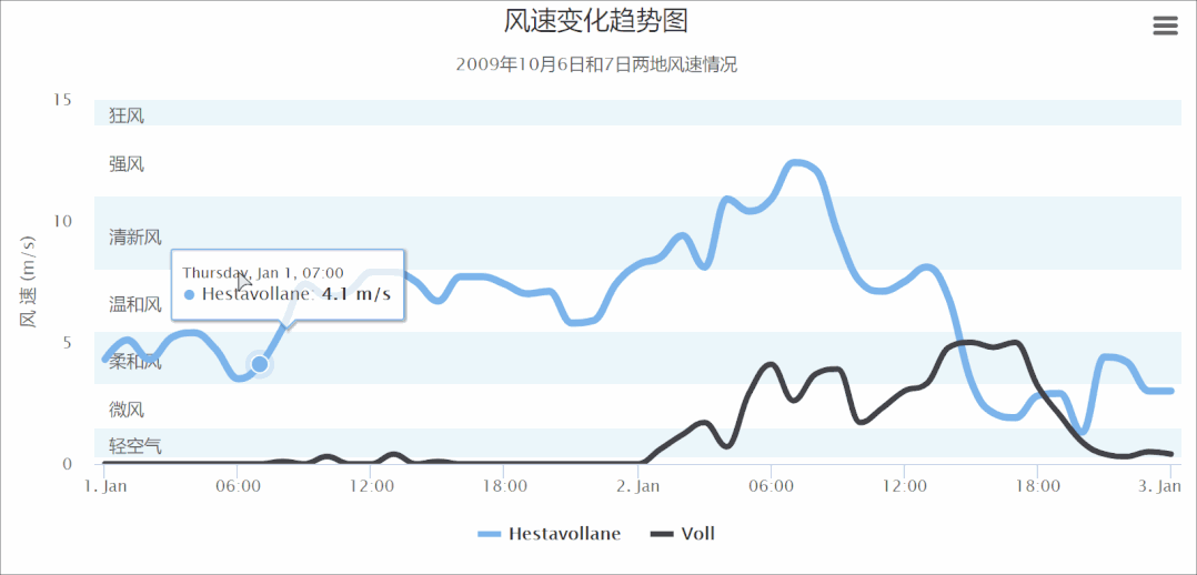
Example04 Of Highchart
小编有话说:基本上官网提供的例子,python-highcharts都是可以实现的,前提是对这个库有一定的了解程度。当然,会一点JS更好~~ 更多关于此包绘制方法详细内容可参考:python-highcharts[1] 和HightCharts[2]
总结
今天这篇推文小编简单介绍了python-highcharts库绘制交互式可视化图表,给不会JS又想绘制HightCharts样式图表的小伙伴提供一种思路,感兴趣的小伙伴可以探索一下~~