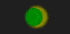
实现效果
完整源码
|
1 2 3 4 5 6 7 8 9 10 11 12 13 14 15 16 17 18 19 20 21 22 23 24 25 26 27 28 29 30 31 32 33 34 35 36 37 38 39 40 41 42 43 44 45 46 47 48 49 50 51 52 53 54 55 56 57 58 |
<template> <div class="parentBox"> <div class="contantBox"></div> </div> </template> <style lang="less" scoped> .parentBox { height: 100%; background: rgb(31, 31, 31); padding: 100px; @keyframes filterBallMove { 50% { left: 140px; } } @keyframes filterBallMove2 { 50% { right: 140px; } } .contantBox { position: absolute; top: 50%; left: 50%; transform: translate(-50%, -50%); width: 300px; height: 200px; filter: contrast(20); } .contantBox::before { content: ""; position: absolute; width: 120px; height: 120px; border-radius: 50%; background: olive; top: 40px; left: 80px; z-index: 2; filter: blur(6px); box-sizing: border-box; animation: filterBallMove 4s ease-out infinite; } .contantBox::after { content: ""; position: absolute; width: 80px; height: 80px; border-radius: 50%; background: green; top: 60px; right: 40px; z-index: 2; filter: blur(6px); animation: filterBallMove2 4s ease-out infinite; } } </style> |
文字融合
实现效果

完整源码
|
1 2 3 4 5 6 7 8 9 10 11 12 13 14 15 16 17 18 19 20 21 22 23 24 25 26 27 28 29 30 31 32 33 34 35 36 37 38 39 40 41 42 43 44 45 46 47 48 49 50 51 |
<template> <div class="parentBox"> <div class="contantBox"> <h1>hello Word!</h1> </div> </div> </template> <style lang="less" scoped> .parentBox { height: 100%; background: rgb(31, 31, 31); padding: 100px; .contantBox { width: 100%; height: 100%; position: relative; padding: 4em; filter: contrast(20); overflow: hidden; background: rgb(0, 0, 0); h1 { font-family: Righteous; color: white; font-size: 4rem; text-transform: uppercase; line-height: 1; animation: letterspacing 3s infinite alternate ease-in-out; display: block; position: absolute; left: 50%; top: 50%; transform: translate3d(-50%, -50%, 0); letter-spacing: -2.2rem; } } @keyframes letterspacing { 0% { letter-spacing: -2.4rem; filter: blur(0.3rem); } 50% { filter: blur(0.5rem); } 100% { letter-spacing: 0.5rem; filter: blur(0rem); color: #fff; } } } </style> |


