问题
- 容器高度使用 px 定高时,随着页面高度发生变化,组件展示的数量不能最大化的铺满,导致出现底部留白。
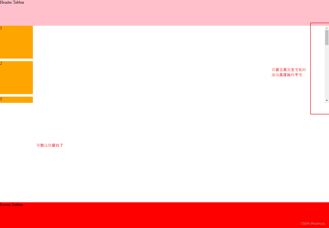
- 容器高度使用 vw 定高时,随着页面宽度发生变化,组件展示的数量不能最大化的铺满,导致出现底部留白。
很明显这两种方案都是采用 错误的像素单位 而导致的,下面我将会介绍如何使用其它方案来解决。
方式1:采用 padding
给最外层的容器定好 padding,子容器后续以 padding 为基准,案例代码如下:
|
1 2 3 4 5 6 7 8 9 10 11 12 13 14 15 16 17 18 19 20 21 22 23 24 25 26 27 28 29 30 31 32 33 34 35 36 37 38 39 40 41 42 43 44 45 46 47 48 49 50 51 52 53 54 55 56 57 58 59 60 |
<!DOCTYPE html> <html lang="en"> <head> <meta charset="UTF-8"> <meta name="viewport" content="width=device-width, initial-scale=1.0"> <title>Document</title> <style> html,body { margin: 0; padding: 0; } * { box-sizing: border-box; } .main { padding-top: 100px; padding-bottom: 100px; } .container .component { width: 200px; height: 200px; margin-bottom: 10px; background: orange; } header, footer { position: fixed; height: 100px; background: red; left: 0; right: 0; } header { top: 0; } footer { bottom: 0; } </style> </head> <body> <div class="main"> <header> Header Tabbar </header> <div class="container"> <div class="component">1</div> <div class="component">2</div> <div class="component">3</div> <div class="component">4</div> <div class="component">5</div> <div class="component">6</div> <div class="component">7</div> <div class="component">8</div> <div class="component">9</div> <div class="component">10</div> </div> <footer> Footer Tabbar </footer> </div> </body> </html> |
效果:
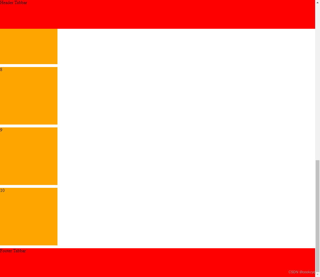
即保留了原生滚动(不用设置 overflow),也实现了自适应,解决了底部留白的问题。
在 header 不固定但 footer 固定的情况下,可将容器的 padding-top 去掉只保留 padding-bottom 即可。
方式2:采用 vh
其实,header 不用 fixied 也能达到吸顶效果,其原理是,给容器定高 + overflow 实现自己的滚动容器,但如果使用了错误的单位,比如本文一开始说的 vw,就会导致留白情况:
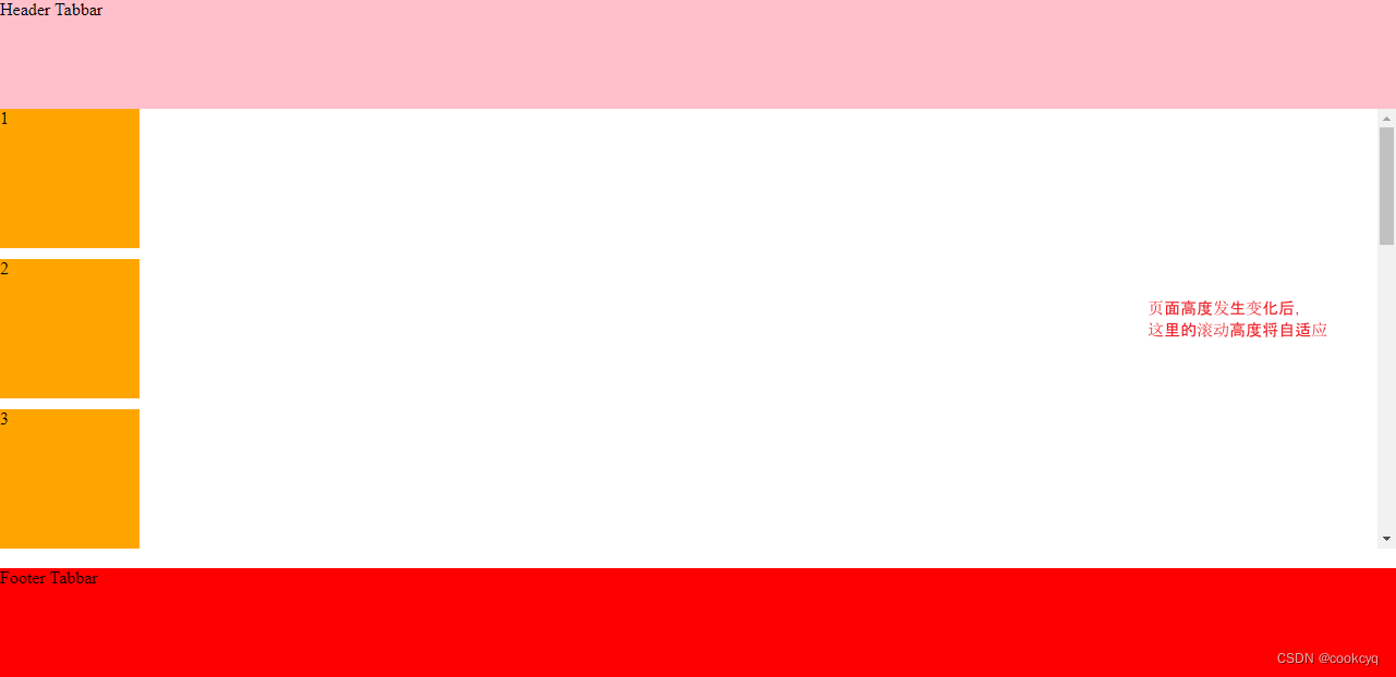
我们可以采用 vh 单位来解决,案例代码如下:
|
1 2 3 4 5 6 7 8 9 10 11 12 13 14 15 16 17 18 19 20 21 22 23 24 25 26 27 28 29 30 31 32 33 34 35 36 37 38 39 40 41 42 43 44 45 46 47 48 49 50 51 52 53 54 55 56 57 58 59 |
<!DOCTYPE html> <html lang="en"> <head> <meta charset="UTF-8"> <meta name="viewport" content="width=device-width, initial-scale=1.0"> <title>Document</title> <style> html,body { margin: 0; padding: 0; } * { box-sizing: border-box; } .container { height: 65vh; overflow: auto; } .container .component{ width: 200px; height: 200px; margin-bottom: 10px; background: orange; } header { height: 100px; background: pink; } footer { position: fixed; height: 100px; background: red; left: 0; right: 0; bottom: 0; } </style> </head> <body> <div class="main"> <header> Header Tabbar </header> <div class="container"> <div class="component">1</div> <div class="component">2</div> <div class="component">3</div> <div class="component">4</div> <div class="component">5</div> <div class="component">6</div> <div class="component">7</div> <div class="component">8</div> <div class="component">9</div> <div class="component">10</div> </div> <footer> Footer Tabbar </footer> </div> </body> </html> |
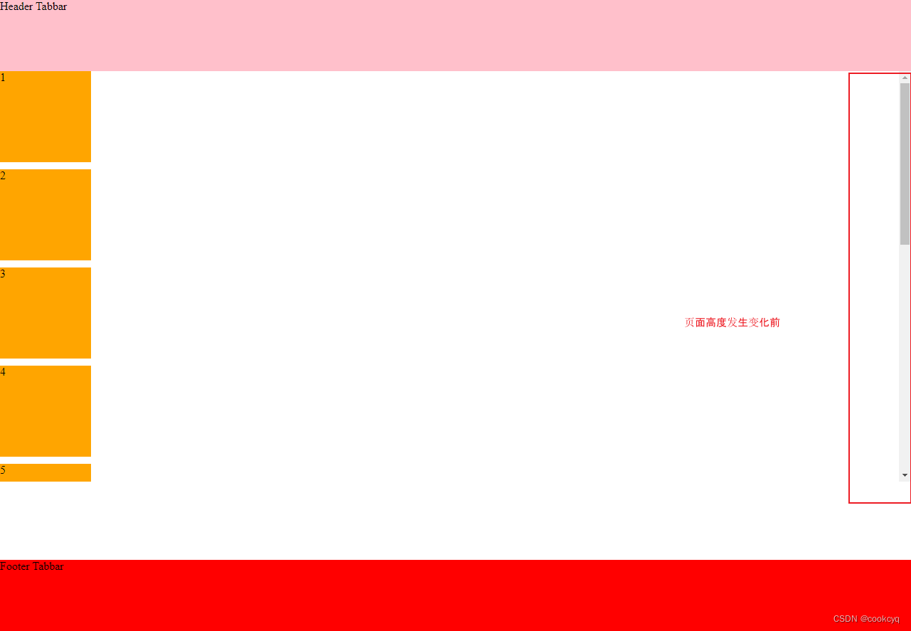
高度未发生变化前:
高度发生变化后:
方式3:采用 JS getBoundingClientRect 动态计算
像 vh、vw 这类动态计算 px 的单位在 IE9 前是不支持的,这里可以考虑借助 JS 提供的 getBoundingClientRect 函数来实现。
它会返回当前元素的宽高、top/left 偏离值,我们可以根据两个元素之间的 top 值相减来获取对应的定高,实现组件最大化铺满,代码如下:
|
1 2 3 4 5 6 7 8 9 10 11 12 13 14 15 16 17 18 19 20 21 22 23 24 25 26 27 28 29 30 31 32 33 34 35 36 37 38 39 40 41 42 43 44 45 46 47 48 49 50 51 52 53 54 55 56 57 58 59 60 61 62 63 64 65 66 67 68 |
<!DOCTYPE html> <html lang="en"> <head> <meta charset="UTF-8"> <meta name="viewport" content="width=device-width, initial-scale=1.0"> <title>Document</title> <style> html,body { margin: 0; padding: 0; } * { box-sizing: border-box; } .container { overflow: auto; } .container .component{ width: 10vw; height: 10vw; margin-bottom: 10px; background: orange; } header { height: 100px; background: pink; } footer { position: fixed; height: 100px; background: red; left: 0; right: 0; bottom: 0; } </style> </head> <body> <div class="main"> <header> Header Tabbar </header> <div id="container" class="container"> <div class="component">1</div> <div class="component">2</div> <div class="component">3</div> <div class="component">4</div> <div class="component">5</div> <div class="component">6</div> <div class="component">7</div> <div class="component">8</div> <div class="component">9</div> <div class="component">10</div> </div> <footer id="footer"> Footer Tabbar </footer> </div> <script> addEventListener("DOMContentLoaded", (event) => { const footerDom = document.getElementById('footer') const containerDom = document.getElementById('container') const { top: footerOffsetTop } = footerDom.getBoundingClientRect(); const { top: containerOffsetTop } = containerDom.getBoundingClientRect(); const scrollHeight = footerOffsetTop - containerOffsetTop; containerDom.style.height = scrollHeight + 'px' }); </script> </body> </html> |
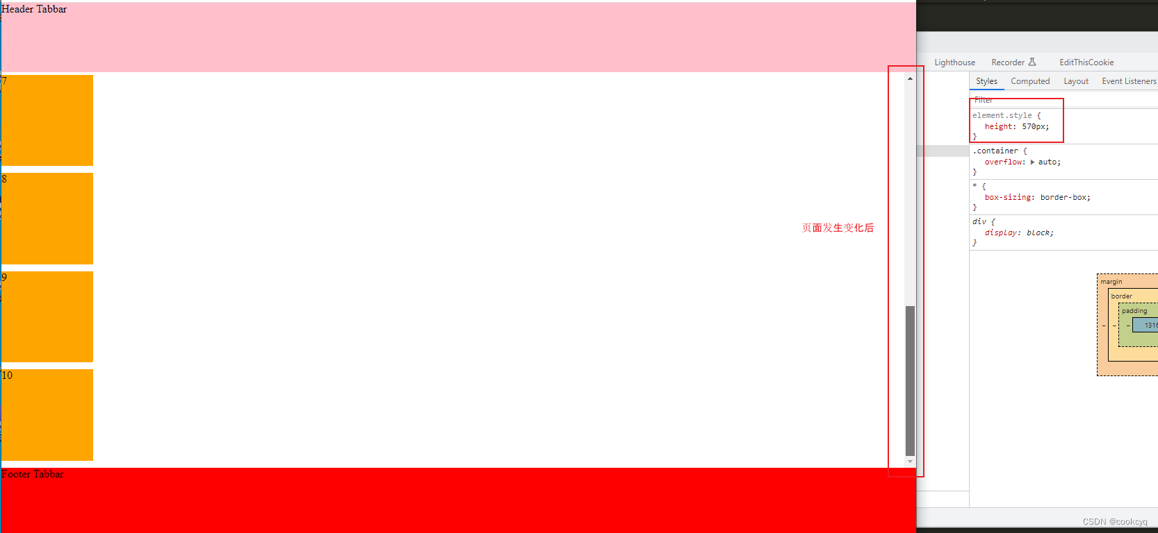
页面高度未发生变化前:
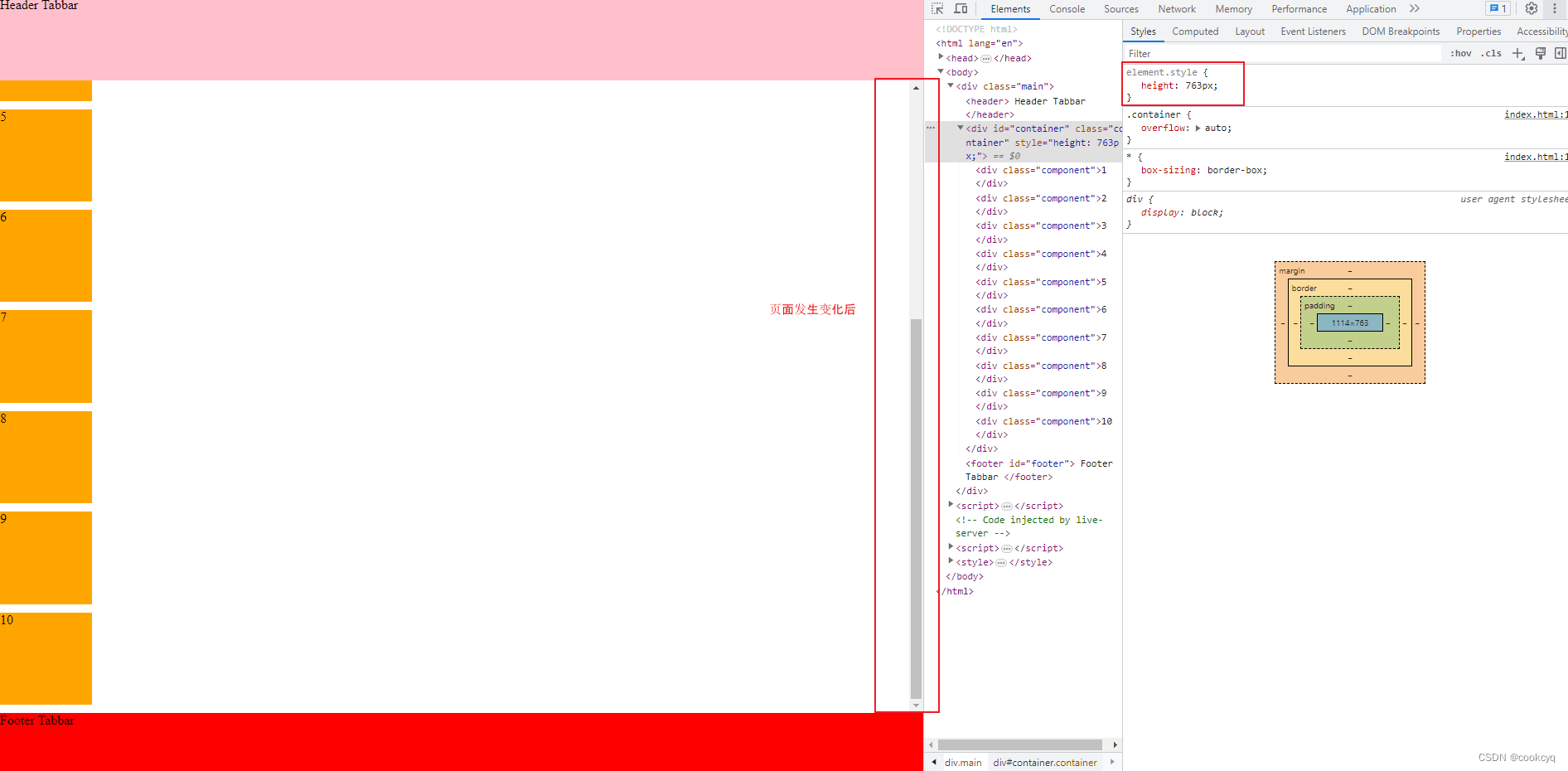
页面高度发生变化后: