
在线演示
实现
HTML 元素:
|
1 2 3 4 |
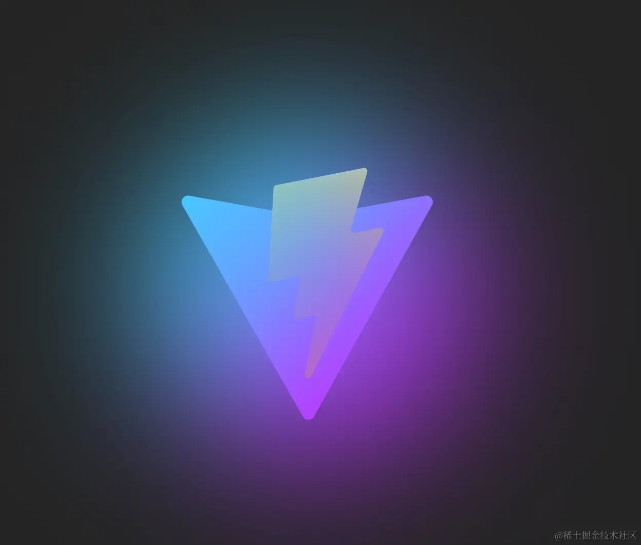
<figure> <section class="img-bg"></section> <img height="320" width="320" src="https://vitejs.dev/logo-with-shadow.png" alt="Vite Logo" /> </figure> |
CSS 样式代码:
|
1 2 3 4 5 6 7 8 9 10 11 12 13 |
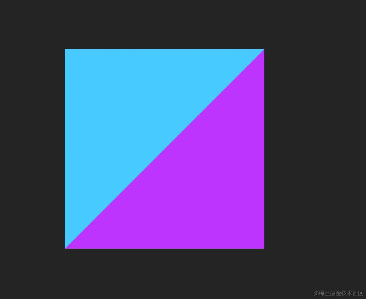
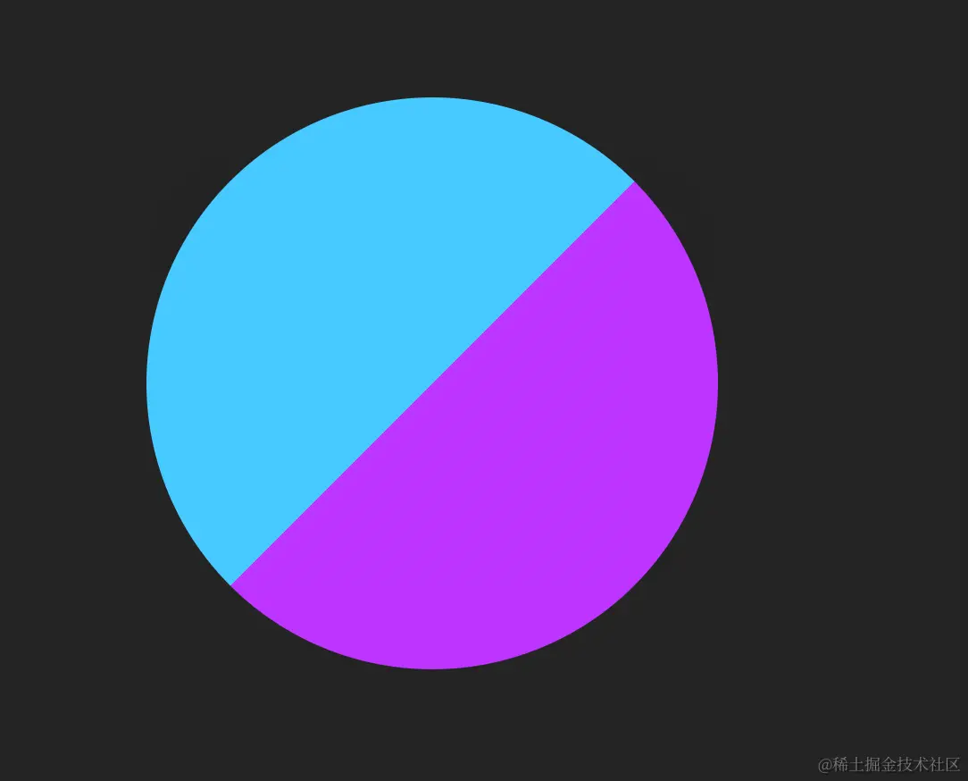
.img-bg { position: absolute; background-image: linear-gradient(-45deg, #bd34fe 50%, #47caff 50%); border-radius: 50%; filter: blur(72px); z-index: -1; animation: pulse 4s cubic-bezier(0, 0, 0, 0.5) infinite; } @keyframes pulse { 50% { transform: scale(1.5); } } |
1. 增加背景
|
1 |
background-image: linear-gradient(-45deg, #bd34fe 50%, #47caff 50%); |
2. 将背景设置为圆形
|
1 |
border-radius: 50%; |
3. 加入关键的filter 属性将模糊的图形效果应用于元素
|
1 |
filter: blur(72px); |
4. 将背景至于图形底部
|
1 |
z-index: -1; |

5. 加入动画效果
|
1 |
animation: pulse 4s cubic-bezier(0, 0, 0, 0.5) infinite; |
原文链接:
相关文章


