浮动:
浮动(float)是css样式的一个定位属性,可以使元素脱离正常文档流并浮动在它父容器的左侧或者右侧。
float设置元素在水平浮动,意味着只能左右浮动而不能上下浮动。
注意事项:
(1)要浮动,并排的盒子都要设置浮动
(2) 父盒子要有足够的宽度,否则盒子会掉下去
浮动实现盒子并排
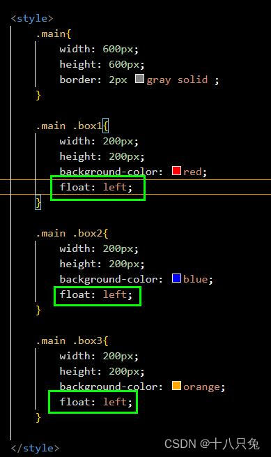
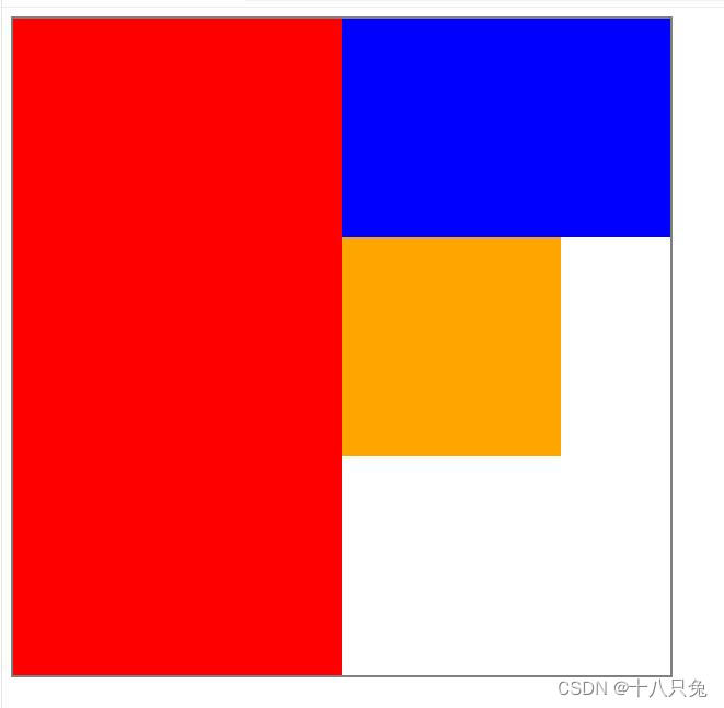
首先,绘制一个600px*600px(指的是内容区域的大小)大小的盒子,大盒子里面容纳三个大小都为200px *200px但背景颜色不同的盒子:
代码:
|
1 2 3 4 5 6 7 8 9 10 11 12 13 14 15 16 17 18 19 20 21 22 23 24 25 26 27 28 29 30 31 32 33 34 35 36 37 38 |
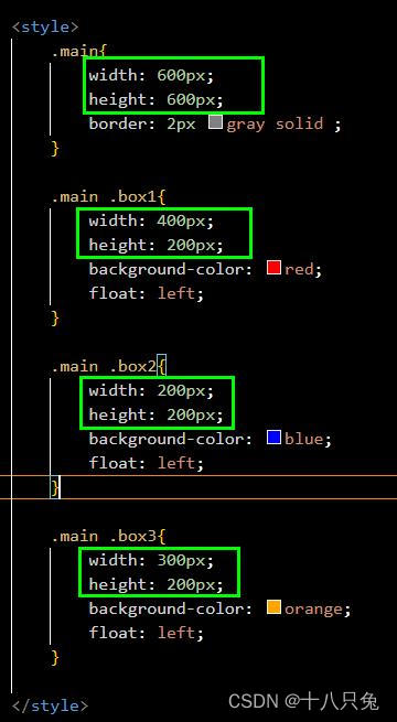
<!DOCTYPE html> <html lang="en"> <head> <meta charset="UTF-8"> <meta http-equiv="X-UA-Compatible" content="IE=edge"> <meta name="viewport" content="width=device-width, initial-scale=1.0"> <title>Document</title> <style> .main{ width: 600px; height: 600px; border: 2px gray solid ; } .main .box1{ width: 200px; height: 200px; background-color: red; } .main .box2{ width: 200px; height: 200px; background-color: blue; } .main .box3{ width: 200px; height: 200px; background-color: orange; } </style> </head> <body> <div class="main"> <div class="box1"></div> <div class="box2"></div> <div class="box3"></div> </div> </body> </html> |
结果:
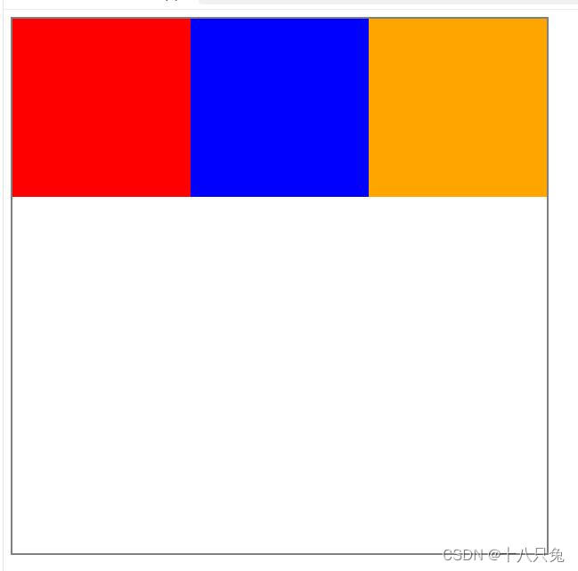
此时三个盒子是垂直排列的,我们可以利用浮动来设置盒子的并排,三个子盒子的样式都要设置浮动:
结果如下:
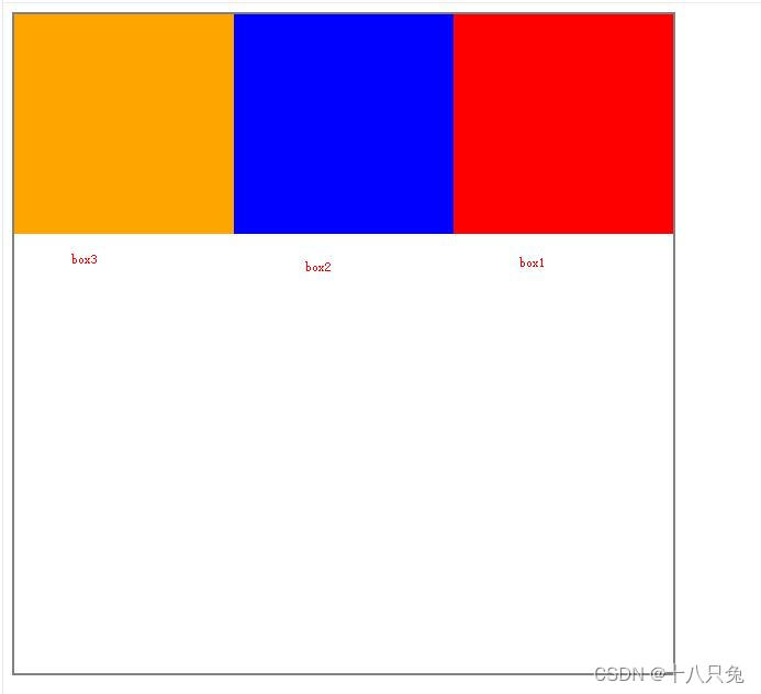
如果没有三个子盒子都设置浮动,比如子盒子box2没有设置浮动:
代码:
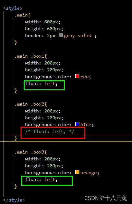
结果:
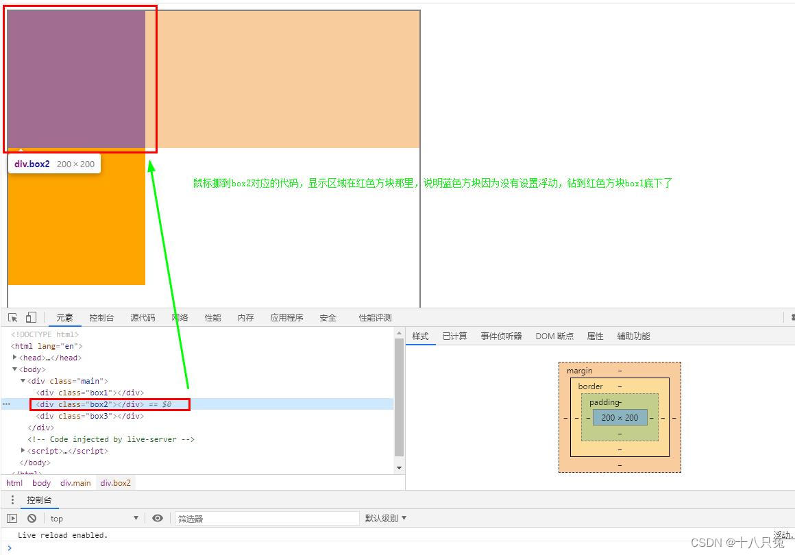
没有设置浮动的子盒子box2(蓝色方块)钻到红色方块底下去了

按住F12可以出现下面的控制台:
把鼠标挪到box2的代码,可以发现box2代表的盒子钻到box1下面去了
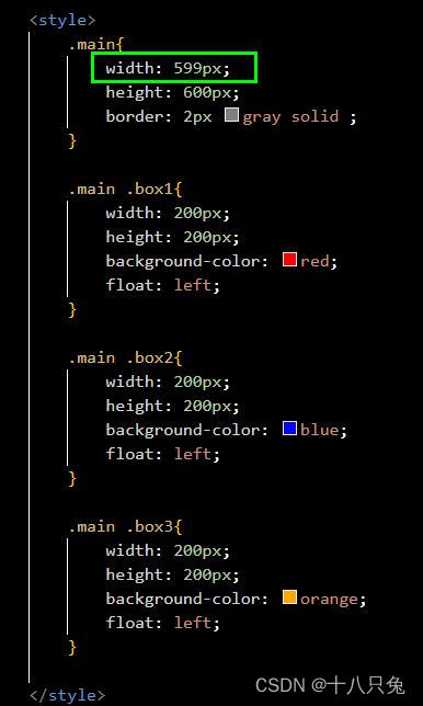
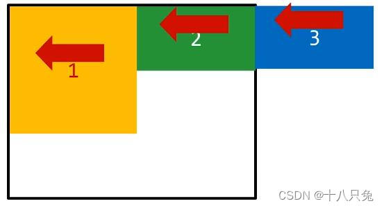
要设置浮动,父盒子要设置足够的宽度
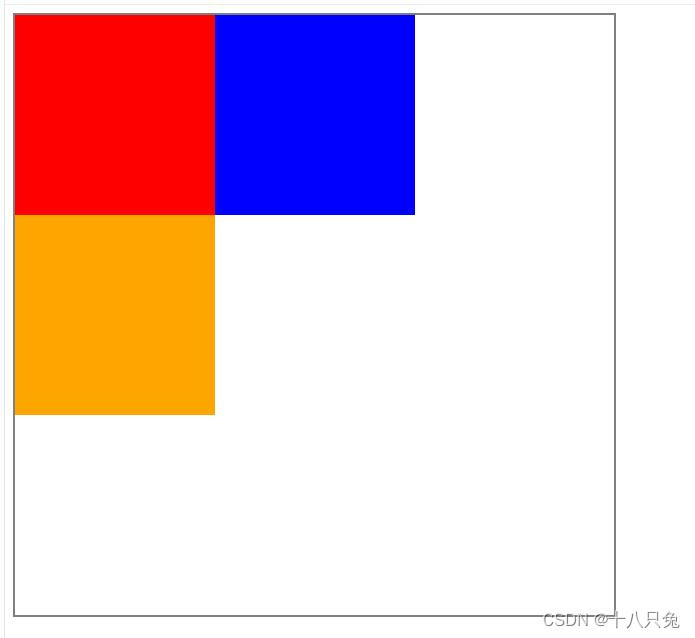
比如:前面我们设置父盒子的宽度刚好可以容纳三个子盒子,此时我们把父盒子的宽度改小一点:
结果:
box3盒子代表的方块会因为父盒子的宽度不够被挤到下面去,无法实现并排
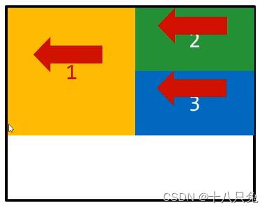
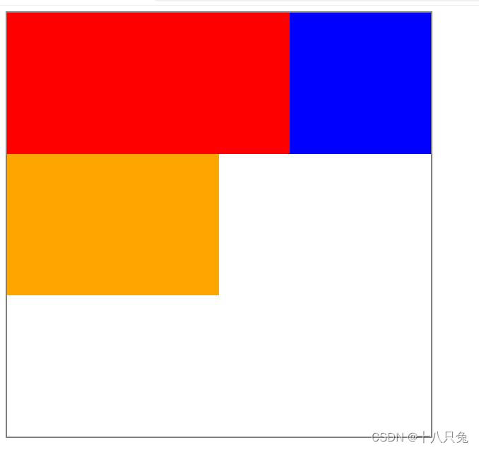
浮动的顺序贴靠特性
- 子盒子会按照顺序进行贴靠,如果父盒子的宽度不够,不足以实现子盒子的并排,那么子盒子会寻找前一个兄弟元素进行并排
- 如图:父盒子因为宽度不够,所以盒子3会沿着盒子2贴靠
如果盒子2没有足够的空间,那么盒子3会试着沿盒子1贴靠,如果盒子1空间不够,那么盒子3会沿着父盒子的边框贴靠,以此类推。
例1:
|
1 2 3 4 5 6 7 8 9 10 11 12 13 14 15 16 17 18 19 20 21 22 23 24 25 26 27 28 29 30 31 32 33 34 35 36 37 38 39 40 41 42 43 44 45 46 47 48 49 |
<!DOCTYPE html> <html lang="en"> <head> <meta charset="UTF-8"> <meta http-equiv="X-UA-Compatible" content="IE=edge"> <meta name="viewport" content="width=device-width, initial-scale=1.0"> <title>Document</title>
<style> .main{ width: 600px; height: 600px; border: 2px gray solid ; }
.main .box1{ width: 300px; height: 600px; background-color: red; float: left; }
.main .box2{ width: 300px; height: 200px; background-color: blue; float: left; }
.main .box3{ width: 200px; height: 200px; background-color: orange; float: left; }
</style> </head>
<body>
<div class="main"> <div class="box1"></div> <div class="box2"></div> <div class="box3"></div> </div>
</body> </html> |
结果:
例2:
代码:
结果:
由于盒子2(蓝色方块)空间不够,所以盒子3(橙色方块)会沿着盒子1贴靠
浮动的元素能设置宽高
- 浮动的元素不再区分块级元素、行内元素,因为浮动元素已经脱离了标准文档流,所以能够设置宽度和高度,即使是span标签或a标签这样的标签也能设置宽高。
- 以span标签为例,没有设置浮动的span标签本身是不能设置宽高的:

结果:
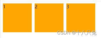
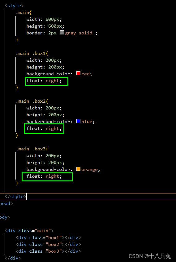
右浮动
float:right顺序是反着来的,即最先提到的子盒子,会先往右边浮动举例:
结果: