一 、CSS种使用 text-decoration 属性来设置文字的装饰效果,包括下划线。
常用的取值:
none:默认值,不设置任何装饰效果。
underline:设置文字下方显示下划线
overline:设置文字上方显示划线
line-through:设置文字中间显示删除线
blink:设置文字闪烁
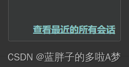
1.设置文字下划线 ,使用 属性,并将其值设置为underline
|
1 |
<div class="allText">查看最近的所有会话</div> |
|
1 2 3 4 5 |
<style> .allText{ text-decoration: underline; } </style> |
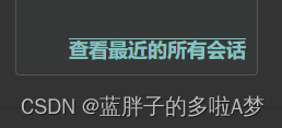
2.上划线 text-decoration 值设置为 overline
|
1 2 3 4 5 |
<style> .allText{ text-decoration: overline; } </style> |
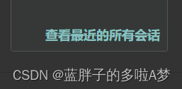
3.文字中间显示删除线 text-decoration 值设置为 line-through
|
1 2 3 4 5 |
<style> .allText{ text-decoration: line-through; } </style> |
二、border-bottom属性
border-bottom属性用来设置元素的底部边框样式,我们可以利用这个属性来实现添加下划线的效果。将元素的border-bottom属性设置为实线,同时调整相应的颜色和宽度,即可实现下划线效果。
|
1 |
border-bottom: 1px solid #000; |
需要注意的是,由于border-bottom属性会占据元素的一部分空间,因此在添加下划线时需要将元素的padding和margin属性作相应调整,以防止下划线覆盖部分文本。
三、背景图实现下划线
还可以利用背景图来实现文本下划线的效果。首先,我们需要准备一张包含下划线的背景图,并将其作为元素的背景图。然后,通过background-position和background-size属性来控制下划线的位置和大小。
|
1 2 3 |
background-image: url("underline.png"); background-size: 100% 50%; background-position: bottom; |
此外,我们还可以为背景图添加一些动画效果,比如渐变效果、滑动效果等,来增强下划线的美观度。
四 、伪元素实现下划线
伪元素是CSS中一种非常有用的技巧,可以用来为元素添加额外的内容或样式。我们可以利用::after伪元素来实现文本下划线的效果。首先,需要给元素设置position: relative属性,然后通过::after伪元素添加一个绝对定位的下划线,在调整下划线的位置和大小即可。
|
1 2 3 4 5 6 7 8 9 10 |
position: relative; &::after { content: ""; position: absolute; bottom: 0; left: 0; width: 100%; height: 1px; background-color: #000; } |


