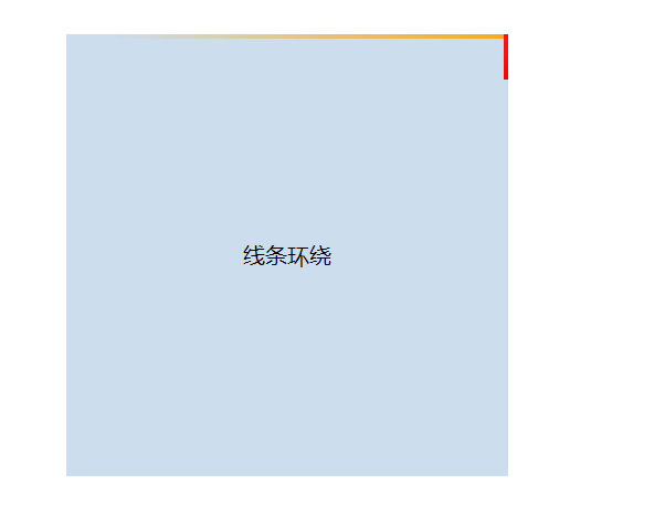
效果:
代码:
|
1 2 3 4 5 6 7 8 9 10 11 12 13 14 15 16 17 18 19 20 21 22 23 24 25 26 27 28 29 30 31 32 33 34 35 36 37 38 39 40 41 42 43 44 45 46 47 48 49 50 51 52 53 54 55 56 57 58 59 60 61 62 63 64 65 66 67 68 69 70 71 72 73 74 75 76 77 78 79 80 81 82 83 84 85 86 87 88 89 90 91 92 93 94 95 96 97 98 99 100 101 102 103 104 105 106 107 108 109 110 111 112 113 114 115 116 |
<!DOCTYPE html> <html lang="en"> <head> <meta charset="UTF-8"> <meta http-equiv="X-UA-Compatible" content="IE=edge"> <meta name="viewport" content="width=device-width, initial-scale=1.0"> <title>Document</title> <style> body { padding: 120px; } .mainbox { width: 320px; height: 320px; position: relative; /* 超出隐藏需要加上 */ overflow: hidden; } .content { width: 320px; height: 320px; line-height: 320px; text-align: center; background-color: #cde; } .line { /* 结合外层元素的相对定位 */ position: absolute; } .line:nth-child(1) { top: 0; left: 0; width: 100%; height: 3px; /* 加上渐变效果,方可形成拖尾效果 */ background: linear-gradient(90deg, transparent, orange); animation: animate1 8s linear infinite; } /* 分别控制其上下左右的定位距离,从而形成线条跟随效果 */ @keyframes animate1 { 0% { left: -100%; } 50%, 100% { left: 100%; } } .line:nth-child(2) { top: -100%; right: 0; width: 3px; height: 100%; background: linear-gradient(180deg, transparent, red); animation: animate2 8s linear infinite; /* 注意要加上延时触发动画效果,这样线条才会依次触发 */ animation-delay: 2s; } @keyframes animate2 { 0% { top: -100%; } 50%, 100% { top: 100%; } } .line:nth-child(3) { bottom: 0; right: 0; width: 100%; background: linear-gradient(270deg, transparent, green); animation: animate3 8s linear infinite; animation-delay: 4s; } @keyframes animate3 { 0% { right: -100%; height: 3px; } 50%, 100% { height: 2px; right: 100%; } } .line:nth-child(4) { bottom: -100%; left: 0; width: 3px; height: 100%; background: linear-gradient(360deg, transparent, #3a86ff); animation: animate4 8s linear infinite; animation-delay: 6s; } @keyframes animate4 { 0% { bottom: -100%; } 50%, 100% { bottom: 100%; } } </style> </head> <body> <div class="mainbox"> <span class="line"></span> <span class="line"></span> <span class="line"></span> <span class="line"></span> <div class="content">线条环绕</div> </div> </body> </html> |


