1. 第一次遇到这个问题的场景
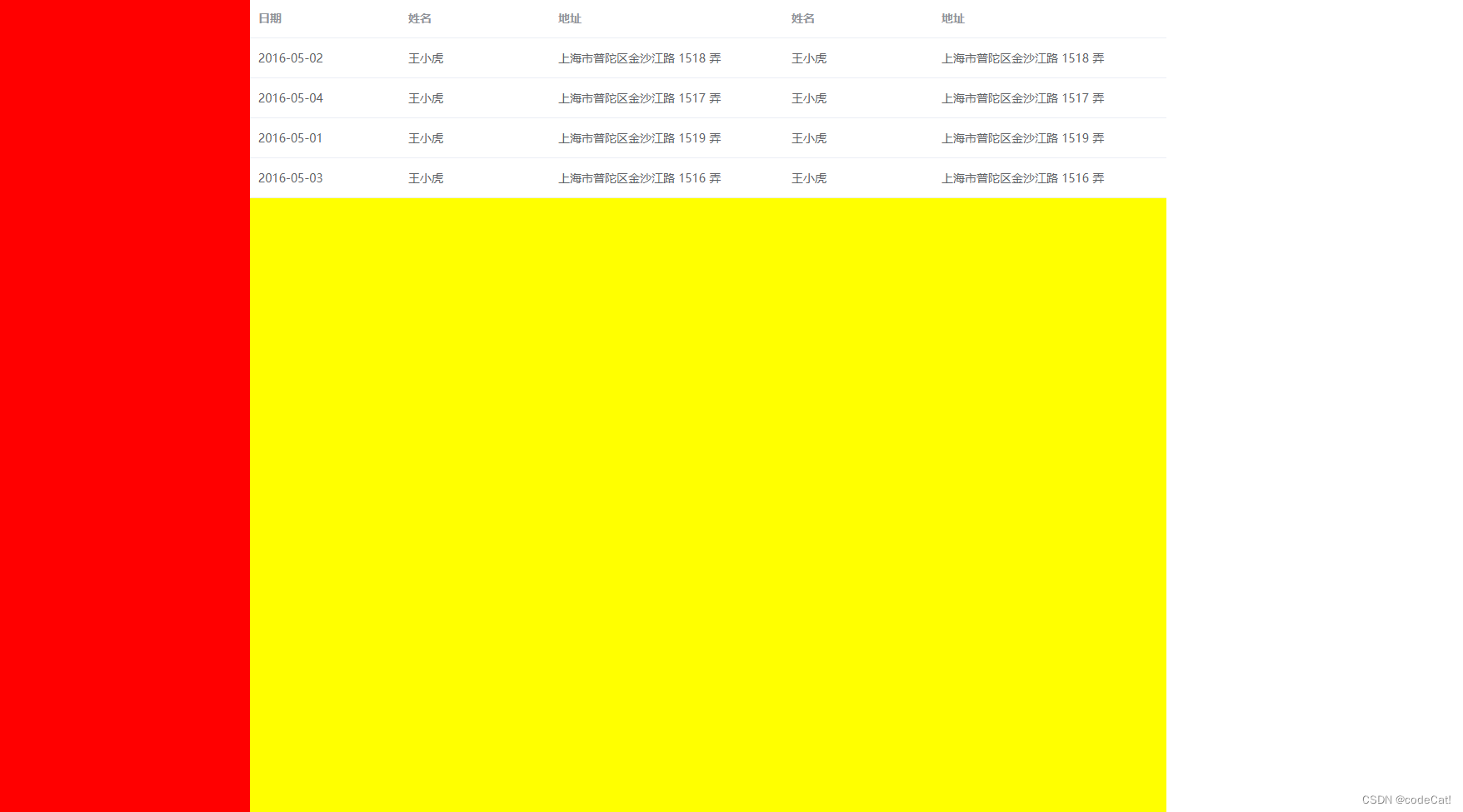
先看效果图,大家可以看一下下面的样式,很明显左边和右边的盒子我是给的定宽,但是被挤压了
这个是我在项目中遇到的一个bug,使用的 flex 布局,由于我动态的修改绿色盒子的显示与隐藏,导致两边盒子的挤压
|
1 2 3 4 5 6 7 8 9 10 11 12 13 14 15 16 17 18 19 20 21 22 23 24 25 26 27 28 |
<style> .container { width: 1400px; display: flex; height: 100vh; } .box1 { background-color: red; width: 300px; } .box2 { background-color: yellow; flex: 1; } .box3 { background-color: green; width: 400px; } </style> <div class="container"> <div class="box1"></div> <div class="box2"> <div> ...el-table </div> </div> <div class="box3 none"></div> </div> |
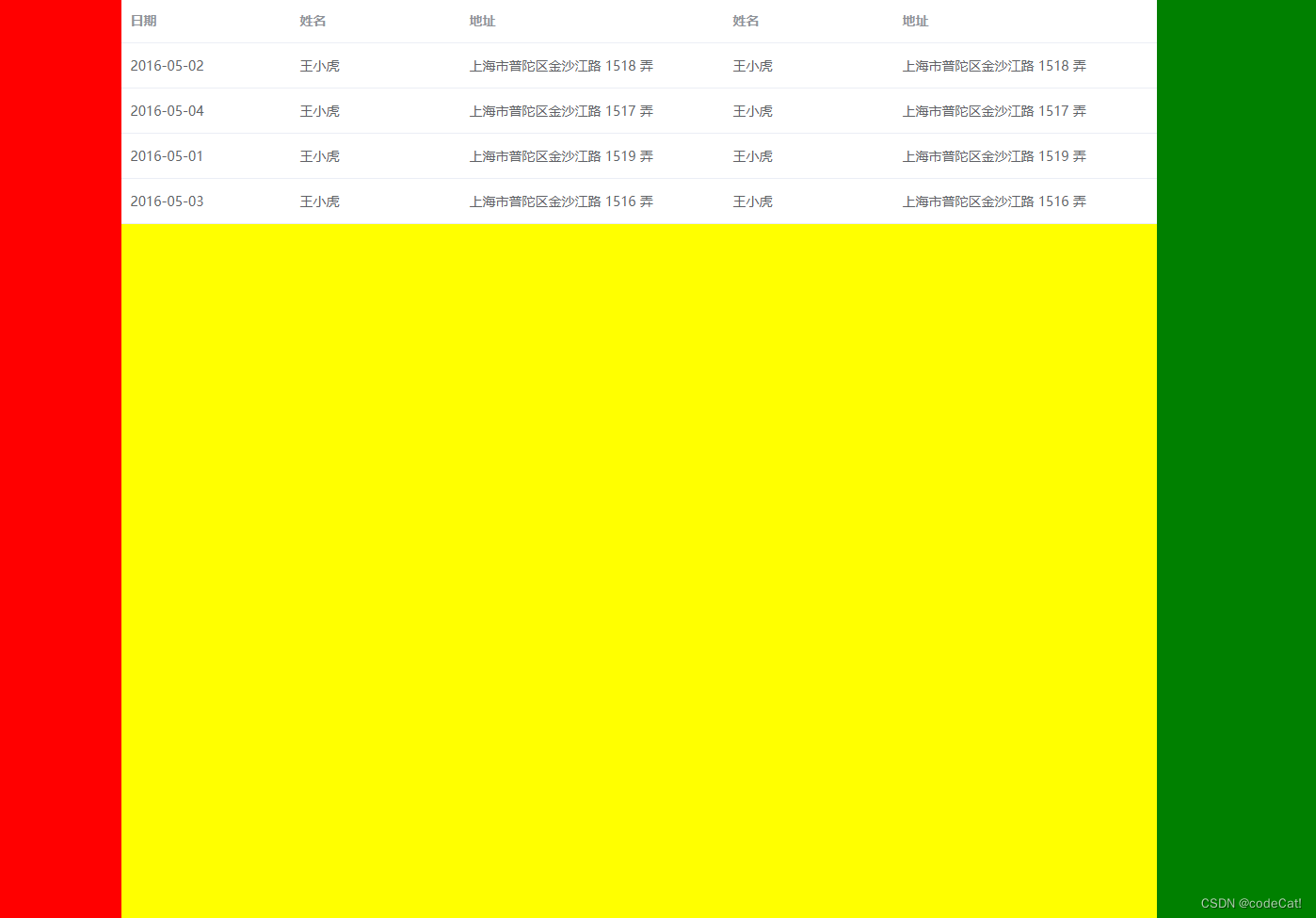
2. 第二种情况
很明显,红色的盒子没有300px
|
1 2 3 4 5 6 7 8 9 10 11 12 13 14 15 16 17 18 19 |
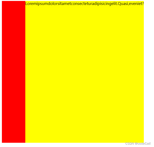
<style> .container { display: flex; width: 600px; height: 600px; } .box1 { background-color: red; width: 300px; } .box2 { background-color: yellow; flex: 1; } </style> <div class="container"> <div class="box1"></div> <div class="box2">Loremipsumdolorsitametconsecteturadipisicingelit.Quasi,eveniet?</div> </div> |
3. 问题原因
- 首先了解一下 flex: n; 的定义,当使用单值语法的时候,可以理解为就是设置了 flex: n 1 0; 对应的 flex-grow: n; flex-shrink: 1; flex-basis: 0;,这里我们只探究 flex-grow: n;
- flex-grow:规定了项在 flex 容器中分配剩余空间的相对比例,这里的剩余空间指的是除内容之外的空间
- 而上面两种情况:
- 情况一:由于 flex-grow 只能使当前元素生效,而子元素的宽度也就是当前元素的内容,在 el-table 中第一次读取宽度后,会给子元素设置固定宽度,进而导致没有剩余空间,也就是当内容空间大于剩余空间时 flex-grow: n; 就已经失效了
- 情况二:内容的长单词没有空格,可能在解析的时候当做一个字符,所以内容的长度就是整个字符的实际长度,同样也导致了 flex-grow: n; 的失效
4. 解决方案
4.1 方案一
- 内容盒设置 width: 0;,侧边栏正常,但是内容盒的内容会溢出,这种情况看怎么处理内容部分
- 因为侧边栏的宽度一般都是固定的,这种处理方案虽然会有一定的取舍,但是会比原先好一些
4.2 方案二
- 给内容盒设置 overflow-y: auto; ,这样侧边栏正常,内容盒会出现横向滚动条