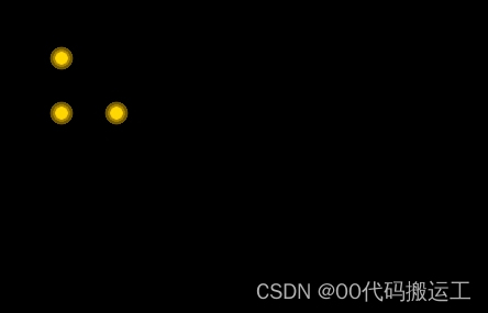
1.效果图,重点opacity,animation,transform:scale
2.html
|
1 2 3 4 5 6 7 8 9 |
<div class="icon-warnCom"> <icon class="icon-warns"><i class="dot"></i><i class="pulse"></i></icon> </div> <div class="icon-warnCom1"> <icon class="icon-warns"><i class="dot"></i><i class="pulse"></i></icon> </div> <div class="icon-warnCom2"> <icon class="icon-warns"><i class="dot"></i><i class="pulse"></i></icon> </div> |
3.css
|
1 2 3 4 5 6 7 8 9 10 11 12 13 14 15 16 17 18 19 20 21 22 23 24 25 26 27 28 29 30 31 32 33 34 35 36 37 38 39 40 41 42 43 44 45 46 47 48 49 50 51 52 53 54 55 56 57 58 59 60 61 62 63 64 65 66 67 68 69 70 71 72 73 74 75 76 77 78 79 80 81 82 83 84 85 86 87 88 89 90 91 92 93 94 95 96 97 98 99 100 |
body { width: 100%; height: 100%; background-color: black; } @keyframes warn { 0% { transform: scale(0); opacity: 0.0; } 25% { transform: scale(0); opacity: 0.1; } 50% { transform: scale(0.1); opacity: 0.3; } 75% { transform: scale(0.2); opacity: 0.5; } 100% { transform: scale(0.3); opacity: 0.0; } } .icon-warnCom { position: absolute; width: 12px; height: 12px; background-color: #ffd803; border-radius: 100%; top: 100px; left: 100px; } .icon-warns { position: relative; width: 100%; height: 100%; display: block; } /* 保持大小不变的小圆圈 */ .dot { position: absolute; left: -44px; top: -44px; width: 60px; height: 60px; -webkit-border-radius: 100; -moz-border-radius: 100; border: 20px solid #f6c100; border-radius: 100%; z-index: 2; opacity: 0; -webkit-animation: warn 2.5s ease-out; -moz-animation: warn 2.5s ease-out; animation: warn 2.5s ease-out; -webkit-animation-iteration-count: infinite; -moz-animation-iteration-count: infinite; animation-iteration-count: infinite; } /* 产生动画(向外扩散变大)的圆圈 */ .pulse { position: absolute; left: -44px; top: -44px; width: 60px; height: 60px; border: 20px solid #f6c100; -webkit-border-radius: 100%; -moz-border-radius: 100%; border-radius: 100%; z-index: 1; opacity: 1; -webkit-animation: warn 1.5s ease-out; -moz-animation: warn 1.5s ease-out; animation: warn 1.5s ease-out; -webkit-animation-iteration-count: infinite; -moz-animation-iteration-count: infinite; animation-iteration-count: infinite; } .icon-warnCom1 { position: absolute; width: 12px; height: 12px; background-color: #ffd803; border-radius: 100%; top: 50px; left: 50px; } .icon-warnCom2 { position: absolute; width: 12px; height: 12px; background-color: #ffd803; border-radius: 100%; top: 100px; left: 50px; } |


