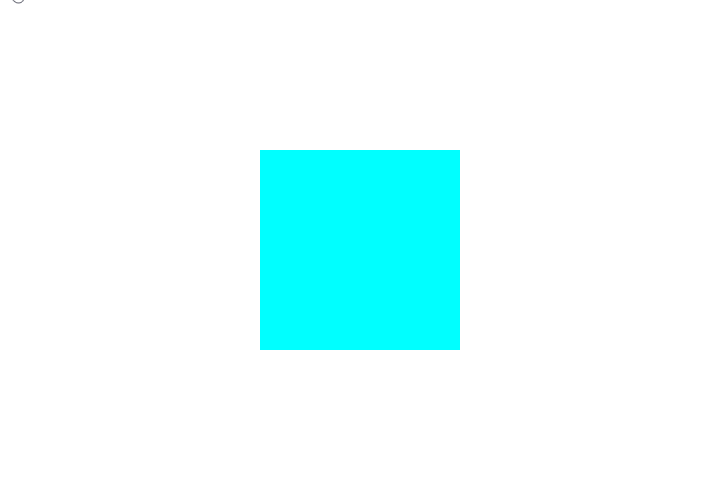
1. Grow-Shadow
鼠标移入盒子放大并出现底部阴影
效果:

代码
|
1 |
<div class="box"></div> |
|
1 2 3 4 5 6 7 8 9 10 11 12 13 14 15 16 17 18 19 |
.box { width: 200px; height: 200px; background-color: aqua; -webkit-transform: perspective(1px) translateZ(0); transform: perspective(1px) translateZ(0); box-shadow: 0 0 1px rgba(0, 0, 0, 0); -webkit-transition-duration: 0.3s; transition-duration: 0.3s; -webkit-transition-property: box-shadow, transform; transition-property: box-shadow, transform; } .box:hover, .box:focus, .box:active { box-shadow: 0 10px 10px -10px rgba(0, 0, 0, 0.5); -webkit-transform: scale(1.1); transform: scale(1.1); } |
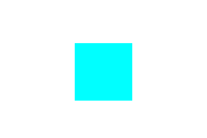
2. Move-Shadow
鼠标移入盒子,盒子向上移动并出现底部阴影
效果:
代码
|
1 |
<div class="box"></div> |
|
1 2 3 4 5 6 7 8 9 10 11 12 13 14 15 16 17 18 19 20 21 22 23 24 25 26 27 28 29 30 31 32 33 34 35 36 37 38 39 40 41 42 43 44 45 46 47 48 49 50 51 |
.box { width: 200px; height: 200px; background: aqua; -webkit-transform: perspective(1px) translateZ(0); transform: perspective(1px) translateZ(0); box-shadow: 0 0 1px rgba(0, 0, 0, 0); position: relative; -webkit-transition-duration: 0.3s; transition-duration: 0.3s; -webkit-transition-property: transform; transition-property: transform; &::before { pointer-events: none; position: absolute; z-index: -1; content: ""; top: 100%; left: 5%; height: 10px; width: 90%; opacity: 0; background: -webkit-radial-gradient( center, ellipse, rgba(0, 0, 0, 0.35) 0%, rgba(0, 0, 0, 0) 80% ); background: radial-gradient( ellipse at center, rgba(0, 0, 0, 0.35) 0%, rgba(0, 0, 0, 0) 80% ); /* W3C */ -webkit-transition-duration: 0.3s; transition-duration: 0.3s; -webkit-transition-property: transform, opacity; transition-property: transform, opacity; } } .box:hover, .box:focus, .box:active { -webkit-transform: translateY(-5px); transform: translateY(-5px); &::before { opacity: 1; -webkit-transform: translateY(5px); transform: translateY(5px); } } |
3. Curl-Bottom-Right
鼠标移入盒子,盒子右下角卷起
效果:
代码
|
1 |
<div class="box"></div> |
|
1 2 3 4 5 6 7 8 9 10 11 12 13 14 15 16 17 18 19 20 21 22 23 24 25 26 27 28 29 30 31 32 33 34 35 36 37 38 |
.box { width: 200px; height: 200px; background: aqua; -webkit-transform: perspective(1px) translateZ(0); transform: perspective(1px) translateZ(0); box-shadow: 0 0 1px rgba(0, 0, 0, 0); position: relative; &::before { pointer-events: none; position: absolute; content: ""; height: 0; width: 0; bottom: 0; right: 0; background: white; /* IE9 */ background: linear-gradient( 315deg, white 45%, #aaa 50%, #ccc 56%, white 80% ); box-shadow: -1px -1px 1px rgba(0, 0, 0, 0.4); -webkit-transition-duration: 0.3s; transition-duration: 0.3s; -webkit-transition-property: width, height; transition-property: width, height; } } .box:hover:before, .box:focus:before, .box:active:before { width: 25%; height: 25%; } |


