今天使用CSS设计一个后台页面,在插入背景图片后,设置透明度时,发现使用opacity设置透明度时,里面的文字内容也会随着背景一起变透明
效果如下图
于是在百度上找了很多方法,记录一下,方便以后使用
1.背景毛玻璃效果
通过伪类选择器before为背景添加透明效果,文字使用的仍时添加效果前的样式
|
1 2 3 4 5 6 7 8 9 10 11 12 13 14 15 16 17 18 19 |
.demo1{ width: 500px; height: 300px; line-height: 50px; text-align: center; } .demo1:before{ background: url(http://csssecrets.io/images/tiger.jpg) no-repeat; background-size: cover; width: 500px; height: 300px; content: ""; position: absolute; top: 0; left: 0; z-index: -1;/*-1 可以当背景*/ -webkit-filter: blur(3px); filter: blur(3px); } |

2.背景半透明效果
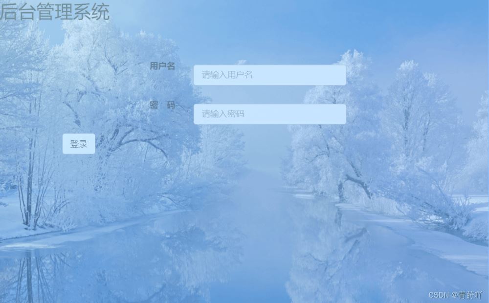
此方法通过在文字所在的div上面设置透明度,不改变背景的透明度
当两个盒子重叠时,就会实现下面图片的效果
|
1 2 3 4 5 6 7 8 9 10 11 12 13 14 15 16 17 18 19 |
.demo2-bg{ background: url("img/htbg1.jpg") no-repeat; background-size: cover; width: 500px; height: 300px; position: relative; } .demo2{ position: absolute; left: 0; right: 0; top: 0; bottom: 0; width: 500px; height: 300px; line-height: 50px; text-align: center; background:rgba(255,255,255,0.3); } |