CSS属性:fit-content
|
1 2 3 4 5 6 |
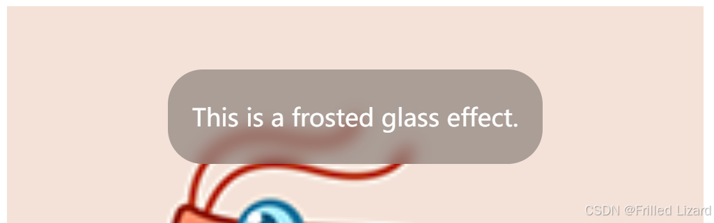
<div class="content"> <img src="src\assets\404_images\xxmLogo.png" alt=""> <div class="frosted-glass"> <p>This is a frosted glass effect.</p> </div> </div> |
|
1 2 3 4 5 6 7 8 9 10 11 12 13 14 15 16 17 18 19 20 21 22 23 |
.frosted-glass { position: absolute; top: 10vh; left: 0; right: 0; margin: auto; width: fit-content; background: rgba(0, 0, 0, 0.3); font-size: 28px; color: #fff; border-radius: 40px; padding: 8px 28px; backdrop-filter: blur(10px); } .content { position: relative; width: 800px; height: 800px; } img { width: 100%; height: 100%; } |
效果图:
fit-content 是 CSS 中用于动态调整元素宽度或高度的一个值。它根据内容的尺寸和容器的可用空间来计算元素的大小。fit-content 主要用于响应式设计场景下,当你希望元素尺寸根据内容自适应,但又不超出特定限制时。
fit-content 可以用于 width、height、max-width 和 max-height 等属性。
fit-content 计算出的宽度等于内容所需的最小宽度,除非被容器的约束条件(如最大宽度或可用空间)限制。
拓展
margin: 0 auto; 不能使 .frosted-glass 元素水平居中的原因是元素的 position: absolute; 属性使其脱离了文档流。在这种情况下,
margin: 0 auto; 无法正常工作,因为绝对定位元素不受常规的自动边距影响。
方法一:使用 left: 0; right: 0; 结合 margin: auto;
方法二:使用 left: 50%; 结合 transform: translate(-50%);


