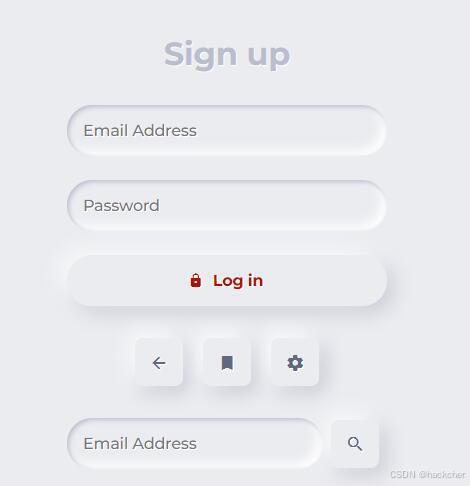
利用 box-shadow 实现浮雕风格的按钮。
HTML:
|
1 2 3 4 5 6 7 8 9 10 11 12 13 14 15 16 17 18 19 20 21 22 23 |
<form> <div class="segment"> <h1>Sign up</h1> </div> <label> <input type="text" placeholder="Email Address" /> </label> <label> <input type="password" placeholder="Password" /> </label> <button class="red" type="button"><i class="icon ion-md-lock"></i> Log in</button> <div class="segment"> <button class="unit" type="button"><i class="icon ion-md-arrow-back"></i></button> <button class="unit" type="button"><i class="icon ion-md-bookmark"></i></button> <button class="unit" type="button"><i class="icon ion-md-settings"></i></button> </div> <div class="input-group"> <label> <input type="text" placeholder="Email Address" /> </label> <button class="unit" type="button"><i class="icon ion-md-search"></i></button> </div> </form> |
SCSS:
|
1 2 3 4 5 6 7 8 9 10 11 12 13 14 15 16 17 18 19 20 21 22 23 24 25 26 27 28 29 30 31 32 33 34 35 36 37 38 39 40 41 42 43 44 45 46 47 48 49 50 51 52 53 54 55 56 57 58 59 60 61 62 63 64 65 66 67 68 69 70 71 72 73 74 75 76 77 78 79 80 81 82 83 84 85 86 87 88 89 90 91 92 93 94 95 96 97 98 99 100 101 102 103 104 105 106 107 108 109 110 |
$ruler: 16px; $color-red: #ae1100; $color-bg: #ebecf0; $color-shadow: #babecc; $color-white: #fff; body, html { background-color: $color-bg; } h1 { margin: 0; } body, p, input, select, textarea, button { font-family: "Montserrat", sans-serif; letter-spacing: -0.2px; font-size: $ruler; } div, p { color: $color-shadow; text-shadow: 1px 1px 1px $color-white; } form { padding: $ruler; width: $ruler * 20; margin: 0 auto; } .segment { padding: $ruler * 2 0; text-align: center; } button, input { border: 0; outline: 0; font-size: $ruler; border-radius: $ruler * 20; padding: $ruler; background-color: $color-bg; text-shadow: 1px 1px 0 $color-white; } label { display: block; margin-bottom: $ruler * 1.5; width: 100%; } input { margin-right: $ruler/2; box-shadow: inset 2px 2px 5px $color-shadow, inset -5px -5px 10px $color-white; width: 100%; box-sizing: border-box; transition: all 0.2s ease-in-out; appearance: none; -webkit-appearance: none; &:focus { box-shadow: inset 1px 1px 2px $color-shadow, inset -1px -1px 2px $color-white; } } button { color: #61677c; font-weight: bold; box-shadow: -5px -5px 20px $color-white, 5px 5px 20px $color-shadow; transition: all 0.2s ease-in-out; cursor: pointer; font-weight: 600; &:hover { box-shadow: -2px -2px 5px $color-white, 2px 2px 5px $color-shadow; } &:active { box-shadow: inset 1px 1px 2px $color-shadow, inset -1px -1px 2px $color-white; } .icon { margin-right: $ruler/2; } &.unit { border-radius: $ruler/2; line-height: 0; width: $ruler * 3; height: $ruler * 3; display: inline-flex; justify-content: center; align-items: center; margin: 0 $ruler/2; font-size: $ruler * 1.2; .icon { margin-right: 0; } } &.red { display: block; width: 100%; color: $color-red; } } .input-group { display: flex; align-items: center; justify-content: flex-start; label { margin: 0; flex: 1; } } |


