VUE使用CSS3动画实现多个跳动小球(语音输入动画)
之前实习期间,有做过一个需求,安卓端嵌H5页面,实现语音输入并包含输入时动画,跳动的小球。通过查阅各种资料,根据实际需求场景,最终实现了其功能。在此便回顾记录一下吧。
单个小球无限跳动
首先,实现单个小球跳动。
分析: 小球起始位置在顶部,中间时间段到底部,最后又回到顶部,并且是无限循环的。通过相对定位与CSS3的关键帧结合实现。
|
1 |
<div class="ball"></div> |
|
1 2 3 4 5 6 7 8 9 10 11 12 13 14 15 16 17 18 19 20 21 22 |
.ball { width: 20px; height: 20px; border-radius: 50%; position: relative; animation-name: bouncing; // 动画名称 animation-duration: 1.6s; // 单次动画持续时长 animation-iteration-count: infinite; // 动画无限循环 background: rgb(244, 7, 7); // 小球背景色 } // 关键帧动画 @keyframes bouncing { 0% { top: 0px; // 初始位于顶部 } 50% { top: 100px; // 中间位于底部 } 100% { top: 0px; // 最终回到顶部 } } |
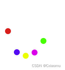
多个小球跳动
分析: 多个小球同时跳动,相对定位需要left不相同,其次每个小球动画开始有时间差,其次就是小球颜色了。
|
1 2 |
/** balls = [1,2,3,4,5] 多个小球 */ <div v-for="ball in balls" :key="ball" :class="['ball', `ball${ball}`]"></div> |
|
1 2 3 4 5 6 7 8 9 10 11 12 13 14 15 16 17 18 19 20 21 22 23 24 25 26 27 28 29 30 31 32 33 34 35 36 37 38 39 40 41 42 43 44 45 46 47 48 49 50 51 |
// 公共样式抽离 .ball { width: 20px; height: 20px; border-radius: 50%; position: relative; animation-name: bouncing; // 动画名称 animation-duration: 1.6s; // 单次动画持续时长 animation-iteration-count: infinite; // 动画无限循环 } .ball1 { @extend .ball; left: 0; background: rgb(244, 7, 7); } .ball2 { @extend .ball; animation-delay: 0.25s; // 动画延迟 left: 30px; background: rgb(16, 106, 241); } .ball3 { @extend .ball; animation-delay: 0.5s; // 动画延迟 left: 60px; background: rgb(251, 236, 13); } .ball4 { @extend .ball; animation-delay: 0.75s; // 动画延迟 left: 90px; background: rgb(233, 23, 233); } .ball5 { @extend .ball; animation-delay: 1.0s; // 动画延迟 left: 120px; background: rgb(6, 247, 6); } // 关键帧动画 @keyframes bouncing { 0% { top: 0px; // 初始位于顶部 } 50% { top: 100px; // 中间位于底部 } 100% { top: 0px; // 最终回到顶部 } } |
Demo
分析: 绑定事件监听,按钮长按动画显示,按钮松开动画隐藏。
最后,就是投入使用,看一下实现的效果了。
|
1 2 |
<el-button id="bouncingBallBtn">语音录入</el-button> <bouncing-ball v-if="showBouncing" /> |
|
1 2 3 4 5 6 7 8 9 10 11 12 13 14 15 16 17 18 19 20 |
/** data showBouncing: false */ mounted() { let theBouncingBtn = document.getElementById("bouncingBallBtn"); // 移动端 theBouncingBtn.addEventListener("touchstart", this.startBouncing, false); theBouncingBtn.addEventListener("touchend", this.endBouncing, false); // pc端 theBouncingBtn.addEventListener("mousedown", this.startBouncing, false); theBouncingBtn.addEventListener("mouseup", this.endBouncing, false); } /** 动画显示 */ startBouncing(event) { event.preventDefault(); this.showBouncing = true; }, /** 动画隐藏 */ endBouncing(event) { event.preventDefault(); this.showBouncing = false; }, |


