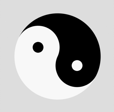
好久没动canvas了,今下午突然想回顾一下,就写了个旋转的太极,哈哈,蛮好玩的,在这里就将自己写的过程展示出来,旋转使用的css实现的,没有用canvas自己的,希望大佬们不要吐槽。html5教程
css
html
js
css
body{
    background: #ddd;
}
#canvas{
    position: absolute;
    left: 40%;
    top: 30%;
    -webkit-transform: translate(-50%,-50%);
    -moz-transform: translate(-50%,-50%);
    -ms-transform: translate(-50%,-50%);
    -o-transform: translate(-50%,-50%);
    transform: translate(-50%,-50%);
    -webkit-animation: testAnimate 3s linear infinite;
    -o-animation: testAnimate 3s linear infinite;
    animation: testAnimate 3s linear infinite;
}
@keyframes testAnimate {
    from {
        -webkit-transform: rotate(0);
        -moz-transform: rotate(0);
        -ms-transform: rotate(0);
        -o-transform: rotate(0);
        transform: rotate(0);
    }
    to {
        -webkit-transform: rotate(360deg);
        -moz-transform: rotate(360deg);
        -ms-transform: rotate(360deg);
        -o-transform: rotate(360deg);
        transform: rotate(360deg);
    }
}
|
html
<body>
    <canvas id="canvas" width="500" height="500"></canvas>
</body>
|
js
let ctx = document
    .getElementById("canvas")
    .getContext("2d");
// left-black-big
ctx.beginPath();
ctx.fillStyle = "#000";
ctx.arc(250,250,200,Math.PI/2,Math.PI*1.5,false);
ctx.closePath();
ctx.fill();
// right-white-big
ctx.beginPath();
ctx.fillStyle = "#fff";
ctx.arc(250,250,200,Math.PI/2,Math.PI*1.5,true);
ctx.closePath();
ctx.fill();
// top-black-middle
ctx.beginPath();
ctx.fillStyle = "#000";
ctx.arc(250,150,100,Math.PI/2,Math.PI*1.5,true);
ctx.closePath();
ctx.fill();
// bottom-white-middle
ctx.beginPath();
ctx.fillStyle = "#fff";
ctx.arc(250,350,100,Math.PI/2,Math.PI*1.5,false);
ctx.closePath();
ctx.fill();
// top-white-small
ctx.beginPath();
ctx.fillStyle = "#fff";
ctx.arc(250,150,25,0,Math.PI*2);
ctx.closePath();
ctx.fill();
// bottom-black-small
ctx.beginPath();
ctx.fillStyle = "#000";
ctx.arc(250,350,25,0,Math.PI*2);
ctx.closePath();
ctx.fill();
|
效果
以上就是本文的全部内容,希望对大家的学习有所帮助。
原文链接:
相关文章