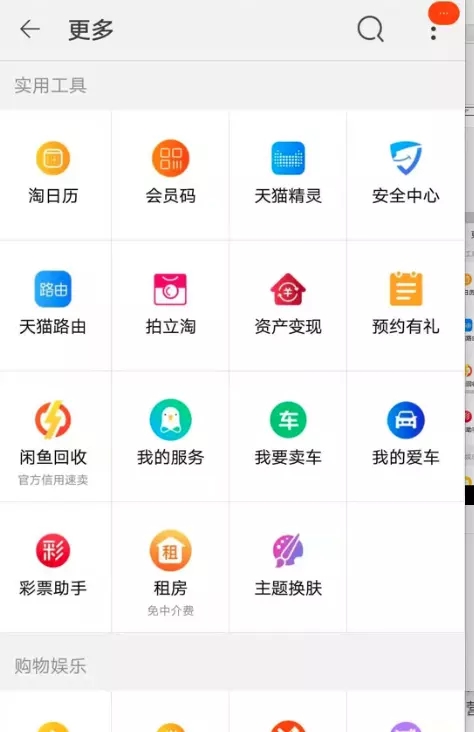
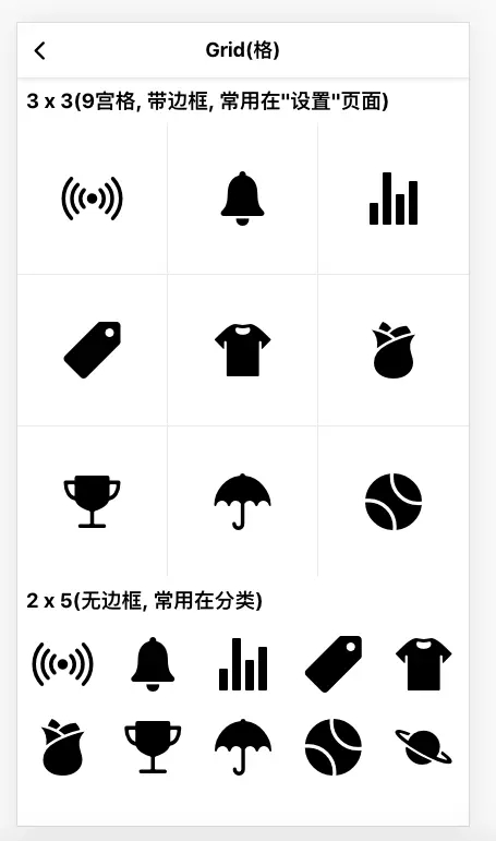
现在的APP界面基本都是大同小异, 宫格布局现在基本成了每个APP必然的存在带边框, 常用在"功能导航"页面
无边框, 常用在首页分类

设计目标
在scss环境下, 通过mixin实现n宫格, 并且可以支持"有无边框"和"每个格是否正方形":
@include grid(3, 3, true); // 3 x 3, 有边框, 且每个格为正方形 @include grid(2, 5, false, false); // 2 x 5, 无边框 |
最终效果
"padding百分比"小技巧
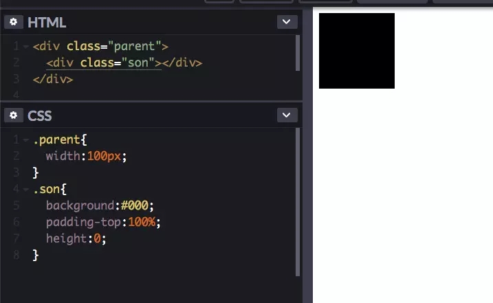
先解释一个小技巧, 如何实现正方形, 保证看一遍就会, 结论就是:
padding的值如果是百分比, 那么他是相对"父"元素宽度计算的, 也就是说如果"父"元素宽度是100px, "子"元素设置padding-top:100%,"子"元素的padding-top实际上等于100px, 这样就实现了一个正方形(100 x 100). 为了减少干扰, 我们把"子"元素高度设置为0;
设计思路(无关你是scss还是less)
- 为了方便内部元素水平/垂直居中, 整体我们用flex布局.
- 使用正方形占位, 因为用了padding-top:100%, 所以我们就需要再单独用一个div来装内容, 我给他起名"item__content".
- 为了让内容的容器div充满方块, 我们给他设置样式:position:absolute;top:0;left:0;right:0;bottom:0;;
因此我们的html是这样的:
<!-- a-grid是一个flex容器, 方便他的内容做"水平/垂直居中" -->
<div class="a-grid">
  <!-- a-grid__item用来占位实现正方形 -->
  <div class="a-grid__item">
      <!-- item__content才是真正装内容的容器 -->
      <div class="item__content">
        内容...
      </div>
  </div>
</div>
|
代码(scss)
这里做了3件事:
- 为了不冗余, 我把公共的部分抽离的出来起名".a-grid";
- mixin支持4个参数, 分别是$row(行数), $column(列数), $hasBorder(是否有边框), $isSquare(是否保证每个块是正方形).
- mixin内部通过计算并结合:nth-child实现"整体无外边框"的效果,
.a-grid {
    display: flex;
    flex-wrap: wrap;
    width: 100%;

    .a-grid__item {
        text-align:center;
        position:relative;
        >.item__content {
            display:flex
            flex-flow: column;
            align-items: center;
            justify-content: center;
        }
    }
}

@mixin grid($row:3, $column:3, $hasBorder:false, $isSquare:true) {
    @extend .a-grid;

    .a-grid__item {

        flex-basis: 100%/$column;

        @if($isSquare) {
            padding-bottom: 100%/$column;
            height: 0;
        }

        >.item__content {

            @if($isSquare) {
                position:absolute;
                top:0;left:0;right:0;bottom:0;
            }
        }
    }

    @for $index from 1 to (($row - 1) * $column + 1) {
        .a-grid__item:nth-child(#{$index}) {
            @if($hasBorder) {
                border-bottom: 1px solid #eee;
            }
        }
    }

    @for $index from 1 to $column {
        .a-grid__item:nth-child(#{$column}n + #{$index}) {
            @if($hasBorder) {
                border-right: 1px solid #eee;
            }
        }
    }
}
|
使用
// 生成一个 3行3列, 正方形格子的宫格
.a-grid-3-3 {
    @include grid(3, 3, true);
}

// 生成一个 2行5列, 无边框宫格, 每个格子由内容决定高度
.a-grid-2-5 {
    @include grid(2, 5, false, false);
}
|
提醒大家: 如要做n x m的布局, 用@include grid(n, m)后千万别忘了在html中添加 n x m个对应的dom结构.
最终
内容很简单, 还有很多可以优化的地方, 比如边框可以改成"头发丝"边框, 在真机上看起来更细些.
好了, 内容就这些, 抛砖引玉, 如果有更好的实现方式请留言, 感谢大家阅读.
最近在写一个css样式库, 目标是兼容小程序, 大家有兴趣的可以一起玩, 这是本节课对应的源码:
https://github.com/any86/3a.css/blob/develop/src/components/_grid.scss-[-/a>
原文链接:https://www.jb51.net/css/690584.html
相关文章


