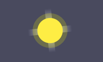
效果
效果图如下
实现思路
- div实现太阳的一条矩形光影
- before伪元素制作另一条光影矩形,和已有的转变90°
- after伪元素画个圆实现太阳样式
dom结构
用两个嵌套的div容器,父容器来控制图标显示的位置,子容器用来写太阳的一条光影矩形的样式。
<div class="container">
    <div class="sunny"></div>
</div>
|
css样式
1、定义父容器样式,控制图标位置,顺便给整个页面加个背景色,方便预览
body{
    background: rgba(73, 74, 95, 1);
}

.container{
    width: 170px;
    height: 170px;
    position: relative;
    margin: 250px auto;
}
|
2、光影矩形样式,有一个360°旋转的动画
.sunny{
    width: 20px;
    height: 140px;
    position: absolute;
    top: 20px;
    left: 90px;
    background: -webkit-linear-gradient(top, rgba(255,255,255,0) 0%, rgba(255,255,255,0.8) 50%, rgba(255,255,255,0) 100%);
    animation: sunny 15s linear infinite;
}

@keyframes sunny {
    0%{
        transform: rotate(0deg);
    }
    100%{
        transform: rotate(360deg);
    }
}
|
3、写另一条垂直的光影矩形
.sunny::before{
    content: '';
    width: 20px;
    height: 140px;
    position: absolute;
    bottom: 0;
    left: 0;
    background: -webkit-linear-gradient(top, rgba(255,255,255,0) 0%, rgba(255,255,255,0.8) 50%, rgba(255,255,255,0) 100%);
    transform: rotate(90deg)
}
|
4、太阳圆圈的样式
.sunny::after{
    content: '';
    width: 80px;
    height: 80px;
    position: absolute;
    top: 30px;
    left: -30px;
    background: #ffee44;
    border-radius: 50%;
    box-shadow: rgba(255,255,0,0.2) 0 0 0 15px;
}
|
|
|
原文链接:https://www.jb51.net/css/693979.html
相关文章


