CSS 中的 Flex(弹性布局) 可以很灵活的控制网页的布局,其中决定 Flex 布局内项目宽度/高度的是三个属性:flex-basis, flex-grow, flex-shrink.
flex-basis
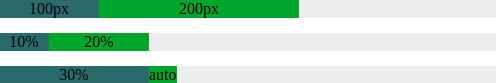
flex-basis 决定了项目占据主轴的空间,除非使用 box-sizing 进行设置,否则它将设置内容框的大小,因此当你指定一个flex项的大小时需要额外小心,因为它很肯能包含内边距与边框。
你可以为其指定一个具体的CSS尺寸值,也可以指定其占据父元素的百分比,它的默认值为 auto(根据内容自动调整大小)
<!-- demo-1 -->

  <div class="parent">
    <div class="child1">100px</div>
    <div class="child2">200px</div>
  </div>
  <div class="parent">
    <div class="child1">10%</div>
    <div class="child2">20%</div>
  </div>
  <div class="parent">
    <div class="child1">30%</div>
    <div class="child2">auto</div>
  </div>

  <style>
    .parent {
      width: 500px;
      display: flex;
      margin-bottom: 15px;
      text-align: center;
      background-color: #eeeeee;
    }

    /** 像素值*/
    .parent:nth-child(1) .child1 {
      flex-basis: 100px;
      background-color: #356969
    }
    .parent:nth-child(1) .child2 {
      flex-basis: 200px;
      background-color: #369925;
    }

    /** 百分比 */
    .parent:nth-child(2) .child1 {
      flex-basis: 10%;
      background-color: #356969
    }
    .parent:nth-child(2) .child2 {
      flex-basis: 20%;
      background-color: #369925;
    }

    /** 自动 */
    .parent:nth-child(3) .child1 {
      flex-basis: 30%;
      background-color: #356969
    }
    .parent:nth-child(3) .child2 {
      flex-basis: auto;
      background-color: #369925;
    }
  </style>
|
flex-grow
flex-grow 设置当 flex 容器存在剩余空间(flex容器的大小减去所有flex项的大小之和)时项目的放大比例,它的默认值为 0 (即使存在剩余空间也不放大)。如果所有项目的 flex-grow 属性值都是相同的,则它们将等分剩余空间,否则,将根据不同的属性值所定义的比率进行分配。
例如,主轴长度为600px, 项目1占据50px, 项目2占据100px, 项目3占据150px, 则剩余空间为:600px - (50px + 100px + 150px) = 300px
假如每个项目的 flex-grow 属性值都相同(例如都为1),则所有项目分配到相同的剩余空间:
- 项目1: 300px * (1 / (1 + 1 + 1)) = 100px;
- 项目2: 300px * (1 / (1 + 1 + 1)) = 100px;
- 项目3: 300px * (1 / (1 + 1 + 1)) = 100px;
<!-- demo-2 -->

<div class="parent">
  <div class="child1">50px + 100px</div>
  <div class="child2">100px + 100px</div>
  <div class="child3">150px + 100px</div>
</div>

<style>
  .parent {
    width: 600px;
    display: flex;
    text-align: center;
    color: #eee;
  }

  .child1 {
    flex-basis: 50px;
    flex-grow: 1;
    background-color: #0066CC;
  }

  .child2 {
    flex-basis: 100px;
    flex-grow: 1;
    background-color: #009900;
  }

  .child3 {
    flex-basis: 150px;
    flex-grow: 1;
    background-color: #CC3300;
  }
</style>
|
要是属性值为小数怎么办呢?这里分两种情况:
1. 所有flex项的 flex-gorw 属性值之和大于1,仍然按照上述方式进行计算;
2. 所有flex项的 flex-gorw 属性值之和小于1,基值按照1来进行计算,例如项目1为 0.2, 项目2为 0.3, 项目3为 0.4, 则它们分配到的剩余
空间分别为:
- 项目1: 300px * (0.2 / 1) = 60px;
- 项目2: 300px * (0.3 / 1) = 90px;
- 项目3: 300px * (0.4 / 1) = 120px;
<!-- demo-4 -->

 <div class="parent">
   <div class="child1">50px + 60px</div>
   <div class="child2">100px + 90px</div>
   <div class="child3">150px + 120px</div>
 </div>

 <style>
   .parent {
     width: 600px;
     display: flex;
     text-align: center;
     color: #eee;
   }

   .child1 {
     flex-basis: 50px;
     flex-grow: 0.2;
     background-color: #0066CC;
   }

   .child2 {
     flex-basis: 100px;
     flex-grow: 0.3;
     background-color: #009900;
   }

   .child3 {
     flex-basis: 150px;
     flex-grow: 0.4;
     background-color: #CC3300;
|
flex-shrink
flex-shrink 设置当 flex 容器空间不足时项目的放大比例,它的默认值为 1 (空间不足时该项目将缩小)。
flex-shrink 的计算方式与 flex-grow 略有不同,有两个因素影响 flex 项该缩小多少,一个是 flex-shrink 的属性值,另一个是 flex 项本身的大小,它们按各自的权重进行缩小,举例来说:
主轴长度为600px, 项目1占据100px, 项目2占据300px, 项目3占据500px, 每个项目的
flex-shrink 属性值分别为1,3,2, 则总权重为 100px 1 + 300px 3 + 500px *2 = 2000px, 每个项目的权重分别为为:
- 项目1: (100px * 1) / 2000px = 0.05;
- 项目2: (300px * 3) / 2000px = 0.45;
- 项目3: (500px * 2) / 2000px = 0.50;
溢出的空间长度为:100px + 300px + 500px - 600px = 300px;
那么每个项目分别缩小:
- 项目1: 300px * 0.05 = 15px;
- 项目2: 300px * 0.45 = 135px;
- 项目3: 300px * 0.50 = 150px;
<!-- demo-5 -->

 <div class="parent">
   <div class="child1">100px - 15px</div>
   <div class="child2">300px - 135px</div>
   <div class="child3">500px - 150px</div>
 </div>
 <style>
   .parent {
     width: 600px;
     display: flex;
     text-align: center;
     color: #eee;
   }

   .child1 {
     flex-basis: 100px;
     flex-shrink: 1;
     background-color: #0066CC;
   }

   .child2 {
     flex-basis: 300px;
     flex-shrink: 3;
     background-color: #009900;
   }

   .child3 {
     flex-basis: 500px;
     flex-shrink: 2;
     background-color: #CC3300;
   }
 </style>
|
同样的,当 flex-shrink 的值为小数时,也分两种情况:
1. 所有flex项的 flex-shrink 属性值之和大于1,仍然按照上述方式进行计算;
2. 所有flex项的 flex-shrink 属性值之和小于1,只收缩溢出空间的一部分,例如项目1为 0.1, 项目2为 0.3, 项目3为 0.2, 则总的收缩空间为:
300px * (0.1 + 0.3 + 0.2) = 180px
每个项的权重计算方式是不变的,每个项目分别缩小:
- 项目1: 180px * 0.05 = 9px;
- 项目2: 180px * 0.45 = 81px;
- 项目3: 180px * 0.50 = 90px;
<!-- demo-6 -->

 <div class="parent">
   <div class="child1">100px - 9px</div>
   <div class="child2">300px - 135px</div>
   <div class="child3">500px - 90px</div>
 </div>

   <style>
   .parent {
     width: 600px;
     display: flex;
     text-align: center;
     color: #eee;
   }

   .child1 {
     flex-basis: 100px;
     flex-shrink: 0.1;
     background-color: #0066CC;
   }

   .child2 {
     flex-basis: 300px;
     flex-shrink: 0.3;
     background-color: #009900;
   }

   .child3 {
     flex-basis: 500px;
     flex-shrink: 0.2;
     background-color: #CC3300;
   }
 </style>
|
由于只收缩了溢出空间的一部分,div 内的元素总宽度实际上是超出 div 的宽度的。
以上就是关于使用flex布局中 flex-grow 与 flex-shrink 计算方式的简单介绍。
该篇博客内的代码已同步到
参考资料:
[1]. MDN文档
[2]. MDN文档
[3]. MDN文档