前言 很多小伙伴在第一次尝试封装组件时会和我一样碰到许多问题,比如人家的组件会有 color 属性,我们在使用组件时传入组件文档中说明的属性值如 primary ,那么这个组件的字体颜
|
前言 很多小伙伴在第一次尝试封装组件时会和我一样碰到许多问题,比如人家的组件会有 color 属性,我们在使用组件时传入组件文档中说明的属性值如 primary ,那么这个组件的字体颜色会变为 primary 对应的颜色,这是如何做到的?还有别人封装的组件类名都有自己独特的前缀,这是如何处理的呢,难道是 css 类名全部加上前缀吗,这也太麻烦了! 如果你正在困惑这些问题,你可以看看这篇文章。 我会参照 antd的divider组件 来讲述如何基于React封装一个组件,以及解答上述的一些问题,请耐心看完! antd 是如何封装组件的仓库地址
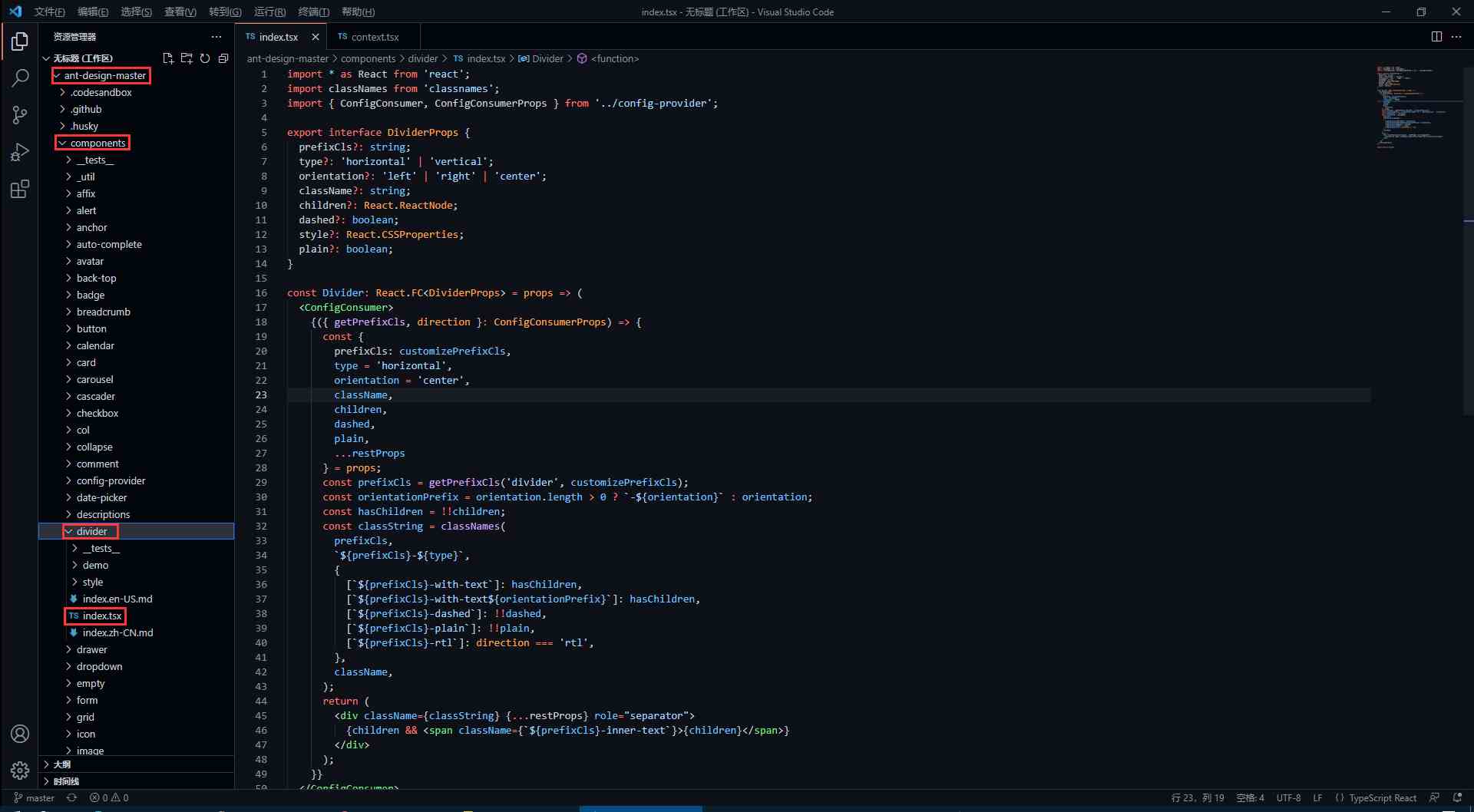
divider 组件源代码antd 的源码使用了 TypeScript 语法,因此不了解语法的同学要及时了解哦!
如何暴露组件属性在源码中,最先看到的是以下内容,这些属性也就是divider组件所暴露的属性,我们可以
在上面的属性中,我们还发现 className 和 style是比较常见的属性,这代表我们可以 如何设置统一类名前缀我们知道,antd 的组件类名会有他们独特的前缀
从源码中,我们发现 prefixCls ,这里是通过 getPrefixCls 方法生成,再看看 getPrefixCls 方法的源码,如下。
不难发现此时会生成的类名前缀为 如何处理样式与类名我们封装的组件肯定是有预设的样式,又因为样式要通过类名来定义,而我们传入的属性值则会决定组件上要添加哪个类名,这又是如何实现的呢?下面看源码。
我们发现,它通过 classNames 方法)定义了一个所有类名的常量,然后传给了 div 中的 className 属性。 其实生成的类名也就是 最后我们再看看它的css样式代码是怎么写的! divider 组件样式源代码antd 组件的样式使用 Less 书写,不了解 Less 语法的同学一定要了解一下。
这样一来,我相信同学们也大概了解如何去封装一个组件以及关键点了,在源码中还有很多地方值得我们学习,比如这里的 ConfigConsumer 的定义与使用,感兴趣的同学欢迎一起交流。 |


2021-06-04
2019-01-10
2019-02-17
2021-09-12
2021-09-30

