????小程序的宿主环境 - 组件
1.scroll-view 组件的基本使用
实现如图的纵向滚动效果
|
1
2
3
4
5
|
<scroll-view class="container_2" scroll-y>
<view>T</view>
<view>S</view>
<view>J</view>
</scroll-view>
|
|
1
2
3
4
5
6
7
8
9
10
11
12
13
14
15
16
17
18
19
20
21
22
23
24
25
|
.container_2 view{
width: 100px;
height: 100px;
text-align: center;
line-height: 100px;
}
.container_2 view:nth-child(1){
background-color: red;
}
.container_2 view:nth-child(2){
background-color: yellowgreen;
}
.container_2 view:nth-child(3){
background-color: blue;
}
.container_2{
display: flex;
justify-content: space-around
}
.container_2{
border: 1px solid yellowgreen;
height: 130px;
width: 100px;
}
|
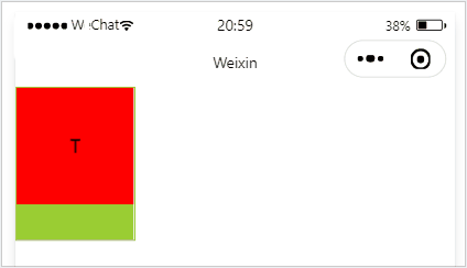
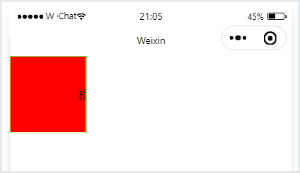
scroll-y 改成 scroll-x
实现如图的横向滚动效果:
|
1
2
3
|
<scroll-view class="container_2" scroll-x>
<view>横 向 滑 动 演 示</view>
</scroll-view>
|
|
1
2
3
4
5
6
7
8
9
10
11
12
13
14
15
16
17
18
19
|
.container_2 view{
width: 300px;
height: 100px;
text-align: center;
line-height: 100px;
}
.container_2 view:nth-child(1){
background-color: red;
}
.container_2{
display: flex;
justify-content: space-around
}
.container_2{
border: 1px solid yellowgreen;
height: 100px;
width: 100px;
}
|
2.swiper 和 swiper-item 组件的基本使用
实现如图的轮播图效果:

|
1
2
3
4
5
6
7
8
9
10
11
12
13
14
15
16
17
18
|
<swiper class="container_3" indicator-dots>
<swiper-item>
<view class="item">1</view>
</swiper-item>
<swiper-item>
<view class="item">2</view>
</swiper-item>
<swiper-item>
<view class="item">3</view>
</swiper-item>
<swiper-item>
<view class="item">4</view>
</swiper-item>
</swiper>
|
|
1
2
3
4
5
6
7
8
9
10
11
12
13
14
15
16
17
18
19
20
21
22
|
.container_3{
height: 160px;
}
.item{
height: 100%;
line-height: 150px;
text-align: center;
}
swiper-item:nth-child(1) .item{
background-color: burlywood;
}
swiper-item:nth-child(2) .item{
background-color: yellow;
}
swiper-item:nth-child(3) .item{
background-color: pink;
}
swiper-item:nth-child(4) .item{
background-color: aqua;
}
|
.swiper 组件的常用属性
|
属性
|
类型
|
默认值
|
说明
|
|
indicator-dots
|
boolean |
false |
是否显示面板指示点 |
| indicator-color |
color |
rgba(0, 0, 0, .3) |
指示点颜色 |
| indicator-active-color |
color |
#000000 |
当前选中的指示点颜色 |
| autoplay |
boolean |
false |
是否自动切换 |
| interval |
number |
5000 |
自动切换时间间隔 |
| circular |
boolean |
false |
是否采用衔接滑动 |
3.text 组件的基本使用
文本组件
类似于 HTML 中的 span 标签,是一个行内元素
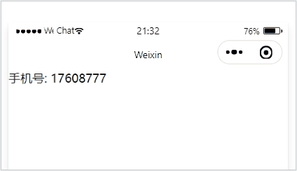
通过 text 组件的 selectable 属性,实现长按选中文本内容的效果:
|
1
2
3
4
|
<view>
手机号:
<text selectable>17608777</text>
</view>
|
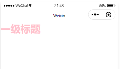
4.rich-text 组件的基本使用
富文本组件
支持把 HTML 字符串渲染为 WXML 结构
|
1
|
<rich-text nodes="<h1 style='color:pink;'>一级标题 <h1>"></rich-text>
|
|


