开始样式
|
1
2
3
4
5
6
7
8
9
10
11
12
13
14
15
16
17
18
19
20
21
22
23
24
25
26
27
|
<div class="planWrap">
<div class="content planItem">1</div>
<div class="content planItem">2</div>
<div class="content planItem">3</div>
<div class="content planItem">4</div>
<div class="content planItem">5</div>
<div class="content planItem">6</div>
</div>
<style>
.content {
background: red;
line-height:50px;
height: 50px;
width: 50px;
text-align: center;
margin-top:5px
}
.planWrap {
width: 160px;
height: 200px;
border: 1px solid;
display:flex;
}
</style>
|
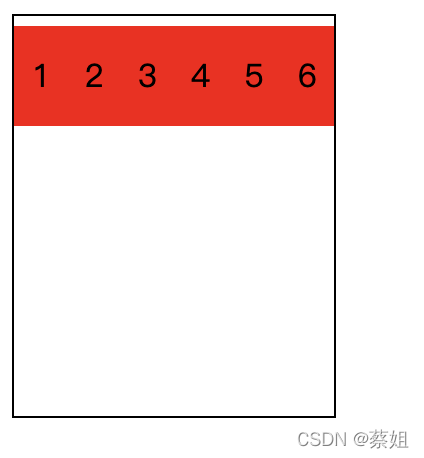
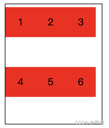
flex-wrap 实现换行
|
1
2
3
4
5
6
7
8
9
|
<style>
.planWrap {
width: 160px;
height: 200px;
border: 1px solid;
display:flex;
flex-wrap: wrap;
}
</style>
|
说明:
1.flex-wrap 属性指定 flex 元素单行显示还是多行显示,该属性接受以下取值:
- nowrap: 元素都放在一行,也是默认属性值;
- wrap:元素放到多行;
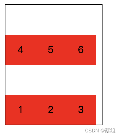
- wrap-reverse: 和 wrap 的行为一样,但是 cross-start 和 cross-end 互换。(如下图展示更直观)
2.上面有提及wrap-reverse,展示一下wrap-reverse的样式
|
1
2
3
4
5
6
7
8
9
|
<style>
.planWrap {
width: 160px;
height: 200px;
border: 1px solid;
display:flex;
flex-wrap: wrap-reverse;
}
</style>
|
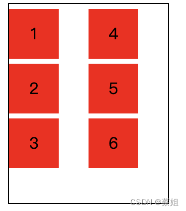
垂直换行 flex-flow
简写属性 flex-flow
上面的都是行分布,现在我想要垂直分布且换行
|
1
2
3
4
5
6
7
8
9
10
|
<style>
.planWrap {
width: 160px;
height: 200px;
border: 1px solid;
display:flex;
flex-wrap: wrap;
flex-direction: column;
}
</style>
|
通过flex-direction指定排列方向,flex-wrap制定是否换行;不过这样写多少有点麻烦,可以使用flex-flow来进行简写
|
1
2
|
// 第一个指定的值为 flex-direction ,第二个指定的值为 flex-wrap.
flex-flow: flex-direction flex-wrap
|
|
1
2
3
4
5
6
7
8
9
|
<style>
.planWrap {
width: 160px;
height: 200px;
border: 1px solid;
display:flex;
flex-flow:column wrap;
}
</style>
|
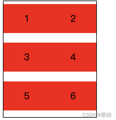
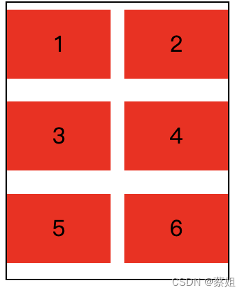
3个一行变为2个一行
Flex属性的简写
现在我不仅希望能换行,我还希望能2个一行
|
1
2
3
4
5
6
7
8
9
10
11
|
.planWrap {
width: 160px;
height: 200px;
border: 1px solid;
display:flex;
flex-flow:row wrap;
}
.planItem {
flex: 50%;
}
|
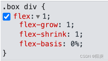
这里面使用了flex属性,flex可以指定元素占据的百分比或者固定宽度,具体可以见上面文档,就不详细说明了.
nth-child 指定一些元素特定属性
现在我希望两个div直接间距10px,但是后面一个元素没有间距
|
1
2
3
4
5
6
7
8
|
.planItem {
flex: 40%;
margin-right: 10px;
}
.planItem:nth-child(2n) {
margin-right: 0px;
}
|
首先指定了margin-right,所以我将flex百分比调小,然后使用了nth-child修改偶数位的元素.
|


