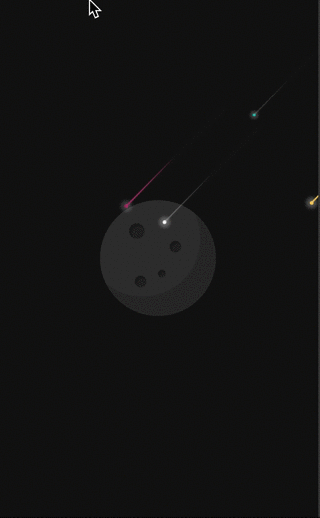
<style lang="scss">
    .space {
        width: 100%;
        height: 100vh;
        background: #121212;
    }

    .planet {
        width: 150px;
        height: 150px;
        border-radius: 50%;
        background: #333;
        position: absolute;
        left: 50%;
        top: 50%;
        margin: -75px 0 0 -75px;
        overflow: hidden;
        z-index: 2;
    }

    .planet_shadow {
        position: absolute;
        border-radius: 50%;
        height: 100%;
        width: 100%;
        top: -40%;
        right: -10%;
        border: 35px solid rgba(0, 0, 0, .15);
    }

    .crater1,
    .crater2,
    .crater3,
    .crater4 {
        position: absolute;
        border-radius: 50%;
        background: rgba(0, 0, 0, .3);
        box-shadow: inset 3px 3px 0 rgba(0, 0, 0, .2);
    }

    .crater1 {
        width: 20px;
        height: 20px;
        left: 25%;
        top: 20%;
    }

    .crater2 {
        width: 10px;
        height: 10px;
        left: 50%;
        top: 60%;
    }

    .crater3 {
        width: 15px;
        height: 15px;
        left: 30%;
        top: 65%;
    }

    .crater4 {
        width: 15px;
        height: 15px;
        left: 60%;
        top: 35%;
    }

    .star {
        display: block;
        width: 5px;
        height: 5px;
        border-radius: 50%;
        background: #FFF;
        top: 100px;
        left: 400px;
        position: relative;
        transform-origin: 100% 0;
        animation: star-ani 6s infinite ease-out;
        box-shadow: 0 0 5px 5px rgba(255, 255, 255, .3);
        opacity: 0;
        z-index: 2;
    }

    .star:after {
        content: '';
        display: block;
        top: 0px;
        left: 4px;
        border: 0px solid #fff;
        border-width: 0px 90px 2px 90px;
        border-color: transparent transparent transparent rgba(255, 255, 255, .3);
        transform: rotate(-45deg) translate3d(1px, 3px, 0);
        box-shadow: 0 0 1px 0 rgba(255, 255, 255, .1);
        transform-origin: 0% 100%;
        animation: shooting-ani 3s infinite ease-out;
    }

    .pink {
        top: 30px;
        left: 395px;
        background: #ff5a99;
        animation-delay: 5s;
        -webkit-animation-delay: 5s;
        -moz-animation-delay: 5s;
    }

    .pink:after {
        border-color: transparent transparent transparent #ff5a99;
        animation-delay: 5s;
        -webkit-animation-delay: 5s;
        -moz-animation-delay: 5s;
    }

    .blue {
        top: 35px;
        left: 432px;
        background: cyan;
        animation-delay: 7s;
        -webkit-animation-delay: 7s;
        -moz-animation-delay: 7s;
    }

    .blue:after {
        border-color: 'transpareanimation-delay: 12s';
        -webkit-animation-delay: 7s;
        -moz-animation-delay: 7s;
        animation-delay: 7s;
    }

    .yellow {
        top: 50px;
        left: 600px;
        background: #ffcd5c;
        animation-delay: 5.8s;
    }

    .yellow:after {
        border-color: transparent transparent transparent #ffcd5c;
        animation-delay: 5.8s;
    }

    @keyframes star-ani {
        0% {
            opacity: 0;
            transform: scale(0) rotate(0) translate3d(0, 0, 0);
            -webkit-transform: scale(0) rotate(0) translate3d(0, 0, 0);
            -moz-transform: scale(0) rotate(0) translate3d(0, 0, 0);
        }

        50% {
            opacity: 1;
            transform: scale(1) rotate(0) translate3d(-200px, 200px, 0);
            -webkit-transform: scale(1) rotate(0) translate3d(-200px, 200px, 0);
            -moz-transform: scale(1) rotate(0) translate3d(-200px, 200px, 0);
        }

        100% {
            opacity: 0;
            transform: scale(1) rotate(0) translate3d(-300px, 300px, 0);
            -webkit-transform: scale(1) rotate(0) translate3d(-300px, 300px, 0);
            -moz-transform: scale(1) rotate(0) translate3d(-300px, 300px, 0);
        }
    }
</style>
|


