近有读者加我微信咨询这个问题:

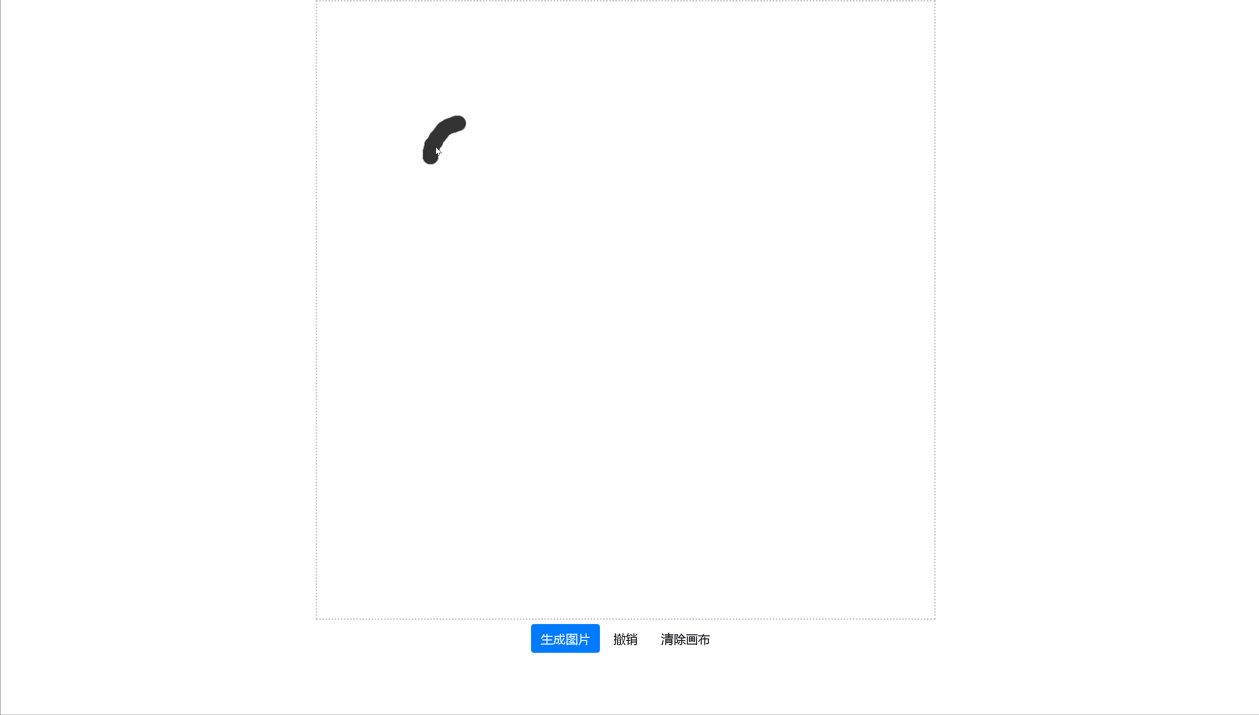
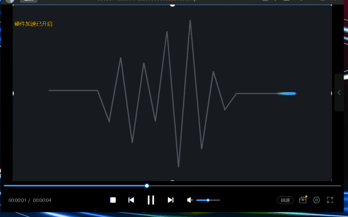
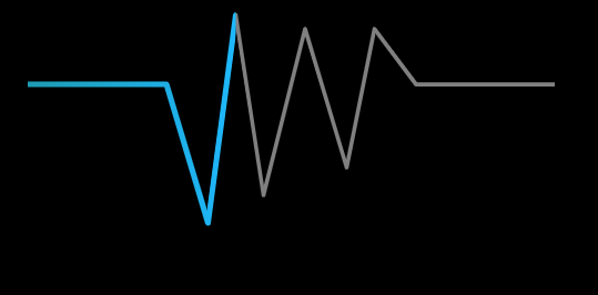
其中的效果是一个折线路径动画效果,如下图所示:
要实现以上路径动画,一般可以使用svg的动画功能。或者使用canvas绘制,结合路径数学计算来实现。
如果用canvas来绘制,其中的难点在于:
- 需要计算子路径,这块计算比较复杂。(当然是可以实现的)
- 渐变的计算, 从图中可以看出,动画的子路径是有渐变效果的,如果要分段计算渐变也很复杂。
本文介绍一种思路,使用clip方法,动态移动clip的区域,来达到近似的效果。具体怎么做。
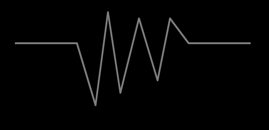
绘制灰色路径
绘制路径的代码比较简单,此处就不详细说明,下面代码就模拟了了一个折线路径的绘制:
|
1
2
3
4
5
6
7
8
9
10
11
12
13
14
|
ctx.beginPath();
ctx.moveTo(100,100);
ctx.lineTo(200,100);
ctx.lineTo(230,200);
ctx.lineTo(250,50);
ctx.lineTo(270,180);
ctx.lineTo(300,60);
ctx.lineTo(330,160);
ctx.lineTo(350,60);
ctx.lineTo(380,100);
ctx.lineTo(480,100);
ctx.strokeStyle = "gray";
ctx.lineJoin = "round";
ctx.stroke();
|
效果如下:
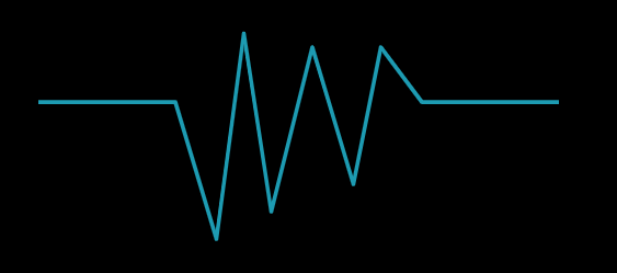
绘制亮色路径
绘制亮色路径的代码和绘制灰色路径的代码一样,只是样式是一个亮的颜色:
|
1
2
3
4
5
6
7
8
9
10
11
12
13
14
15
|
ctx.save();
ctx.beginPath();
ctx.moveTo(100,100);
ctx.lineTo(200,100);
ctx.lineTo(230,200);
ctx.lineTo(250,50);
ctx.lineTo(270,180);
ctx.lineTo(300,60);
ctx.lineTo(330,160);
ctx.lineTo(350,60);
ctx.lineTo(380,100);
ctx.lineTo(480,100);
ctx.strokeStyle = "gray";
ctx.lineJoin = "round";
ctx.stroke();
|
效果如下:
clip控制亮色路径的绘制区域
canvas的clip方法可以控制绘制的区域,通过该方法,可以控制智绘制路径的一部分:
|
1
2
3
4
5
|
ctx.beginPath();
ctx.rect(offset,0,100,500); // offset 等于0
ctx.clip();
...
ctx.stroke();
|
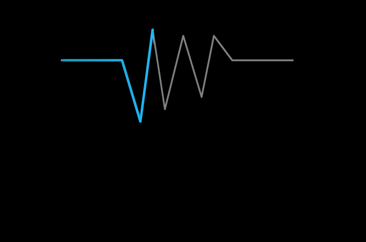
clip之后,亮色路径就只会绘制一部分,如下图:
动画效果
通过不断变化offset的值,就可以大道亮色路径移动的效果,代码如下:
|
1
2
3
4
5
|
offset += 2;
if(offset > 600){
offset = 100;
}
requestAnimationFrame(animate);
|
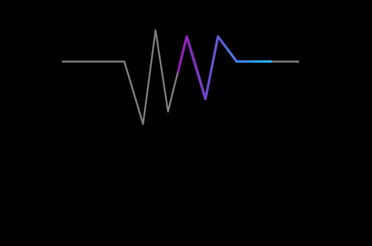
最终效果如下:
渐变
我们知道渐变没法沿着任意路径,如果计算折线,分段计算渐变又很麻烦。 其实在本案例中,虽然是折线,但是整体的运动方向总是从左往右的,所以可以用从左往右的渐变来近似模拟既可以:
|
1
2
3
4
5
6
7
8
|
function createGradient(ctx,x0,y0,x1,y1){
var grd = ctx.createLinearGradient(x0,y0,x1,y1);
grd.addColorStop(0,'#129ab3');
grd.addColorStop(1,"#19b5fe");
return grd;
}
ctx.strokeStyle = createGradient(ctx,offset,0,offset + 100,0);
|
最终效果如下所示:
全部代码
|
1
2
3
4
5
6
7
8
9
10
11
12
13
14
15
16
17
18
19
20
21
22
23
24
25
26
27
28
29
30
31
32
33
34
35
36
37
38
39
40
41
42
43
44
45
46
47
48
49
50
51
52
53
54
55
56
57
58
59
60
61
62
63
64
65
66
67
68
69
70
71
72
73
74
75
76
77
78
79
80
81
82
83
84
85
86
87
88
89
90
91
92
93
94
95
96
|
<!DOCTYPE html>
<html lang="en">
<head>
<meta charset="UTF-8">
<title>line animate</title>
<style>
canvas {
border: 1px solid #000;
}
</style>
</head>
<body>
<canvas id="canvas" width="600" height="400"></canvas>
<script>
var ctx = document.getElementById( 'canvas' ).getContext( '2d' );
var w = canvas.width,
h = canvas.height;
var x = w / 2,y = h / 2;
function setupCanvas(canvas) {
let width = canvas.width,
height = canvas.height,
dpr = window.devicePixelRatio || 1.0;
if (dpr != 1.0 ) {
canvas.style.width = width + "px";
canvas.style.height = height + "px";
canvas.height = height * dpr;
canvas.width = width * dpr;
ctx.scale(dpr, dpr);
}
}
setupCanvas(canvas);
var offset = 100;
function createGradient(ctx,x0,y0,x1,y1){
var grd = ctx.createLinearGradient(x0,y0,x1,y1);
grd.addColorStop(0,'#9a12b3');
grd.addColorStop(1,"#19b5fe");
return grd;
}
function animate(){
ctx.fillStyle = "black";
ctx.fillRect(0,0,canvas.width,canvas.height);
ctx.lineWidth = 3;
ctx.save();
ctx.beginPath();
ctx.moveTo(100,100);
ctx.lineTo(200,100);
ctx.lineTo(230,200);
ctx.lineTo(250,50);
ctx.lineTo(270,180);
ctx.lineTo(300,60);
ctx.lineTo(330,160);
ctx.lineTo(350,60);
ctx.lineTo(380,100);
ctx.lineTo(480,100);
ctx.strokeStyle = "gray";
ctx.lineJoin = "round";
ctx.stroke();
ctx.beginPath();
ctx.rect(offset,0,150,500);
ctx.clip();
ctx.beginPath();
ctx.moveTo(100,100);
ctx.lineTo(200,100);
ctx.lineTo(230,200);
ctx.lineTo(250,50);
ctx.lineTo(270,180);
ctx.lineTo(300,60);
ctx.lineTo(330,160);
ctx.lineTo(350,60);
ctx.lineTo(380,100);
ctx.lineTo(480,100);
ctx.lineWidth = 4;
ctx.strokeStyle = createGradient(ctx,offset,0,offset + 150,0);
ctx.lineCap = "round";
// ctx.globalCompositeOperation = 'lighter';
ctx.lineJoin = "round";
ctx.stroke();
ctx.restore();
offset += 2;
if(offset > 600){
offset = 100;
}
requestAnimationFrame(animate);
}
animate();
</script>
</body>
</html>
|
总结
其实整体思路是用了近似,而不是严格的控制路径长度和渐变效果,这样可以更方便实现以上功能。 其实人眼有时候是分辨不出来一些细节,可视化,有的时候只有能够达到让人“觉得”是那么回事,其实目的也就达到了。
以上方案只能适用于,折线路径的整体方向是一致的。如果整体方向是先水平向右,然后在垂直向下,或者甚至出现往回拐的情况,就不适合了。
原文链接:https://www.jb51.net/html5/774946.html
相关文章