效果演示
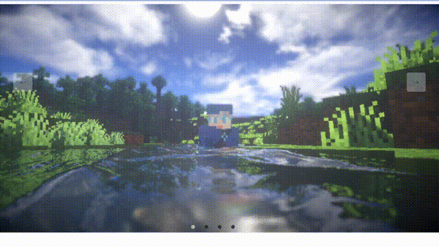
实现了一个简单的网页布局,其中包含了五个不同的盒子,每个盒子都有一个不同的背景图片,并且它们之间有一些间距。当鼠标悬停在某个盒子上时,它的背景图片会变暗,并且文字会变成白色。这些盒子和按钮都被放在一个容器中,整个页面看起来像一个画廊。
Code
|
1 2 3 4 5 6 7 8 9 10 11 12 13 14 15 16 17 |
<div class="container"> <div id="slide"> <div class="item" style="background-image:url('./img/章若楠01.jpg')"></div> <div class="item" style="background-image:url('./img/鞠婧祎01.jpg')"></div> <div class="item" style="background-image:url('./img/鞠婧祎02.jpg')"></div> <div class="item" style="background-image:url('./img/鞠婧祎06.jpg')"></div> <div class="item" style="background-image:url('./img/鞠婧祎04.jpg')"></div> <div class="item" style="background-image:url('./img/鞠婧祎07.jpg')"></div> </div> <div class="buttons"> <div class="left"> < Prev</div> <div class="center">下载壁纸</div> <div class="right">Next ></div> </div> </div> </div> |
|
1 2 3 4 5 6 7 8 9 10 11 12 13 14 15 16 17 18 19 20 21 22 23 24 25 26 27 28 29 30 31 32 33 34 35 36 37 38 39 40 41 42 43 44 45 46 47 48 49 50 51 52 53 54 55 56 57 58 59 60 61 62 63 64 65 66 67 68 69 70 71 |
* { margin: 0; padding: 0; box-sizing: border-box; } .container { width: 100vw; height: 100vh; position: relative; overflow: hidden; } .item { width: 240px; height: 160px; position: absolute; top: 50%; left: 0; transform: translateY(-50%); border-radius: 10px; box-shadow: 0 30px 50px #505050; background-size: cover; background-position: center; transition: 1s; } .item:nth-child(1), .item:nth-child(2) { left: 0; top: 0; width: 100%; height: 100%; transform: translateY(0); box-shadow: none; border-radius: 0; } .item:nth-child(3) { left: 70%; } .item:nth-child(4) { left: calc(70% + 250px); } .item:nth-child(5) { left: calc(70% + 500px); } .item:nth-child(n+6) { left: calc(70% + 750px); opacity: 0; } .buttons { width: 100%; position: absolute; bottom: 50px; margin-left: -50px; text-align: center; display: flex; justify-content: center; } .buttons div { width: 120px; height: 50px; line-height: 50px; text-align: center; border-radius: 5px; margin: 0 25px; transition: .5s; cursor: pointer; user-select: none; font-size: 20px; color: #fff; background-color: rgba(0, 0, 0, 0.4); box-shadow: 2px 2px 2px rgba(0, 0, 0, 0.2); } |
|
1 2 3 4 5 6 7 8 9 10 11 12 13 14 15 16 17 18 19 20 |
const leftBtn = document.querySelector(".buttons .left") const rightBtn = document.querySelector(".buttons .right") const slide = document.querySelector("#slide") let openClick = true // 节流处理 (保证动画执行过程,按钮不被重复点击) leftBtn.addEventListener("click", () => { if (openClick) { openClick = false // 触发点击后,禁用按钮 const items = document.querySelectorAll(".item") slide.prepend(items[items.length - 1]) setTimeout(() => openClick = true, 1000) // 1s 再开放按钮的点击 } }) rightBtn.addEventListener("click", () => { if (openClick) { openClick = false const items = document.querySelectorAll(".item") slide.appendChild(items[0]) setTimeout(() => openClick = true, 1000) } }) |
实现思路拆分
|
1 2 3 4 5 |
* { margin: 0; padding: 0; box-sizing: border-box; } |
这段代码是设置全局的CSS样式,包括设置元素的盒模型为border-box,即盒模型的宽度和高度包括了元素的边框和内边距,而不是只包括元素的内容。
|
1 2 3 4 5 6 |
.container { width: 100vw; height: 100vh; position: relative; overflow: hidden; } |
这段代码是设置容器的CSS样式,包括设置容器的宽度和高度为100vw和100vh,即视口的宽度和高度。同时,设置容器的定位为相对定位,即相对于其父元素进行定位。最后,设置容器的溢出属性为隐藏,即超出容器范围的元素不会被显示出来。
|
1 2 3 4 5 6 7 8 9 10 11 12 13 |
.item { width: 240px; height: 160px; position: absolute; top: 50%; left: 0; transform: translateY(-50%); border-radius: 10px; box-shadow: 0 30px 50px #505050; background-size: cover; background-position: center; transition: 1s; } |
这段代码是设置盒子的CSS样式,包括设置盒子的宽度和高度为240px和160px,即盒子的大小。同时,设置盒子的定位为绝对定位,即相对于其父元素进行定位。最后,设置盒子的边框半径为10px,即盒子的圆角。盒子的背景图片大小为cover,即覆盖整个盒子。背景图片的位置为居中对齐。最后,设置盒子的过渡效果为1秒,即过渡效果的时间为1秒。
|
1 2 3 4 5 6 7 8 9 10 |
.item:nth-child(1), .item:nth-child(2) { left: 0; top: 0; width: 100%; height: 100%; transform: translateY(0); box-shadow: none; border-radius: 0; } |
这段代码是设置第一个和第二个盒子的CSS样式,包括将它们的位置设置为0,即它们覆盖在容器的最上层。同时,将它们的高度设置为100%,即它们覆盖在容器的整个高度。最后,将它们的变换属性设置为 translateY(0),即它们不会向下移动。同时,将它们的阴影和边框半径设置为0,即它们没有阴影和边框。
|
1 2 3 |
.item:nth-child(3) { left: 70%; } |
这段代码是设置第三个盒子的CSS样式,包括将它的位置设置为距离容器左侧70%的位置。
|
1 2 3 |
.item:nth-child(4) { left: calc(70% + 250px); } |
这段代码是设置第四个盒子的CSS样式,包括将它的位置设置为距离第三个盒子右侧250px的位置。
|
1 2 3 |
.item:nth-child(5) { left: calc(70% + 500px); } |
这段代码是设置第五个盒子的CSS样式,包括将它的位置设置为距离第三个盒子右侧500px的位置。
|
1 2 3 4 |
.item:nth-child(n+6) { left: calc(70% + 750px); opacity: 0; } |
这段代码是设置所有盒子的CSS样式,包括将它们的位置设置为距离第三个盒子右侧750px的位置。同时,将它们的不透明度设置为0,即它们不可见。
|
1 2 3 4 5 6 7 8 9 |
.buttons { width: 100%; position: absolute; bottom: 50px; margin-left: -50px; text-align: center; display: flex; justify-content: center; } |
这段代码是设置按钮的CSS样式,包括设置按钮的宽度为100%,即按钮的大小与容器相同。同时,将按钮的位置设置为距离容器底部50px的位置。最后,将按钮的对齐方式设置为居中对齐,即按钮在水平方向上居中对齐。
|
1 2 3 4 5 6 7 8 9 10 11 12 13 14 15 |
.buttons div { width: 120px; height: 50px; line-height: 50px; text-align: center; border-radius: 5px; margin: 0 25px; transition:.5s; cursor: pointer; user-select: none; font-size: 20px; color: #fff; background-color: rgba(0, 0, 0, 0.4); box-shadow: 2px 2px 2px rgba(0, 0, 0, 0.2); } |
这段代码是设置按钮的CSS样式,包括设置按钮的宽度为120px,高度为50px,即按钮的大小。同时,设置按钮的行高为50px,即按钮的高度。按钮的文本对齐方式为居中对齐,即文本在水平方向上居中对齐。按钮的边框半径为5px,即按钮的圆角。按钮的外边距为0 25px,即按钮在水平方向上左右两侧的距离为25px。按钮的过渡效果为0.5秒,即过渡效果的时间为0.5秒。按钮的光标属性为pointer,即鼠标悬停在按钮上时,鼠标的形状会变成手型。按钮的用户选择属性为none,即用户不能选中按钮中的文本。按钮的字体大小为20px,即按钮的文本大小。按钮的文本颜色为白色,即按钮的文本颜色。按钮的背景颜色为rgba(0, 0, 0, 0.4),即按钮的背景颜色为黑色,透明度为0.4。按钮的阴影属性为2px 2px 2px rgba(0, 0, 0, 0.2),即按钮的阴影为2px 2px 2px黑色,透明度为0.2。