通过Plotly实现交互式数据可视化的步骤
在数据科学和数据分析领域,数据可视化是一种非常重要的技术。Plotly 是一个功能强大的 Python 可视化库,它可以帮助我们创建交互式的数据可视化图表。本文将介绍如何使用 Plotly 实现交互式数据可视化,包括数据准备、图表创建和交互功能的添加。
步骤
1. 安装 Plotly
首先,确保已经安装了 Plotly。如果没有安装,可以使用 pip 进行安装:
|
1 |
pip install plotly |
2. 准备数据
在进行数据可视化之前,需要准备好要可视化的数据。在本示例中,我们将使用一个简单的数据集。
|
1 2 3 4 5 6 7 8 9 |
import pandas as pd
# 创建示例数据 data = { 'Year': [2015, 2016, 2017, 2018, 2019], 'Sales': [100, 150, 200, 250, 300] }
df = pd.DataFrame(data) |
3. 创建交互式图表
使用 Plotly 来创建交互式图表非常简单。下面是一个简单的例子,创建一个折线图:
|
1 2 3 4 5 6 7 8 9 10 11 12 13 |
import plotly.graph_objs as go
# 创建折线图 trace = go.Scatter(x=df['Year'], y=df['Sales'], mode='lines', name='Sales')
# 创建布局 layout = go.Layout(title='Yearly Sales', xaxis=dict(title='Year'), yaxis=dict(title='Sales'))
# 创建图表对象 fig = go.Figure(data=[trace], layout=layout)
# 显示图表 fig.show() |
4. 添加交互功能
Plotly 提供了丰富的交互功能,可以让用户与图表进行互动。例如,我们可以添加鼠标悬停提示信息:
|
1 2 3 4 5 6 7 8 9 10 11 12 |
# 添加鼠标悬停提示信息 trace = go.Scatter(x=df['Year'], y=df['Sales'], mode='lines', name='Sales', hoverinfo='x+y', line=dict(color='blue'))
# 创建布局 layout = go.Layout(title='Yearly Sales', xaxis=dict(title='Year'), yaxis=dict(title='Sales'))
# 创建图表对象 fig = go.Figure(data=[trace], layout=layout)
# 显示图表 fig.show() |
5. 更多交互功能
除了鼠标悬停提示信息之外,Plotly 还支持许多其他交互功能,如缩放、平移、选择和标记等。你可以根据需要添加这些功能来提升用户体验。
|
1 2 3 4 5 6 7 8 9 10 11 12 13 14 15 16 17 18 19 20 21 22 23 |
import pandas as pd import plotly.graph_objs as go
# 创建示例数据 data = { 'Year': [2015, 2016, 2017, 2018, 2019], 'Sales': [100, 150, 200, 250, 300] }
df = pd.DataFrame(data)
# 创建折线图 trace = go.Scatter(x=df['Year'], y=df['Sales'], mode='lines', name='Sales', hoverinfo='x+y', line=dict(color='blue'))
# 创建布局 layout = go.Layout(title='Yearly Sales', xaxis=dict(title='Year'), yaxis=dict(title='Sales'))
# 创建图表对象 fig = go.Figure(data=[trace], layout=layout)
# 显示图表 fig.show() |
6. 导出图表
一旦你创建了交互式的图表,你可能想要将它导出到文件中以供分享或嵌入到网页中。Plotly 提供了多种导出图表的方法,包括静态图片和交互式 HTML 文件。
导出静态图片
|
1 2 |
# 导出为静态图片 fig.write_image("sales_plot.png") |
导出为 HTML 文件
|
1 2 |
# 导出为 HTML 文件 fig.write_html("sales_plot.html") |
这样,你就可以轻松地将交互式图表分享给其他人或者嵌入到网页中。
|
1 2 3 4 5 6 7 8 9 10 11 12 13 14 15 16 17 18 19 20 21 22 23 24 25 26 27 28 29 30 31 32 33 34 35 36 37 38 39 40 41 42 43 44 45 46 |
import pandas as pd import plotly.graph_objs as go
# 创建示例数据 data = { 'Year': [2015, 2016, 2017, 2018, 2019], 'Sales': [100, 150, 200, 250, 300] }
df = pd.DataFrame(data)
# 创建折线图 trace = go.Scatter(x=df['Year'], y=df['Sales'], mode='lines', name='Sales', hoverinfo='x+y', line=dict(color='blue'))
# 创建布局 layout = go.Layout(title='Yearly Sales', xaxis=dict(title='Year'), yaxis=dict(title='Sales'))
# 创建图表对象 fig = go.Figure(data=[trace], layout=layout)
# 添加交互功能 fig.update_layout( xaxis=dict( rangeselector=dict( buttons=list([ dict(count=1, label="1年", step="year", stepmode="backward"), dict(count=2, label="2年", step="year", stepmode="backward"), dict(count=3, label="3年", step="year", stepmode="backward"), dict(count=4, label="4年", step="year", stepmode="backward"), dict(step="all") ]) ), rangeslider=dict(visible=True), type="date" ) )
# 导出为静态图片 fig.write_image("sales_plot.png")
# 导出为 HTML 文件 fig.write_html("sales_plot.html")
# 显示图表 fig.show() |
通过以上步骤,你可以轻松地创建、定制并分享交互式的数据可视化图表,为数据分析工作增添更多的乐趣和效率!
7. 自定义图表样式
Plotly 允许你对图表样式进行高度定制,以满足特定需求或者提升可视化效果。
修改线条样式
|
1 2 3 |
# 修改线条样式 trace = go.Scatter(x=df['Year'], y=df['Sales'], mode='lines+markers', name='Sales', hoverinfo='x+y', line=dict(color='blue', width=2), marker=dict(size=8, color='red')) |
调整布局
|
1 2 |
# 调整布局 layout = go.Layout(title='Yearly Sales', xaxis=dict(title='Year', showgrid=False), yaxis=dict(title='Sales', showgrid=False)) |
添加标题和标签
|
1 2 |
# 添加标题和标签 fig.update_layout(title_text="Yearly Sales", xaxis_title="Year", yaxis_title="Sales") |
通过以上调整,你可以根据需要自定义图表的外观和布局。
|
1 2 3 4 5 6 7 8 9 10 11 12 13 14 15 16 17 18 19 20 21 22 23 24 25 26 27 28 29 30 31 32 33 34 35 36 37 38 39 40 41 42 43 44 45 46 47 48 49 |
import pandas as pd import plotly.graph_objs as go
# 创建示例数据 data = { 'Year': [2015, 2016, 2017, 2018, 2019], 'Sales': [100, 150, 200, 250, 300] }
df = pd.DataFrame(data)
# 创建折线图 trace = go.Scatter(x=df['Year'], y=df['Sales'], mode='lines+markers', name='Sales', hoverinfo='x+y', line=dict(color='blue', width=2), marker=dict(size=8, color='red'))
# 创建布局 layout = go.Layout(title='Yearly Sales', xaxis=dict(title='Year', showgrid=False), yaxis=dict(title='Sales', showgrid=False))
# 创建图表对象 fig = go.Figure(data=[trace], layout=layout)
# 添加交互功能 fig.update_layout( xaxis=dict( rangeselector=dict( buttons=list([ dict(count=1, label="1年", step="year", stepmode="backward"), dict(count=2, label="2年", step="year", stepmode="backward"), dict(count=3, label="3年", step="year", stepmode="backward"), dict(count=4, label="4年", step="year", stepmode="backward"), dict(step="all") ]) ), rangeslider=dict(visible=True), type="date" ) )
# 添加标题和标签 fig.update_layout(title_text="Yearly Sales", xaxis_title="Year", yaxis_title="Sales")
# 导出为静态图片 fig.write_image("sales_plot.png")
# 导出为 HTML 文件 fig.write_html("sales_plot.html")
# 显示图表 fig.show() |
通过以上步骤,你可以更加灵活地定制和分享交互式的数据可视化图表!
总结
在这篇文章中,我们学习了如何使用 Plotly 实现交互式数据可视化的步骤。以下是我们探讨的主要内容:
-
安装 Plotly:首先,我们确保安装了 Plotly 库,它是一个功能强大的 Python 可视化库。
-
准备数据:在进行数据可视化之前,我们需要准备好要可视化的数据。我们使用了一个简单的示例数据集作为演示。
-
创建交互式图表:我们使用 Plotly 创建了一个交互式折线图,并学习了如何调整布局和添加交互功能,例如鼠标悬停提示信息和范围选择器。
-
导出图表:我们还学习了如何将交互式图表导出为静态图片或 HTML 文件,以便分享或嵌入到网页中。
-
自定义图表样式:最后,我们探讨了如何自定义图表样式,包括修改线条样式、调整布局以及添加标题和标签,以满足特定需求或提升可视化效果。
通过以上步骤,你可以轻松地创建、定制并分享交互式的数据可视化图表,为数据分析工作增添更多的乐趣和效率!
拓展:Plotly实现数据可视化的五种动图形式
启动
如果你还没安装 Plotly,只需在你的终端运行以下命令即可完成安装:
|
1 |
pip install plotly |
安装完成后,就开始使用吧!
动画
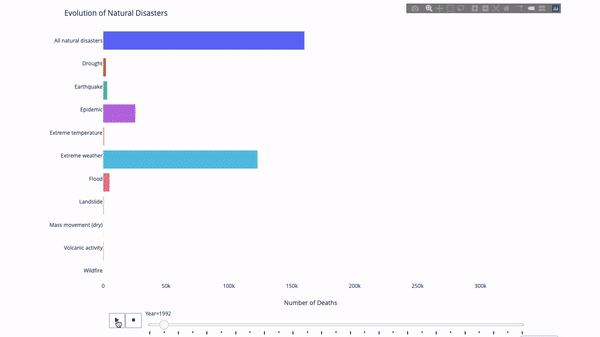
在研究这个或那个指标的演变时,我们常涉及到时间数据。Plotly 动画工具仅需一行代码就能让人观看数据随时间的变化情况,如下图所示:
代码如下:
|
1 2 3 4 5 6 7 8 9 10 11 12 13 14 15 16 17 18 19 20 21 22 23 |
import plotly.express as px from vega\_datasets import data df = data.disasters() df = df\[df.Year > 1990\] fig = px.bar(df, y="Entity", x="Deaths", animation\_frame="Year", orientation='h', range\_x=\[0, df.Deaths.max()\], color="Entity") # improve aesthetics (size, grids etc.) fig.update\_layout(width=1000, height=800, xaxis\_showgrid=False, yaxis\_showgrid=False, paper\_bgcolor='rgba(0,0,0,0)', plot\_bgcolor='rgba(0,0,0,0)', title\_text='Evolution of Natural Disasters', showlegend=False) fig.update\_xaxes(title\_text='Number of Deaths') fig.update\_yaxes(title\_text='') fig.show() |
只要你有一个时间变量来过滤,那么几乎任何图表都可以做成动画。下面是一个制作散点图动画的例子:
|
1 2 3 4 5 6 7 8 9 10 11 12 13 14 15 16 17 18 19 20 21 22 23 |
import plotly.express as px df = px.data.gapminder() fig = px.scatter( df, x="gdpPercap", y="lifeExp", animation\_frame="year", size="pop", color="continent", hover\_name="country", log\_x=True, size\_max=55, range\_x=\[100, 100000\], range\_y=\[25, 90\],
# color\_continuous\_scale=px.colors.sequential.Emrld ) fig.update\_layout(width=1000, height=800, xaxis\_showgrid=False, yaxis\_showgrid=False, paper\_bgcolor='rgba(0,0,0,0)', plot\_bgcolor='rgba(0,0,0,0)') |
太阳图
太阳图(sunburst chart)是一种可视化 group by 语句的好方法。如果你想通过一个或多个类别变量来分解一个给定的量,那就用太阳图吧。
假设我们想根据性别和每天的时间分解平均小费数据,那么相较于表格,这种双重 group by 语句可以通过可视化来更有效地展示。
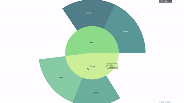
这个图表是交互式的,让你可以自己点击并探索各个类别。你只需要定义你的所有类别,并声明它们之间的层次结构(见以下代码中的 parents 参数)并分配对应的值即可,这在我们案例中即为 group by 语句的输出。
|
1 2 3 4 5 6 7 8 9 10 11 12 13 14 15 16 17 18 |
import plotly.graph\_objects as go import plotly.express as px import numpy as np import pandas as pd df = px.data.tips() fig = go.Figure(go.Sunburst( labels=\["Female", "Male", "Dinner", "Lunch", 'Dinner ', 'Lunch '\], parents=\["", "", "Female", "Female", 'Male', 'Male'\], values=np.append( df.groupby('sex').tip.mean().values, df.groupby(\['sex', 'time'\]).tip.mean().values), marker=dict(colors=px.colors.sequential.Emrld)), layout=go.Layout(paper\_bgcolor='rgba(0,0,0,0)', plot\_bgcolor='rgba(0,0,0,0)'))
fig.update\_layout(margin=dict(t=0, l=0, r=0, b=0), title\_text='Tipping Habbits Per Gender, Time and Day') fig.show() |
现在我们向这个层次结构再添加一层:
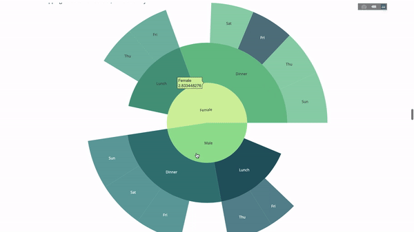
为此,我们再添加另一个涉及三个类别变量的 group by 语句的值。
|
1 2 3 4 5 6 7 8 9 10 11 12 13 14 15 16 17 18 19 20 21 22 23 24 25 26 27 28 29 30 |
import plotly.graph\_objects as go import plotly.express as px import pandas as pd import numpy as np df = px.data.tips() fig = go.Figure(go.Sunburst(labels=\[ "Female", "Male", "Dinner", "Lunch", 'Dinner ', 'Lunch ', 'Fri', 'Sat', 'Sun', 'Thu', 'Fri ', 'Thu ', 'Fri ', 'Sat ', 'Sun ', 'Fri ', 'Thu ' \], parents=\[ "", "", "Female", "Female", 'Male', 'Male', 'Dinner', 'Dinner', 'Dinner', 'Dinner', 'Lunch', 'Lunch', 'Dinner ', 'Dinner ', 'Dinner ', 'Lunch ', 'Lunch ' \], values=np.append( np.append( df.groupby('sex').tip.mean().values, df.groupby(\['sex', 'time'\]).tip.mean().values, ), df.groupby(\['sex', 'time', 'day'\]).tip.mean().values), marker=dict(colors=px.colors.sequential.Emrld)), layout=go.Layout(paper\_bgcolor='rgba(0,0,0,0)', plot\_bgcolor='rgba(0,0,0,0)')) fig.update\_layout(margin=dict(t=0, l=0, r=0, b=0), title\_text='Tipping Habbits Per Gender, Time and Day')
fig.show() |
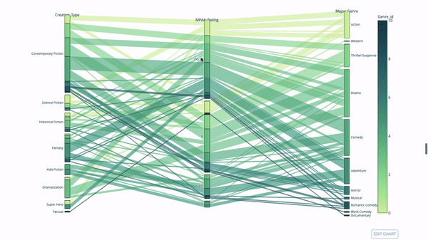
平行类别
另一种探索类别变量之间关系的方法是以下这种流程图。你可以随时拖放、高亮和浏览值,非常适合演示时使用。
代码如下:
|
1 2 3 4 5 6 7 8 9 10 11 12 13 |
import plotly.express as px from vega\_datasets import data import pandas as pd df = data.movies() df = df.dropna() df\['Genre\_id'\] = df.Major\_Genre.factorize()\[0\] fig = px.parallel\_categories( df, dimensions=\['MPAA\_Rating', 'Creative\_Type', 'Major\_Genre'\], color="Genre\_id", color\_continuous\_scale=px.colors.sequential.Emrld, ) fig.show() |
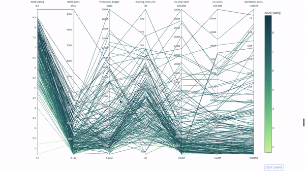
平行坐标图
平行坐标图是上面的图表的连续版本。这里,每一根弦都代表单个观察。这是一种可用于识别离群值(远离其它数据的单条线)、聚类、趋势和冗余变量(比如如果两个变量在每个观察上的值都相近,那么它们将位于同一水平线上,表示存在冗余)的好用工具。
代码如下:
|
1 2 3 4 5 6 7 8 9 10 11 12 13 14 15 |
import plotly.express as px from vega\_datasets import data import pandas as pd df = data.movies() df = df.dropna() df\['Genre\_id'\] = df.Major\_Genre.factorize()\[0\] fig = px.parallel\_coordinates( df, dimensions=\[ 'IMDB\_Rating', 'IMDB\_Votes', 'Production\_Budget', 'Running\_Time\_min', 'US\_Gross', 'Worldwide\_Gross', 'US\_DVD\_Sales' \], color='IMDB\_Rating', color\_continuous\_scale=px.colors.sequential.Emrld) fig.show() |
量表图和指示器
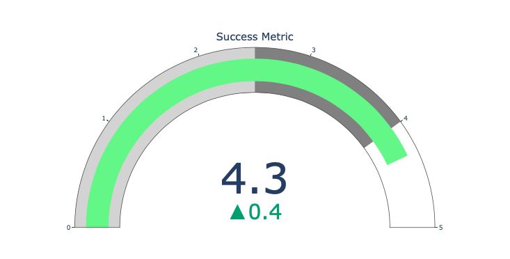
量表图仅仅是为了好看。在报告 KPI 等成功指标并展示其与你的目标的距离时,可以使用这种图表。
指示器在业务和咨询中非常有用。它们可以通过文字记号来补充视觉效果,吸引观众的注意力并展现你的增长指标。
|
1 2 3 4 5 6 7 8 9 10 11 12 13 14 |
import plotly.graph\_objects as go fig = go.Figure(go.Indicator( domain = {'x': \[0, 1\], 'y': \[0, 1\]}, value = 4.3, mode = "gauge+number+delta", title = {'text': "Success Metric"}, delta = {'reference': 3.9}, gauge = {'bar': {'color': "lightgreen"}, 'axis': {'range': \[None, 5\]}, 'steps' : \[ {'range': \[0, 2.5\], 'color': "lightgray"}, {'range': \[2.5, 4\], 'color': "gray"}\], })) fig.show() |