|
* {
margin: 0;
padding: 0;
}
.carousel_map {
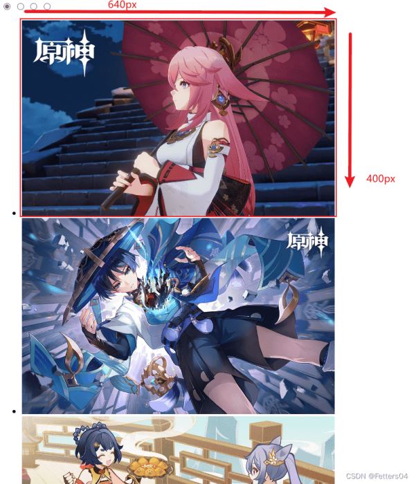
width: 640px;
height: 400px;
}
.slide {
width: inherit;
height: inherit;
overflow: hidden;
position: relative;
}
/* 鼠标放上去显示按钮 */
.slide:hover .labels {
display: flex;
}
.slide:hover .list {
animation: none;
}
.slide input {
display: none;
}
/* 按钮位置 */
.labels {
position: absolute;
bottom: 0.5em;
z-index: 1;
width: inherit;
justify-content: center;
display: none; /* 鼠标移开隐藏按钮 */
}
/* 按钮样式 */
.labels label {
width: 1rem;
height: 1rem;
border-radius: 50%;
margin: 0 0.3rem;
border: 0.1rem solid #fff;
background-color: transparent;
box-sizing: border-box;
cursor: pointer;
}
/* 选择哪个按钮就有被点击的效果 */
input[id=pic1]:checked ~ .labels label[for=pic1],
input[id=pic2]:checked ~ .labels label[for=pic2],
input[id=pic3]:checked ~ .labels label[for=pic3],
input[id=pic4]:checked ~ .labels label[for=pic4] {
background-color: #fff;
border: 0.1rem solid #fff;
}
/* 按钮控件选择图片 */
input[id=pic1]:checked ~ .list {
transform: translate(calc(0 * 640px));
}
input[id=pic2]:checked ~ .list {
transform: translate(calc(-1 * 640px));
}
input[id=pic3]:checked ~ .list {
transform: translate(calc(-2 * 640px));
}
input[id=pic4]:checked ~ .list {
transform: translate(calc(-3 * 640px));
}
ul {
list-style: none;
}
.list {
width: calc(5 * 640px);
height: inherit;
position: relative;
/* 设置动画效果 */
animation: move 15s ease 1s infinite;
}
/* 动画关键帧轮播 */
@keyframes move {
0% {
transform: translate(calc(0 * 640px));
}
25% {
transform: translate(calc(-1 * 640px));
}
50% {
transform: translate(calc(-2 * 640px));
}
75% {
transform: translate(calc(-3 * 640px));
}
100% {
transform: translate(calc(-4 * 640px));
}
}
.item {
width: 640px;
height: 400px;
float: left;
}
|


