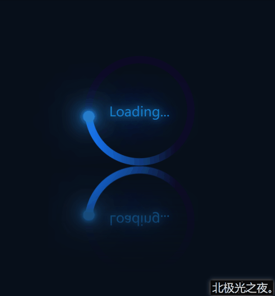
先看效果(完整代码在底部):
实现(可一步一步边看效果边编写):
※先初始化(直接复制):
*{
           margin: 0;
           padding: 0;
           box-sizing: border-box;
       }
body{
           height: 100vh;
           display: flex;
           justify-content: center;
           align-items: center;
           background-color: rgb(7, 15, 26);
       }
|
flex布局,让子元素居中对齐。
1.定义标签:
<div class="container">
        <span>Loading...</span>
        <div class="circle">
            <div class="ring"></div>
        </div>
    </div>
|
.container是最底层盒子。
span是文本。
.circle是底层圆形盒子。
.ring是那个蓝色环。
2. .container的css样式:
.container{
            position: relative;
            height: 150px;
            width: 250px;
            -webkit-box-reflect:below 1px linear-gradient(transparent  ,rgb(7, 15, 26));
        }
|
-webkit-box-reflect:该属性能实现倒影特效。详细。
3. .circle的css样式,动画部分可暂时注释掉:
.circle{
            position: relative;
            margin: 0 auto;
            height: 150px;
            width: 150px;
            background-color: rgb(13, 10, 37);
            border-radius: 50%;
            animation: zhuan 2s linear infinite;
        }
        @keyframes zhuan{
            0%{

                transform: rotate(0deg);
            }
            100%{

                 transform: rotate(360deg);
            }
        }
|
margin: 0 auto;居中。
border-radius: 50%; 角弧度。
animation: zhuan 2s linear infinite; 设置动画,让其旋转。
transform: rotate(…deg); 旋转角度。
4. 定义一个双伪类,为一个与背景色相同的小圆,覆盖在.circle上:
.circle::after{
            content: '';
            position: absolute;
            top: 10px;
            left: 10px;
            right: 10px;
            bottom: 10px;
            background-color: rgb(7, 15, 26);
            border-radius: 50%;
        }
|
5.定义蓝色环形效果,因为被第4步的小圆覆盖了,所以直接定义一个渐变的蓝色圆形即可得到蓝色环形:
.ring{
            position: absolute;
            top: 0;
            left: 0;
            width: 75px;
            height: 150px;
            background-image: linear-gradient(180deg,rgb(22, 121, 252) ,transparent 80%);
            border-radius: 75px 0 0 75px;

        }
|
background-image: linear-gradient(180deg,rgb(22, 121, 252) ,transparent 80%); 渐变颜色,先蓝色,过渡到透明色。
6.定义环形上发光的小圆球:
.ring::after{
            content: '';
            position: absolute;
            right: -5px;
            top: -2.5px;
            width: 15px;
            height: 15px;
            background-color: rgb(40, 124, 202);
            box-shadow: 0 0 5px rgb(40, 151, 202),
            0 0 10px rgb(40, 124, 202),
            0 0 20px rgb(40, 124, 202),
            0 0 30px rgb(40, 124, 202),
            0 0 40px rgb(40, 124, 202),
            0 0 50px rgb(40, 124, 202),
            0 0 60px rgb(40, 124, 202),
            0 0 60px rgb(40, 124, 202);
            border-radius: 50%;
            z-index: 1;

        }
|
box-shadow: 阴影。
z-index: 1; 显示在最上层。
7. 定义文本loading:
.container>span{
            position: absolute;
            left: 50%;
            top: 50%;
            transform: translate(-50%,-50%);
            color: rgb(20, 129, 202);
            text-shadow: 0 0 10px rgb(20, 129, 202),
            0 0 30px rgb(20, 129, 202),
            0 0 60px rgb(20, 129, 202),
            0 0 100px rgb(20, 129, 202);
            font-size: 18px;
            z-index: 1;

        }
|
left: 50%;
top: 50%;
transform: translate(-50%,-50%); 居中对齐。
text-shadow: 文字阴影。
完整代码:
<!DOCTYPE html>
<html lang="zh-CN">
<head>
    <meta charset="UTF-8">
    <meta http-equiv="X-UA-Compatible" content="IE=edge">
    <meta name="viewport" content="width=device-width, initial-scale=1.0">
    <title>Document</title>
    <style>
        *{
            margin: 0;
            padding: 0;
            box-sizing: border-box;
        }
        body{
            height: 100vh;
            display: flex;
            justify-content: center;
            align-items: center;
            background-color: rgb(7, 15, 26);
        }
        .container{
            position: relative;
            height: 150px;
            width: 250px;
            -webkit-box-reflect:below 1px linear-gradient(transparent  ,rgb(7, 15, 26));
        }
        .container>span{
            position: absolute;
            left: 50%;
            top: 50%;
            transform: translate(-50%,-50%);
            color: rgb(20, 129, 202);
            text-shadow: 0 0 10px rgb(20, 129, 202),
            0 0 30px rgb(20, 129, 202),
            0 0 60px rgb(20, 129, 202),
            0 0 100px rgb(20, 129, 202);
            font-size: 18px;
            z-index: 1;

        }
        .circle{
            position: relative;
            margin: 0 auto;
            height: 150px;
            width: 150px;
            background-color: rgb(13, 10, 37);
            border-radius: 50%;
            animation: zhuan 2s linear infinite;
        }
        @keyframes zhuan{
            0%{

                transform: rotate(0deg);
            }
            100%{

                 transform: rotate(360deg);
            }
        }
        .circle::after{
            content: '';
            position: absolute;
            top: 10px;
            left: 10px;
            right: 10px;
            bottom: 10px;
            background-color: rgb(7, 15, 26);
            border-radius: 50%;
        }

        .ring{
            position: absolute;
            top: 0;
            left: 0;
            width: 75px;
            height: 150px;
            background-image: linear-gradient(180deg,rgb(22, 121, 252) ,transparent 80%);
            border-radius: 75px 0 0 75px;

        }

        .ring::after{
            content: '';
            position: absolute;
            right: -5px;
            top: -2.5px;
            width: 15px;
            height: 15px;
            background-color: rgb(40, 124, 202);
            box-shadow: 0 0 5px rgb(40, 151, 202),
            0 0 10px rgb(40, 124, 202),
            0 0 20px rgb(40, 124, 202),
            0 0 30px rgb(40, 124, 202),
            0 0 40px rgb(40, 124, 202),
            0 0 50px rgb(40, 124, 202),
            0 0 60px rgb(40, 124, 202),
            0 0 60px rgb(40, 124, 202);
            border-radius: 50%;
            z-index: 1;

        }

    </style>
</head>
<body>
    <div class="container">
        <span>Loading...</span>
        <div class="circle">
            <div class="ring"></div>
        </div>
    </div>
</body>
</html>
|
|


