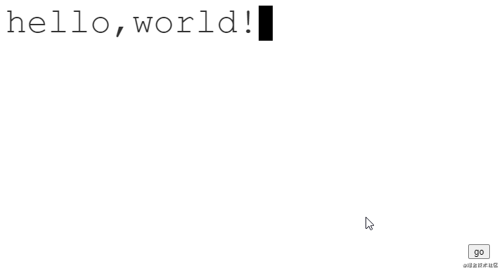
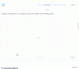
效果图
分析
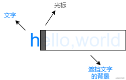
可以将动画看做三个不同的层次:
文字是静止的,而中间的背景和最上层的光标是动态的。
初始时,背景挡住所有的文字,光标在最左边。
动画进行时,背景和光标以相同的步伐从左往右移动。
动画结束时,背景不再遮挡文字,光标则在最右边闪烁。
代码
html
<div class="text">hello,world!</div>
|
css
:root {
    /* 字符数量 */
    --steps: 12;
    /* 动画时间 */
    --duration: 2.5s;
    /* 字体大小 */
    --fontSize: 50px;
    /* 光标大小 */
    --cursorSize: 20px;
}

.text {
    color: #333;;
    position: relative;
    display: inline-block;
    font-family: 'Courier New', Courier, monospace;
    font-size: var(--fontSize);
    line-height: 1;
}

.text::after {
    content: '';
    width: var(--cursorSize);
    height: var(--fontSize);
    background-color: black;
    z-index: 2;
    position: absolute;
    animation: blink 1s var(--duration) step-end infinite,
               moveCursor var(--duration) steps(var(--steps)) forwards;
}

.text::before {
    content: '';
    width: 100%;
    height: var(--fontSize);
    z-index: 1;
    position: absolute;
    background: linear-gradient(#fff, #fff) no-repeat top right;
    animation: showText var(--duration) steps(var(--steps)) forwards;
}

/* 光标闪烁动画 */
@keyframes blink {
    0% {
        background-color: black;
    }
    50% {
        background-color: transparent;
    }
    100% {
        background-color: black;
    }
}

/* 光标移动动画 */
@keyframes moveCursor {
    0% {
        left: 0%;
    }
    100% {
        left: 100%;
    }
}

/* 背景移动动画 */
@keyframes showText {
    0% {
        background-size: 100% 100%;
    }
    100% {
        background-size: 0% 100%;
    }
}
|
注意:字体必须是等宽字体。因为光标每次移动的距离是是根据字符的数量 / 总宽度来决定的。
|


