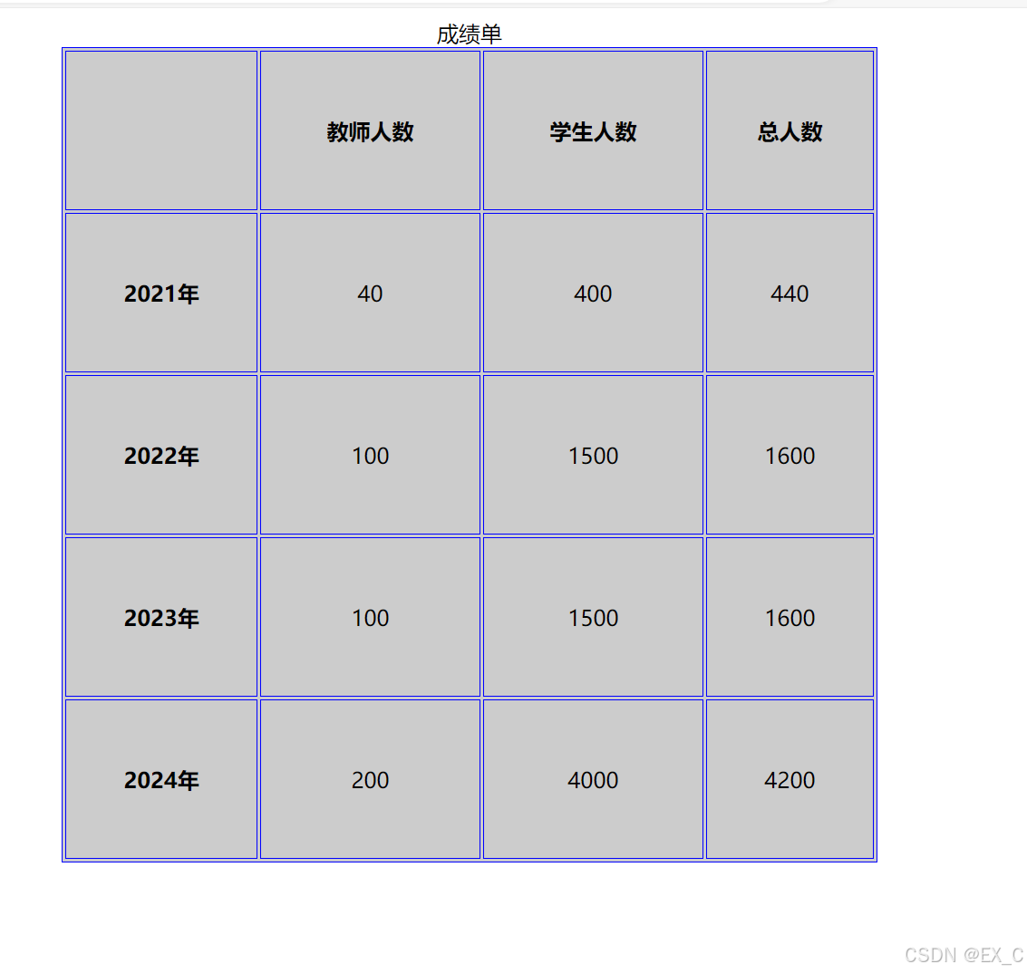
| 
                            
                                  一 使用媒体查询响应式布局        使用的参数@media这是常用的参数width,height代表的是浏览器可视宽度,高度
                          device-width:设备屏幕的宽度                          device-height:设备屏幕的高度  使用的是内部样式表 
	
		
			| 1 2 3 4 5 6 7 8 9 10 11 12 13 14 15 16 17 18 19 20 21 22 23 24 25 26 27 28 29 30 31 32 33 34 35 36 37 38 39 40 41 42 43 44 45 46 47 48 49 50 51 52 53 54 55 56 57 58 59 60 61 62 63 64 65 66 67 68 | <!DOCTYPE html> <html lang="en"> <head>     <meta charset="UTF-8">     <meta name="viewport" content="width=device-width, initial-scale=1.0">     <title>媒体查询</title>     <style>         .div{             /* width:1200px; */             width:100%;             /* height:600px; */         }         .div div{             float: left;             height:100px;         }     </style>     <style media="(min-width:330px) and (max-width:430px)">             .div div{                 width:33.3%             }             .div div:nth-child(1){             background-color: aqua;             }             .div div:nth-child(2){                 background-color: yellow;             }             .div div:nth-child(3){                 background-color: green;             }     </style>     <style media="(min-width:100px) and (max-width:329px)">         .div div{                 width:50%             }             .div div:nth-child(1){             background-color: aqua;             }             .div div:nth-child(2){                 background-color: yellow;             }             .div div:nth-child(3){                 background-color: green;             }     </style>     <style media="(max-width:99px)">        .div div{                 width:100%             }            .div div:nth-child(1){             background-color: aqua;             }            .div div:nth-child(2){                 background-color: yellow;             }            .div div:nth-child(3){                 background-color: green;             }     </style> </head> <body>     <div class="div">         <div></div>         <div></div>         <div></div>     </div> </body> </html> |  外部样式         进行创建三个的css的样式                第一个                       css-1.css 
	
		
			| 1 2 3 4 5 6 7 8 9 10 11 12 13 14 15 16 17 18 | .div{     /* width:1200px; */     width:100%;     /* height:600px; */ } .div div{     float: left;     height:100px; } .div div:nth-child(1){     background-color: aqua;     }     .div div:nth-child(2){         background-color: yellow;     }     .div div:nth-child(3){         background-color: green;     } |          第二个                 css-2.css 
	
		
			| 1 2 3 | .div div{     width:33.3% } |          第三个                 css-3.css 
	
		
			| 1 2 3 | .div div{     width:50% } |          将这三个分别引入到MediaQuery.html中 
	
		
			| 1 2 3 4 5 6 7 8 9 10 11 12 13 14 15 16 17 18 | <!DOCTYPE html> <html lang="en"> <head>     <meta charset="UTF-8">     <meta name="viewport" content="width=device-width, initial-scale=1.0">     <title>媒体查询</title>     <link rel="stylesheet" href="./css-1.css">     <link rel="stylesheet" href="./css-2.css" media="(min-width:330px) and (max-width:430px)">     <link rel="stylesheet" href="./css-3.css" media="(min-width:100px) and (max-width:329px)"> </head> <body>     <div class="div">         <div></div>         <div></div>         <div></div>     </div> </body> </html> |          这就是我们媒体查询的响应式自适应 二 使用flex进行响应式布局        我们为什么使用flex                 用来为盒状模型提供最大的灵活性。任何一个容器都可以指定为Flex布局更加符合响应        式设计的特点         flex-direction        作用:子元素在父元素盒子中的排列方式row:默认值,按从左到右的顺序显示
         row-reverse:与row相同,但是以相反的顺序         column:灵活的项目将垂直显示,按从上到下的顺序         column-reverse:与column相同,但是以相反的顺序         flex-wrap                 作用:子元素在父元素盒子中的是否换行(列)                 nowrap:默认值。不换行或不换列。                 wrap:换行或换列。                 wrap-reverse:换行或换列,但以相反的顺序。         justify-content                 作用:用来在存在剩余空间时,设置为间距的方式                 flex-start:默认值。从左到右,挨着行的开头。flex-end:从右到左,挨着行的结尾。
 center:居中显示。
 space-between:平均分布在该行上,两边不留间隔空间。
 space-around:平均分布在该行上,两边留有一半的间隔空间。
         align-items                 作用:设置每个flex元素在交叉轴上的默认对齐方式                 flex-start:位于容器的开头。flex-end:位于容器的结尾
 center:居中显示。
         align-content                 作用:设置每个flex元素在交叉轴上的默认对齐方式                 flex-start:位于容器的开头。flex-end:位于容器的结尾。
 center:位于容器的中心。
 space-between:之间留有空白。
 space-around:两端都留有空白。
         其他属性                 flex-basis:设置弹性盒伸缩基准值。flex-grow:设置弹性盒子的扩展比率。
 flex-shrink:设置弹性盒子的缩小比率。
 flex:flex-grow、flex-shrink、flex-basis的缩写
 三 CSS Grid        基础布局:网格容器与项目 
	
		
			| 1 2 3 4 5 6 7 8 9 10 11 12 13 14 15 16 17 18 19 20 21 22 23 24 25 26 27 28 29 30 31 32 33 34 | <!DOCTYPE html> <html> <head> <style> .grid-container {   display: grid;   grid-template-columns: repeat(3, 1fr); /* 3列 */   grid-template-rows: repeat(3, 1fr);     /* 3行 */   gap: 20px;                             /* 网格间距 */   padding: 20px;   background: #eee; } .grid-item {   background: #fff;   padding: 30px;   border-radius: 8px;   text-align: center; } </style> </head> <body> <div class="grid-container">   <div class="grid-item">1</div>   <div class="grid-item">2</div>   <div class="grid-item">3</div>   <div class="grid-item">4</div>   <div class="grid-item">5</div>   <div class="grid-item">6</div>   <div class="grid-item">7</div>   <div class="grid-item">8</div>   <div class="grid-item">9</div> </div> </body> </html> |  响应式网格:自动换行 
	
		
			| 1 2 3 4 5 6 7 8 9 10 11 12 13 14 15 16 17 18 19 20 21 22 23 24 25 26 27 28 29 30 31 32 33 | <!DOCTYPE html> <html> <head> <style> .container {   max-width: 1200px;   margin: 0 auto; } .items {   display: grid;   grid-template-columns: repeat(auto-fit, minmax(250px, 1fr)); /* 自动填充列 */   gap: 15px; } .item {   background: #f0f0f0;   padding: 20px;   border-radius: 6px; } </style> </head> <body> <div class="container">   <div class="items">     <div class="item">Item 1</div>     <div class="item">Item 2</div>     <div class="item">Item 3</div>     <div class="item">Item 4</div>     <div class="item">Item 5</div>     <div class="item">Item 6</div>   </div> </div> </body> </html> |  
 |