html代码
|
1 2 3 4 |
<div class="switch-box"> <input id="switchButton" type="checkbox" class="switch" /> <label for="switchButton"></label> </div> |
css代码
|
1 2 3 4 5 6 7 8 9 10 11 12 13 14 15 16 17 18 19 20 21 22 23 24 25 26 27 28 29 30 31 32 33 34 35 36 37 38 39 40 41 42 43 44 45 46 47 48 49 50 51 52 53 54 55 56 57 58 |
.switch-box { width: 48px; } .switch-box .switch { /* 隐藏checkbox默认样式 */ display: none; } .switch-box label { /* 通过label扩大点击热区 */ position: relative; display: block; margin: 1px; height: 28px; cursor: pointer; } .switch-box label::before { /* before设置前滚动小圆球 */ content: ''; position: absolute; top: 50%; left: 50%; margin-top: -13px; margin-left: -14px; width: 26px; height: 26px; border-radius: 100%; background-color: #fff; box-shadow: 1px 1px 1px 1px rgba(0, 0, 0, 0.06); /* 通过transform、transition属性控制元素过渡进而形成css3动画 */ -webkit-transform: translateX(-9px); -moz-transform: translateX(-9px); transform: translateX(-9px); -webkit-transition: all 0.3s ease; -moz-transition: all 0.3s ease; transition: all 0.3s ease; } .switch-box .switch:checked~label::before { /* 语义:被选中的类名为"switch"元素后面的label元素里的伪类元素,进行更改css样式 */ /* 形成伪类结构选择器:":"冒号加布尔值"checked" */ /* " Ele1 ~ Ele2 "波浪号在css的作用:连接的元素必须有相同的父元素,选择出现在Ele1后的Ele2(但不必跟在Ele1,也就是说可以并列) */ -webkit-transform: translateX(10px); -moz-transform: translateX(10px); transform: translateX(10px); } .switch-box label::after { /* after设置滚动前背景色 */ content: ""; display: block; border-radius: 30px; height: 28px; background-color: #dcdfe6; -webkit-transition: all 0.3s ease; -moz-transition: all 0.3s ease; transition: all 0.3s ease; } .switch-box .switch:checked~label::after { background-color: #13ce66; } |
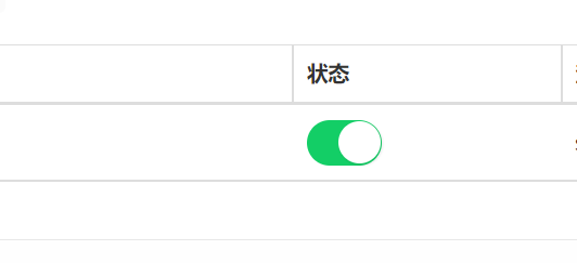
效果图
效果如图:
JS事件触发
|
1 |
<input id="switchButton" type="checkbox" class="switch" onclick="reverseStatus('1')" /> |
input添加onclick事件,点击触发reverseStatus()函数
|
1 2 3 4 5 |
<script> function reverseStatus(id){ $.get("/pocs/reverse/"+id); } </script> |
flask后端接口
|
1 2 3 4 |
@poc.route('/pocs/reverse/<int:id>', methods=['GET']) def reverse(id=None): print(id) return 'success' |
在后端编写我们需要的逻辑
参考链接
https://article.itxueyuan.com/rx83a2