广告位联系
返回顶部
分享到

JS前端模拟Excel条件格式实现数据条效果

JavaScript 来源:互联网 作者:佚名 发布时间:2023-02-28 22:27:39 人浏览
摘要

最近业务中遇到一个有意思的需求,是要在现有的表格中实现类似 Excel 中的数据条的效果,在数据比较多的时候单纯看表格里的数字会比较密集且不容易对比,加上数据条之后就比较明

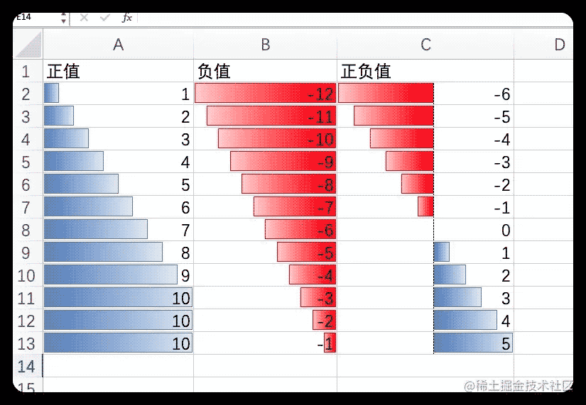
最近业务中遇到一个有意思的需求,是要在现有的表格中实现类似 Excel 中的数据条的效果,在数据比较多的时候单纯看表格里的数字会比较密集且不容易对比,加上数据条之后就比较明显的看出数据的对比情况,也让表格看起来生动了一些,这算是融合了表格和柱状图的优点。

先来看下 Excel 的效果

下面记录下实现过程和原理。

需求分析

通过图片可以看出共有几种情况:

  • 只有正值:数据条全部向右
  • 只有负值:数据条全部向左
  • 正负值都有:正负值会以一个轴线做分割分布在左右两侧,根据正负值的多少轴线的位置也会相应的偏左或偏右

实现逻辑

实现这个效果的前提,我们要知道每列数据的最大值max和最小值min,最大值的数据条宽度就是100%,下面先用伪代码梳理下逻辑。

全是正值和全是负值的情况,这种情况就比较简单了,就是计算单元格的值占最大值的比例,计算公式是这样:数据条宽度 = (当前值 / max) * 100

正负值都有的情况多了一个“轴线位置“的计算和”数据条偏移量“计算

1

轴线位置 = (Math.abs(min) / (max - min)) * 100

1

数据条宽度 = (Math.abs(当前值) / (max - min)) * 100

1

2

3

4

5

// 当前值 < 0 时数据条在轴线左边,改变 right 值

// 数据条的总长为100%

right = 100 - 轴线位置

// 当前值 > 0 时数据条在轴线右边,改变 left 值

left = 轴线位置

轴线位置逻辑其实是 "最小值到0的距离在总长度(max-min)之间的占比",我们知道数字与0之间的距离其实就是绝对值的计算,那么转换为公式来表示就是:

数据条的宽度就是 “当前值到0的距离在总长度(max-min)之间的占比”,公式表示:

  • 数据条的偏移量,这里需要知道是向左还是向右偏移(最终是通过改变元素CSS的 left、right 属性来实现偏移)

完整代码实现

代码使用 Vue + ElementUI

template 部分

1

2

3

4

5

6

7

8

9

10

11

12

13

14

15

16

17

18

19

20

<template>

  <el-table :data="tableData" border style="width: 100%">

    <el-table-column

      v-for="item in columns"

      sortable

      :key="item.prop"

      :prop="item.prop"

      :label="item.label"

    >

      <template slot-scope="scope">

        <!-- 数据条 -->

        <div class="data-bar" :style="renderDataBar(item, scope.row)"></div>

        <!-- 轴线 -->

        <div class="data-bar-axis" :style="renderAxis(item, scope.row)"></div>

        <!-- 当前值 -->

        <span class="cell-value">{{ scope.row[item.prop] }}</span>

      </template>

    </el-table-column>

  </el-table>

</template>

style 部分

先放 style 部分是为了让大家对基础样式有个感受,渲染函数中主要就是动态修改元素的 width、left、right 的值

1

2

3

4

5

6

7

8

9

10

11

12

13

14

15

16

17

18

<style>

    .el-table .cell-value {

      position: relative;

    }

    .data-bar {

      position: absolute;

      top: 0;

      bottom: 0;

      margin: 5px auto;

      transition: width 0.2s;

    }

    .data-bar-axis {

      position: absolute;

      top: -1px;

      bottom: 0;

      border-right: 1px dashed #303133;

    }

</style>

script 部分

1

2

3

4

5

6

7

8

9

10

11

12

13

14

15

16

17

18

19

20

21

22

23

24

25

26

27

28

29

30

31

32

33

34

35

36

37

38

39

40

41

42

43

44

45

46

47

48

49

50

51

52

53

54

55

56

57

58

59

60

61

62

63

64

65

66

67

68

69

70

71

72

73

74

75

76

77

78

79

80

81

82

83

84

85

86

<script>

export default {

  data() {

    return {

      columns: [

        {

          prop: 'positive',

          label: '正值',

          min: 1,

          max: 10

        },

        {

          prop: 'negative',

          label: '负值',

          min: -1,

          max: -12

        },

        {

          prop: 'mixed',

          label: '正负值',

          min: -6,

          max: 5

        }

      ],

      tableData: []

    }

  },

  created() {

    this.initData()

  },

  methods: {

    initData() {

      // mock数据过程,忽略 ...

      this.tableData.push({...})

    },

    renderDataBar(column, row) {

      const { min, max, prop } = column

      // 当前单元格值

      const cellVal = row[prop]

      if (cellVal === 0) return { display: 'none' };

      let style = {

        width: '0',

        background: '#409eff'

      }

      // 全是正值 或 全是负值

      if (min >= 0 || max <= 0) {

        const width = ((cellVal / max) * 100).toFixed(2);

        style.width = `${width}%`

        style = min >= 0 ? { ...style, left: '0' } : { ...style, right: '0' }

      }

      // 正负值都有

      if (min < 0 && max > 0) {

        const range = max - min;

        // 轴线位置

        const leftOffset = Math.abs((min / range) * 100)

        // 数据条宽度

        const width = ((Math.abs(cellVal / range) * 100)).toFixed(2)

        style = cellVal > 0 ? {

          width: `${width}%`,

          left: `${leftOffset.toFixed(2)}%`

        } : {

          width: `${width}%`,

          background: '#F56C6C', // 负值进行颜色区分

          right: `${(100 - leftOffset).toFixed(2)}%`

        }

      }

      return style;

    },

    renderAxis(column) {

      const { min, max } = column

      if (min < 0 && max > 0) {

        // 正负值都有的情况下,显示轴线

        const range = max - min;

        const leftOffset = (((0 - min) / range) * 100).toFixed(2)

        return {

          left: `${leftOffset}%`

        }

      } else {

        return {

          display: 'none'

        }

      }

    }

  }

}

</script>

最终实现效果


版权声明 : 本文内容来源于互联网或用户自行发布贡献,该文观点仅代表原作者本人。本站仅提供信息存储空间服务和不拥有所有权,不承担相关法律责任。如发现本站有涉嫌抄袭侵权, 违法违规的内容, 请发送邮件至2530232025#qq.cn(#换@)举报,一经查实,本站将立刻删除。
原文链接 : https://juejin.cn/post/7204825838537261111
相关文章
  • 本站所有内容来源于互联网或用户自行发布,本站仅提供信息存储空间服务,不拥有版权,不承担法律责任。如有侵犯您的权益,请您联系站长处理!
  • Copyright © 2017-2022 F11.CN All Rights Reserved. F11站长开发者网 版权所有 | 苏ICP备2022031554号-1 | 51LA统计