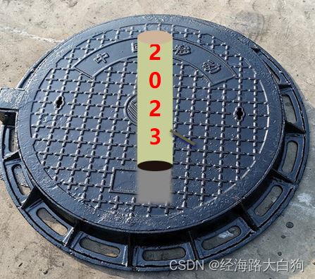
实现效果
实现思路
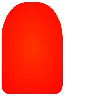
实现的核心是一个灯罩和一个灯芯。灯罩主要是使用了border-radius圆角边框,灯芯主要是radial-gradient径向渐变。再使用动画效果来实现一闪一闪的效果。让我们来一步一步实现效果。
灯罩实现
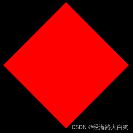
因为大部分报警灯是红色,而且是子弹头形状的圆角柱状。
使用简单的二维实现的话,我们先需要使用一个红色矩形。
|
1
2
3
|
width: 200px;
height: 300px;
background-color: red;
|
由于一般子弹头的圆角柱状,上面的圆角比下面的大,所以上面使用的圆角数据,也需要比下面大。
|
1
2
3
4
|
width: 200px;
height: 300px;
background-color: red;
border-radius:40% 40% 10% 10%;
|
这样,一个简易的灯罩就完成了。
灯芯实现
经过观察,灯芯主要为黄色,但是伴有闪烁。我们先需要实现灯芯效果。
用于灯罩是红色,黄色光需要过度,所以使用从黄色到红色的渐变。
|
1
2
3
|
width: 300px;
height: 300px;
background-image: radial-gradient(yellow,red);
|
将这个模块放到灯罩模块内部,随便处理一下居中和超出的边缘。
|
1
2
3
4
5
6
7
8
9
10
11
12
13
14
15
|
#alarmLamp{
width: 200px;
height: 300px;
background-color: red;
border-radius:40% 40% 10% 10%;
display: flex;
justify-content: center;
align-items: center;
overflow: hidden;
}
#lamp{
width: 300px;
height: 300px;
background-image: radial-gradient(yellow,red);
}
|
这样就实现了一个灯在灯罩内部常亮的一个效果。
灯芯闪烁效果实现
灯芯的闪烁,主要是使用到了CSS的@keyframes动画和opacity透明度。用@keyframes分为3段时间:开灯、开灯缓冲、关灯。
|
1
2
3
4
5
|
@keyframes imageAnim{
0% {opacity: 0.9;}
50% {opacity: 0.5;}
100% {opacity: 0;}
}
|
分别使用的是:0.9、0.5和0。如果使用1的话,会显得太过于生硬。
灯芯一般0.5s闪烁一次,而且是一直闪烁。需要再灯芯的地方设置:
|
1
2
3
4
5
6
7
8
9
10
11
|
#lamp{
width: 300px;
height: 300px;
animation-name: imageAnim;
animation-duration: 0.5s;
animation-iteration-count: infinite;
animation-direction: alternate;
animation-timing-function: ease;
animation-play-state: running;
background-image: radial-gradient(yellow,red);
}
|
通过这些,就能基本实现一个简易的报警灯效果。
完整代码
|
1
2
3
4
5
6
7
8
9
10
11
12
13
14
15
16
17
18
19
20
21
22
23
24
25
26
27
28
29
30
31
32
33
34
35
36
37
38
39
40
41
42
|
<!DOCTYPE html>
<html lang="en">
<head>
<meta charset="UTF-8">
<meta http-equiv="X-UA-Compatible" content="IE=edge">
<meta name="viewport" content="width=device-width, initial-scale=1.0">
<title>Document</title>
<style>
#alarmLamp{
width: 200px;
height: 300px;
background-color: red;
border-radius:40% 40% 10% 10%;
display: flex;
justify-content: center;
align-items: center;
overflow: hidden;
}
#lamp{
width: 300px;
height: 300px;
animation-name: imageAnim;
animation-duration: 0.5s;
animation-iteration-count: infinite;
animation-direction: alternate;
animation-timing-function: ease;
animation-play-state: running;
background-image: radial-gradient(yellow,red);
}
@keyframes imageAnim{
0% {opacity: 0.9;}
50% {opacity: 0.5;}
100% {opacity: 0;}
}
</style>
</head>
<body>
<div id="alarmLamp">
<div id="lamp"></div>
</div>
</body>
</html>
|
|


