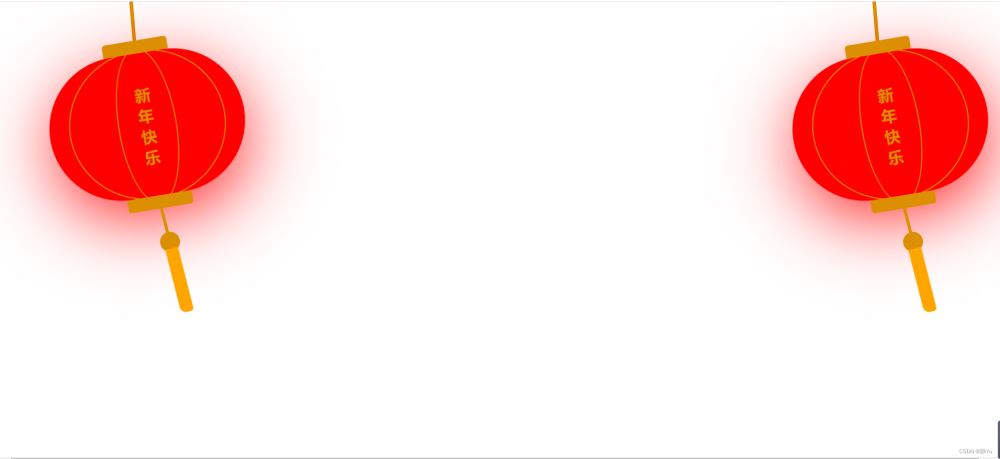
新年马上就要到了,教大家用html+css设计两个大灯笼,喜气洋洋。
html代码:
html代码部分非常简单,将一个灯笼分成几部分进行设计,灯笼最上方部分,中间的线条部分和最下方的灯笼穗。组合在一起就是一个完整的灯笼,我们实现了两个就是将下方的代码再复制一份就可以了。
|
1
2
3
4
5
6
7
8
9
10
11
12
13
14
15
|
<div class="lantern-box">
<div class="lantern-line"></div>
<div class="lantern-body">
<!-- 灯笼中间的线条 -->
<div class="lantern-circle">
<div class="lantern-rect">
<!-- 灯笼中间的文字内容 -->
<div class="lantern-text">新年快乐</div>
</div>
</div>
<!-- 灯笼穗 -->
<div class="lantern-tassel"></div>
</div>
</div>
|
css部分:
灯笼整体样式动画,以顶部中心为旋转点,
animation: swing 3s infinite ease-in-out,使用了一个名为swing的动画序列,动画序列通过@keyframes创建,执行时间3s,动画循环执行,最后ease-in-out表示动画执行的节奏。
|
1
2
3
4
5
6
7
8
|
.lantern-box {
display: flex;
flex-direction: column;
align-items: center;
/* 设置旋转点 */
transform-origin: top center;
animation: swing 3s infinite ease-in-out;
}
|
灯笼上方悬挂灯笼的那一条竖线。
|
1
2
3
4
5
|
.lantern-line {
width: 5px;
height: 80px;
background-color: #dc8f03;
}
|
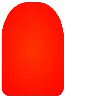
为一个矩形添加border-radius使其形成一个灯笼的外形。
box-shadow: 0 30px 115px -10px #f00;向灯笼添加阴影,模拟红色点亮的灯。
|
1
2
3
4
5
6
7
8
9
10
11
|
.lantern-body {
position: relative;
width: 300px;
height: 220px;
background-color: #f00;
border-radius: 120px;
box-shadow: 0 30px 115px -10px #f00;
/* 设置旋转点 */
transform-origin: top center;
animation: swing 3s infinite ease-in-out;
}
|
灯笼上方和下方黄色的两小部分。
border-radius 允许你设置元素的外边框圆角。每个半径的四个值的顺序是:左上角,右上角,右下角,左下角。
|
1
2
3
4
5
6
7
8
9
10
11
12
13
14
15
16
17
18
19
20
21
22
|
.lantern-body::before {
content: '';
position: absolute;
top: -20px;
left: 50%;
transform: translate(-50%, 0);
width: 100px;
height: 20px;
background-color: #dc8f03;
border-radius: 5px 5px 0 0;
}
.lantern-body::after {
content: '';
position: absolute;
bottom: -20px;
left: 50%;
transform: translate(-50%, 0);
width: 100px;
height: 20px;
background-color: #dc8f03;
border-radius: 0 0 5px 5px;
}
|
设置灯笼的动画效果
|
1
2
3
4
5
6
7
8
9
10
11
12
13
14
|
/* 灯笼的动画效果 */
@keyframes swing {
0% {
transform: rotate(-6deg);
}
50% {
transform: rotate(6deg);
}
100% {
transform: rotate(-6deg);
}
}
|
灯笼的线条,实际上就是一个圆形。
|
1
2
3
4
5
6
7
8
9
10
|
.lantern-circle {
position: absolute;
top: -5px;
left: 50%;
transform: translate(-50%, 0);
width: 240px;
height: 230px;
border: 2px solid #dc8f03;
border-radius: 50%;
}
|
灯笼中间的线条,是一个椭圆形。
|
1
2
3
4
5
6
7
8
9
10
|
.lantern-rect {
position: absolute;
top: -5px;
left: 50%;
transform: translate(-50%, 0);
width: 90px;
height: 240px;
border: 2px solid #dc8f03;
border-radius: 50%;
}
|
灯笼中间文字部分的样式设置
|
1
2
3
4
5
6
7
8
9
10
|
.lantern-text {
position: absolute;
top: 50%;
left: 50%;
transform: translate(-50%, -50%);
width: 24px;
font-size: 24px;
color: #dc8f03;
font-weight: 700;
}
|
灯笼穗部分样式设置,也是三部分组成。
|
1
2
3
4
5
6
7
8
9
10
11
12
13
14
15
16
17
18
19
20
21
22
23
24
25
26
27
28
29
30
31
32
33
|
.lantern-tassel {
position: absolute;
bottom: -40%;
left: 50%;
transform: translate(-50%, 0);
width: 5px;
height: 75px;
background-color: #dc8f03;
/* 设置旋转点 */
animation: swing 3s infinite ease-in-out;
}
.lantern-tassel::before {
content: '';
position: absolute;
bottom: 0;
left: 50%;
transform: translate(-50%, 0);
width: 30px;
height: 30px;
background-color: #dc8f03;
border-radius: 50%;
}
.lantern-tassel::after {
content: '';
position: absolute;
bottom: -100%;
left: 50%;
transform: translate(-50%, 20%);
width: 20px;
height: 100px;
background-color: #ffa500;
border-radius: 0 0 5px 10px;
}
|
|


