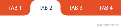
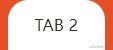
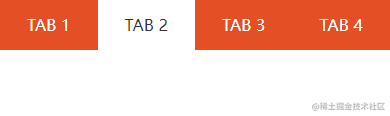
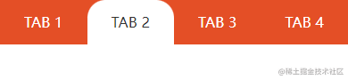
效果图
分析
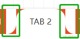
一个带圆角的矩形 + 左右对称的不规则图形(一个小矩形分别去掉一个圆角),利用伪元素 ::before ::after 和 box-shadow 阴影实现。


代码结构
|
1
2
3
4
5
6
|
<div class="tab-box">
<div class="tab-item">TAB 1</div>
<div class="tab-item active">TAB 2</div>
<div class="tab-item">TAB 3</div>
<div class="tab-item">TAB 4</div>
</div>
|
|
1
2
3
4
5
6
7
8
9
10
11
12
13
14
15
16
17
18
19
20
21
22
23
|
* {
margin: 0;
padding: 0;
}
.tab-box {
display: flex;
align-items: center;
background: #e44f26;
}
.tab-box .tab-item {
position: relative;
flex: 1;
height: 50px;
line-height: 50px;
text-align: center;
color: #fff;
background: #e44f26;
}
.tab-box .active {
background: #fff;
color: #333;
z-index: 1;
}
|
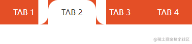
1. 顶部圆角实现
|
1
2
3
|
.tab-box .active {
border-radius: 20px 20px 0 0;
}
|
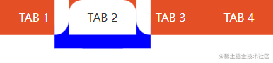
2. 底部外圆角实现(借助 CSS3 伪元素)
|
1
2
3
4
5
6
7
8
9
10
11
12
13
14
15
16
17
18
19
20
|
.tab-box .active::before {
content: "";
position: absolute;
left: -21px;
bottom: 0;
width: 21px;
height: 50px;
background: #e44f26;
border-radius: 0 0 20px 0;
}
.tab-box .active::after {
content: "";
position: absolute;
right: -21px;
bottom: 0;
width: 21px;
height: 50px;
background: #e44f26;
border-radius: 0 0 0 20px;
}
|
3. 使用 box-shadow 覆盖外圆角没有覆盖的区域
|
1
2
3
|
.tab-box .active {
box-shadow: 20px 20px 0 0 blue, -20px 20px 0 0 blue;
}
|
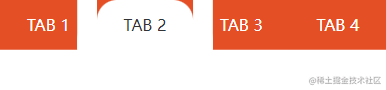
将蓝色改回白色,左右外圆角底色改成橙色
|
1
2
3
4
5
6
|
.tab-box .active::before {
background: #e44f26;
}
.tab-box .active::after {
background: #e44f26;
}
|

|


