clearfix 是一种 CSS 技巧,可以在不添加新的 html 标签的前提下,解决让父元素包含浮动的子元素的问题。这个技巧的版本是很多的,最流行的一个是 Micro Clearfix Hack 。这个也是 Bootstrap 采用的方案(可以 google 一下 “bootstrap clearfix” 来查看详情)。
Micro Clearfix Hack 的作者给出的原始方案,内容如下:
|
1
2
3
4
5
6
7
8
9
10
11
12
13
14
15
16
17
18
19
20
21
22
23
24
25
26
|
/**
* For modern browsers
* 1. The space content is one way to avoid an Opera bug when the
* contenteditable attribute is included anywhere else in the document.
* Otherwise it causes space to appear at the top and bottom of elements
* that are clearfixed.
* 2. The use of `table` rather than `block` is only necessary if using
* `:before` to contain the top-margins of child elements.
*/
.cf:before,
.cf:after {
content: " "; /* 1 */
display: table; /* 2 */
}
.cf:after {
clear: both;
}
/**
* For IE 6/7 only
* Include this rule to trigger hasLayout and contain floats.
*/
.cf {
*zoom: 1;
}
|
但是我的习惯是支持到 IE9+ ,同时习惯了用 “ clearfix ” 作为 class 名,所有稍微修改后的版本如下:
|
1
2
3
4
5
6
7
8
9
|
.clearfix:before,
.clearfix:after {
content: " ";
display: table;
}
.clearfix:after {
clear: both;
}
|
百度用的代码
|
1
2
3
|
.clearfix:after{content:'\20';display:block;height:0;clear:both}
.clearfix{zoom:1}
.clear{clear:both;height:0;line-height:0;font-size:0;visibility:hidden;overflow:hidden}
|
脚本之家用的
|
1
2
3
4
5
6
|
.clear{clear: both;overflow: hidden;line-height: 0;height: 0;zoom:1}
.clear:after {display: block; height: 0px; visibility: hidden; clear: both; content: ""}
.clearfix{ *zoom:1;}
.clearfix:before,
.clearfix:after {content: ".";display: block;height: 0;overflow: hidden;visibility: hidden;}
.clearfix:after{clear: both}
|
用了这个方法很长时间之后,都觉得上面的代码就是天书,尤其是对 display: table 这一行不理解。其实,这些代码为的是解决两个实际中经常遇到,而且非常让人恼火的问题。问题搞清楚了,代码也就明白了。
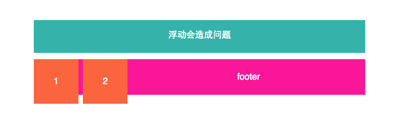
自清除子元素浮动
比如有这样的 html 代码:
|
1
2
3
4
|
<div class="container">
<div class="item">1</div>
<div class="item">2</div>
</div>
|
如果子元素没有浮动,那么显示是这样的:
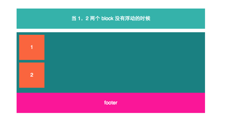
但是一旦所有子元素都浮动了,那么父元素的高度变为0,就成了这样的恶心效果:
解决方法如下:
html 中添加 clearfix
|
1
2
3
4
|
<div class="container clearfix">
<div class="item">1</div>
<div class="item">2</div>
</div>
|
如果只是解决这个问题,那么下面的代码就够了。
|
1
2
3
4
5
|
.clearfix:after {
content: " ";
display: block;
clear: both;
}
|
但是注意,文章开始的代码中使用 display: table 而不是这里的 display: block ,可以同样解决这个问题。但是,下面这个问题中使用 display: table 就是必须的了。
Margin Collapse 外边距重叠问题
再来说第二个问题。
外边距重叠也是一个很让人讨厌的问题。来描述一下症状。
container 之中包含一个 item 子元素,代码如下
|
1
2
3
4
5
|
<div class="container">
<div class="item">
item
</div>
</div>
|
比如默认显示成这样:
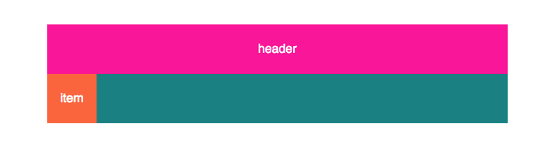
这时,我给 item 加了 margin-top: 30px ,本来这时候我期待的结果是,item 块本身应该距离 container 青色区域的上边界 30px 。同时一个副作用是青色区域应该拉高 30px 。但是实际上得到的却是下面的效果:
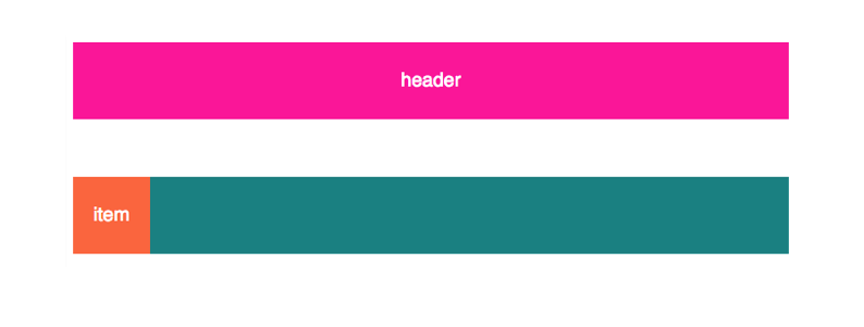
造成这个的原因是,父子元素的 margin-top 是会重叠的,即使是像上面的情况中,父元素 container 自身 margin-top 为 0 的情况下也一样。这样造成的一个现象就是父元素“包不住”子元素的 margin-top ,溢出了。类似的问题也会发生在 margin-bottom 身上。
要解决这个问题,就要给 container 添加 clearfix ,html 代码如下
|
1
2
3
4
5
|
<div class="container clearfix">
<div class="item">
item
</div>
</div>
|
如果只是针对这一种问题,最简单的 clearfix 实现是这样:
|
1
2
3
4
5
6
|
.clearfix:before,
.clearfix:after
{
content: " ";
display: table;
}
|
注意,display: table 换成 dispaly: block 是不行的。
效果图
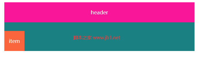
完整测试代码脚本的家专门提供
|
1
2
3
4
5
6
7
8
9
10
11
12
13
14
15
16
17
18
19
20
21
22
23
24
25
26
27
28
29
30
31
32
|
<!DOCTYPE html>
<html lang="zh-CN">
<head>
<meta charset="UTF-8">
<meta http-equiv="X-UA-Compatible" content="IE=edge">
<meta name="viewport" content="width=device-width, initial-scale=1.0">
<title>Document</title>
<style>
.header{margin:0 auto;width:660px;color:white;font-size:18px;text-align:center;background-color:#fa1698;width:660px;height:70px;line-height:70px}
.container{margin:0 auto;width:660px;color:white;font-size:18px;text-align:center;background-color:#1a8081;}
.item{background-color:#fa653e;width:70px;height:70px;line-height:70px;margin-top: 30px}
.clearfix:before,
.clearfix:after
{
content: " ";
display: table;
}
.clearfix{zoom:1}
.clear{clear:both;height:0;line-height:0;font-size:0;visibility:hidden;overflow:hidden}
</style>
</head>
<body style="text-align:center;">
<div class="header">
header
</div>
<div class="container clearfix">
<div class="item">
item
</div>
</div>
</body>
</html>
|
当然,外边距重叠不局限于上面的父子元素之间,也会发生在兄弟元素之间,甚至是一个高度为 0 的元素,自己的上下边距也会重叠,这个就是 MDN Margin Collapse 文档上给出的全部三种情况,但是后两种在实际开发中不会带来很大麻烦,也不是咱们的 clearfix 方法所关心的。
结语
上面两个问题的解决代码合并到一起,就是文章最初 Peter 给出的 clearfix 代码了。 有了这个方法,当给子元素添加浮动或者是 margin 的时候,父元素的行为就非常符合正常的预期了,开发页面布局变得非常简单,所以 clearfix 方法对于按照 div 的 block 模型排版是非常有用的。
下面分享一段当前比较常用的代码
|
1
2
3
|
.clearfix:after{content:'\20';display:block;height:0;clear:both}
.clearfix{zoom:1}
.clear{clear:both;height:0;line-height:0;font-size:0;visibility:hidden;overflow:hidden}
|
但是,顺便提一下,未来 flexbox 会大行其道,flexbox 模型的特点是,不用 float ,并且子元素的 margin 也不会和父元素重叠。
|


