1. 使用Flexbox布局
Flexbox是CSS的强大布局模型,它为我们提供了简单而灵活的方法来实现元素的水平和垂直居中。
|
1
2
3
4
5
6
|
html复制代码
<div class="container">
<div class="centered-element">
<!-- 内容 -->
</div>
</div>
|
|
1
2
3
4
5
6
7
8
9
10
11
12
|
css复制代码
.container {
display: flex;
justify-content: center;
align-items: center;
/* 设置容器的宽高,如果需要 */
width: 100vw;
height: 100vh;
}
.centered-element {
/* 元素样式 */
}
|
上面的代码中,我们使用了Flexbox布局模型,通过display: flex;将容器设置为弹性布局容器。justify-content: center;和align-items: center;分别使内容在水平和垂直方向上居中。
2. 使用绝对定位和transform
另一种常用的方法是使用绝对定位和CSS的transform属性来实现元素的居中。
|
1
2
3
4
5
6
|
html复制代码
<div class="container">
<div class="centered-element">
<!-- 内容 -->
</div>
</div>
|
|
1
2
3
4
5
6
7
8
9
10
11
12
13
14
|
css复制代码
.container {
position: relative;
/* 设置容器的宽高,如果需要 */
width: 100vw;
height: 100vh;
}
.centered-element {
position: absolute;
top: 50%;
left: 50%;
transform: translate(-50%, -50%);
/* 元素样式 */
}
|
上面的代码中,我们将容器设置为相对定位,并通过top: 50%;和left: 50%;将元素的左上角定位到了容器的中心。然后,通过transform: translate(-50%, -50%);将元素向左和向上移动自身宽高的一半,从而实现元素在水平和垂直方向上的居中。
3. 使用Grid布局
如果你在项目中已经使用了CSS的Grid布局,那么也可以很容易地实现元素的水平和垂直居中。
|
1
2
3
4
5
6
|
html复制代码
<div class="container">
<div class="centered-element">
<!-- 内容 -->
</div>
</div>
|
|
1
2
3
4
5
6
7
8
9
10
11
|
css复制代码
.container {
display: grid;
place-items: center;
/* 设置容器的宽高,如果需要 */
width: 100vw;
height: 100vh;
}
.centered-element {
/* 元素样式 */
}
|
在上面的代码中,我们使用了Grid布局,通过display: grid;将容器设置为网格容器。然后,通过place-items: center;将内容在网格容器中居中。
4. 使用text-align和line-height
如果你需要让一个行内元素水平垂直居中,你可以使用text-align: center;将内容在水平方向上居中,然后使用line-height属性设置和容器高度相等的行高来实现垂直居中。
|
1
2
3
4
|
html复制代码
<div class="container">
<span class="centered-text">居中文本</span>
</div>
|
|
1
2
3
4
5
6
7
8
9
10
11
12
13
|
css复制代码
.container {
/* 设置容器的宽高,如果需要 */
width: 100vw;
height: 100vh;
text-align: center;
line-height: 100vh;
}
.centered-text {
/* 元素样式 */
display: inline-block;
vertical-align: middle;
}
|
在上面的代码中,我们将容器设置为文本居中,并设置行高和容器高度相等,从而实现行内元素的垂直居中。同时,为了让行内元素居中,我们还使用了display: inline-block;和vertical-align: middle;。
5. 利用定位+margin:auto
父级设置为相对定位,子级绝对定位 ,并且四个定位属性的值都设置了0,那么这时候如果子级没有设置宽高,则会被拉开到和父级一样宽高
|
1
2
3
4
5
6
7
8
9
10
11
12
13
14
15
16
17
18
19
20
21
22
|
<style>
.father{
width:500px;
height:300px;
border:1px solid #0a3b98;
position: relative;
}
.son{
width:100px;
height:40px;
background: #f0a238;
position: absolute;
top:0;
left:0;
right:0;
bottom:0;
margin:auto;
}
</style>
<div class="father">
<div class="son"></div>
</div>
|
这里子元素设置了宽高,所以宽高会按照我们的设置来显示,但是实际上子级的虚拟占位已经撑满了整个父级,这时候再给它一个margin:auto它就可以上下左右都居中了
6. 利用定位+margin:负值
绝大多数情况下,设置父元素为相对定位, 子元素移动自身50%实现水平垂直居中
|
1
2
3
4
5
6
7
8
9
10
11
12
13
14
15
16
17
18
19
20
21
|
<style>
.father {
position: relative;
width: 200px;
height: 200px;
background: skyblue;
}
.son {
position: absolute;
top: 50%;
left: 50%;
margin-left:-50px;
margin-top:-50px;
width: 100px;
height: 100px;
background: red;
}
</style>
<div class="father">
<div class="son"></div>
</div>
|
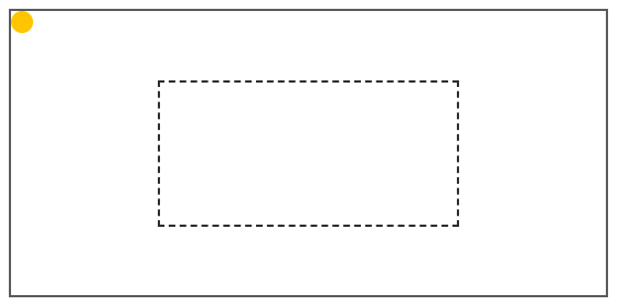
- 初始位置为方块1的位置
- 当设置left、top为50%的时候,内部子元素为方块2的位置
- 设置margin为负数时,使内部子元素到方块3的位置,即中间位置
这种方案不要求父元素的高度,也就是即使父元素的高度变化了,仍然可以保持在父元素的垂直居中位置,水平方向上是一样的操作,但是该方案需要知道子元素自身的宽高,但是我们可以通过下面transform属性进行移动
总结
根据元素标签的性质,可以分为:
内联元素居中布局
水平居中
- 行内元素可设置:text-align: center
- flex布局设置父元素:display: flex; justify-content: center
垂直居中
- 单行文本父元素确认高度:height === line-height
- 多行文本父元素确认高度:disaply: table-cell; vertical-align: middle
块级元素居中布局
水平居中
- 定宽: margin: 0 auto
- 绝对定位+left:50%+margin:负自身一半
垂直居中
- position: absolute设置left、top、margin-left、margin-top(定高)
- display: table-cell
- transform: translate(x, y)
- flex(不定高,不定宽)
- grid(不定高,不定宽),兼容性相对比较差
|


