css设置背景模糊周边有白色光晕,如何解决?
|
1
2
3
4
|
<div class="img-box">
<img :src="xxx.png">
<div class="img-bg" :style="{'background-image': `url(`+ xxx.png+ `)`}"></div>
</div>
|
|
1
2
3
4
5
6
7
8
9
10
11
12
13
14
15
16
17
18
19
20
21
22
23
24
25
26
27
28
29
30
31
32
33
34
|
.img-box {
width: 100%;
height: 212px;
text-align: center;
position: relative;
img {
width: 100%;
height: 100%;
position: relative;
z-index: 5;
}
.img-bg {
position: absolute;
top: 0;
left: 0;
width: 100%;
height: 100%;
background-size: 200%; /* 放大两倍 */
background-position: center;
background-repeat: no-repeat;
filter: blur(20px); /* 添加20模糊效果 */
overflow: hidden;
}
.img-bg::before {
content: "";
position: absolute;
top: 0;
left: 0;
width: 100%;
height: 100%;
background-color: rgba(0, 0, 0, 0.6); /* 60%不透明度的黑色 */
z-index: 1; /* 确保蒙层在背景之上 */
}
}
|
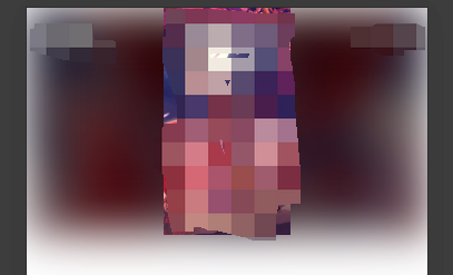
需求:想要给一个展示图片的区域底部加一个该图片的放大后的背景,并模糊 20,并增加一个黑色 0.6 透明度的遮罩
但是按照上面代码实现后,周边有一圈白色光晕,如图:
解决方案:
使用backdrop-filter: blur(20px);
但是注意,backdrop-filter 不能直接加在背景图本身样式上,会导致不生效。
- backdrop-filter 属性需要在具有定位的元素上使用,例如 position: relative 或 position: absolute;
- backdrop-filter应用于的元素需要有一个背景元素在其后,通常是该元素的父级元素。如果没有这样的背景元素,backdrop-filter将不会生效。确保父级元素有可见的背景内容。
所以我们将backdrop-filter 放在 img-bg::before 里,即可生效:
|
1
2
3
4
5
6
7
8
9
10
11
|
.img-bg::before {
content: "";
position: absolute;
top: 0;
left: 0;
width: 100%;
height: 100%;
background-color: rgba(0, 0, 0, 0.6); /* 60%不透明度的黑色 */
z-index: 1; /* 确保蒙层在背景之上 */
backdrop-filter: blur(20px); /* 添加20模糊效果 */
}
|
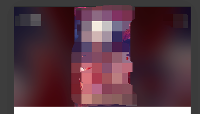
这样就白色光晕的效果了。
|


