前言
现如今网页越来越趋近于动画,相信大家平时浏览网页或多或少都能看到一些动画效果,今天我们来做一个有意思的动画效果,纯 css 实现 loading 加载中(多种展现形式),下面一起看看吧。
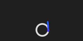
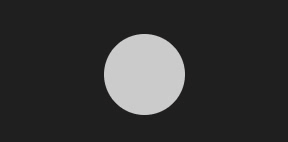
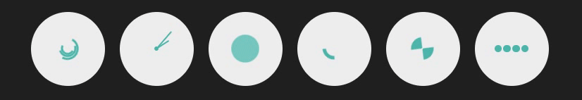
1. 常规 loading
实现效果

代码如下
|
1
2
3
4
5
6
7
8
9
10
11
12
13
14
15
16
17
18
19
20
21
22
23
24
25
26
27
28
29
30
31
32
33
34
35
36
37
38
39
40
41
42
43
44
45
46
47
48
49
50
51
52
53
54
55
56
57
58
59
60
61
62
63
64
65
66
67
68
69
70
71
72
|
<template>
<div class="parentBox">
<div class="loadBox">
<div class="loaderContantBox"></div>
</div>
</div>
</template>
<style lang="less" scoped>
.parentBox {
height: 100%;
background: rgb(31, 31, 31);
padding: 100px;
.loadBox .loaderContantBox {
color: white;
font-size: 40px;
overflow: hidden;
width: 40px;
height: 40px;
border-radius: 50%;
transform: translateZ(0);
/* animation:规定完成动画所花费的时间,该属性必须规定,否则动画时长为0,无法播放 */
animation: loadBox 1.7s infinite ease, round 1.7s infinite ease;
}
@keyframes loadBox {
0% {
box-shadow: 0 -0.83em 0 -0.4em, 0 -0.83em 0 -0.42em, 0 -0.83em 0 -0.44em,
0 -0.83em 0 -0.46em, 0 -0.83em 0 -0.477em;
}
5%,
95% {
box-shadow: 0 -0.83em 0 -0.4em, 0 -0.83em 0 -0.42em, 0 -0.83em 0 -0.44em,
0 -0.83em 0 -0.46em, 0 -0.83em 0 -0.477em;
}
10%,
59% {
box-shadow: 0 -0.83em 0 -0.4em, -0.087em -0.825em 0 -0.42em,
-0.173em -0.812em 0 -0.44em, -0.256em -0.789em 0 -0.46em,
-0.297em -0.775em 0 -0.477em;
}
20% {
box-shadow: 0 -0.83em 0 -0.4em, -0.338em -0.758em 0 -0.42em,
-0.555em -0.617em 0 -0.44em, -0.671em -0.488em 0 -0.46em,
-0.749em -0.34em 0 -0.477em;
}
38% {
box-shadow: 0 -0.83em 0 -0.4em, -0.377em -0.74em 0 -0.42em,
-0.645em -0.522em 0 -0.44em, -0.775em -0.297em 0 -0.46em,
-0.82em -0.09em 0 -0.477em;
}
100% {
box-shadow: 0 -0.83em 0 -0.4em, 0 -0.83em 0 -0.42em, 0 -0.83em 0 -0.44em,
0 -0.83em 0 -0.46em, 0 -0.83em 0 -0.477em;
}
}
@keyframes round {
0% {
transform: rotate(0deg); /* 开始旋转 div 元素 */
}
100% {
transform: rotate(360deg); /* 结束旋转 div 元素 */
}
}
}
</style>
|
2. 抛出线条式 loading
实现效果
代码如下
|
1
2
3
4
5
6
7
8
9
10
11
12
13
14
15
16
17
18
19
20
21
22
23
24
25
26
27
28
29
30
31
32
33
34
35
36
37
38
39
40
41
42
43
44
45
46
47
48
49
50
51
52
53
54
55
56
57
58
59
60
61
62
63
64
65
66
67
68
69
70
71
72
73
74
75
76
77
78
79
80
81
82
83
84
85
86
87
88
89
90
91
92
93
94
95
96
97
98
99
100
101
102
103
104
105
106
107
108
|
<template>
<div class="parentBox">
<svg class="scalableBox" viewBox="0 0 128 256" width="128px" height="256px" xmlns="http://www.w3.org/2000/svg">
<defs>
<linearGradient id="ap-grad1" x1="0" y1="0" x2="0" y2="1">
<stop offset="0%" stop-color="hsl(223,90%,55%)" />
<stop offset="100%" stop-color="hsl(253,90%,55%)" />
</linearGradient>
<linearGradient id="ap-grad2" x1="0" y1="0" x2="0" y2="1">
<stop offset="0%" stop-color="hsl(193,90%,55%)" />
<stop offset="50%" stop-color="hsl(223,90%,55%)" />
<stop offset="100%" stop-color="hsl(253,90%,55%)" />
</linearGradient>
</defs>
<circle class="apringBox" r="56" cx="64" cy="192" fill="none" stroke="#ddd" stroke-width="16" stroke-linecap="round" />
<circle class="apwormOneBox" r="56" cx="64" cy="192" fill="none" stroke="url(#ap-grad1)" stroke-width="16" stroke-linecap="round"
stroke-dasharray="87.96 263.89" />
<path class="apwormTwoBox" d="M120,192A56,56,0,0,1,8,192C8,161.07,16,8,64,8S120,161.07,120,192Z" fill="none" stroke="url(#ap-grad2)"
stroke-width="16" stroke-linecap="round" stroke-dasharray="87.96 494" />
</svg>
</div>
</template>
<style lang="less" scoped>
.parentBox {
height: 100%;
background: rgb(31, 31, 31);
padding: 100px;
.scalableBox {
width: 40px;
height: 70px;
}
.apringBox {
transition: stroke 0.3s;
}
.apwormOneBox,
.apwormTwoBox {
animation-duration: 3s;
animation-iteration-count: infinite;
}
.apwormTwoBox {
animation-name: worm2;
visibility: hidden;
}
.apwormOneBox {
animation-name: worm1;
}
}
@media (prefers-color-scheme: dark) {
:root {
--bg: hsl(var(--hue), 10%, 10%);
--fg: hsl(var(--hue), 10%, 90%);
}
.apringBox {
stroke: hsla(var(--hue), 10%, 90%, 0.9);
}
}
@keyframes worm1 {
from {
animation-timing-function: ease-in-out;
stroke-dashoffset: -87.96;
}
20% {
animation-timing-function: ease-in;
stroke-dashoffset: 0;
}
60% {
stroke-dashoffset: -791.68;
visibility: visible;
}
60.1%,
to {
stroke-dashoffset: -791.68;
visibility: hidden;
}
}
@keyframes worm2 {
from,
60% {
stroke-dashoffset: -87.96;
visibility: hidden;
}
60.1% {
animation-timing-function: cubic-bezier(0, 0, 0.5, 0.75);
stroke-dashoffset: -87.96;
visibility: visible;
}
77% {
animation-timing-function: cubic-bezier(0.5, 0.25, 0.5, 0.88);
stroke-dashoffset: -340;
visibility: visible;
}
to {
stroke-dashoffset: -669.92;
visibility: visible;
}
}
</style>
|
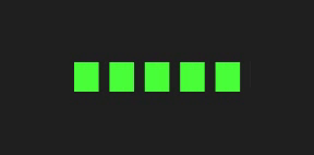
3. 进度条颜色覆盖式 loading
实现效果
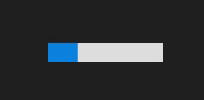
代码如下
|
1
2
3
4
5
6
7
8
9
10
11
12
13
14
15
16
17
18
19
20
21
22
23
24
|
<template>
<div class="parentBox">
<div class="contantBox"></div>
</div>
</template>
<style lang="less" scoped>
.parentBox {
height: 100%;
background: rgb(31, 31, 31);
padding: 100px;
.contantBox {
width: 120px;
height: 20px;
background: linear-gradient(rgb(12, 132, 223) 0 0) 0/0% no-repeat #ddd;
animation: cartoon 2s infinite linear;
}
@keyframes cartoon {
100% {
background-size: 100%;
}
}
}
</style>
|
4. 椭圆式进度条 loading
实现效果
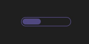
代码如下
|
1
2
3
4
5
6
7
8
9
10
11
12
13
14
15
16
17
18
19
20
21
22
23
24
25
26
27
28
29
30
31
32
33
34
35
|
<template>
<div class="parentBox">
<div class="contantBox"></div>
</div>
</template>
<style lang="less" scoped>
.parentBox {
height: 100%;
background: rgb(31, 31, 31);
padding: 100px;
.contantBox {
width: 120px;
height: 22px;
border-radius: 20px;
color: #514b82;
border: 2px solid;
position: relative;
}
.contantBox::before {
content: "";
position: absolute;
margin: 2px;
inset: 0 100% 0 0;
border-radius: inherit;
background: #514b82;
animation: cartoon 2s infinite;
}
@keyframes cartoon {
100% {
inset: 0;
}
}
}
</style>
|
5. 卡顿式进度条 loading
实现效果
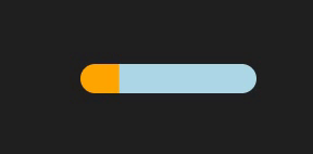
代码如下
|
1
2
3
4
5
6
7
8
9
10
11
12
13
14
15
16
17
18
19
20
21
22
23
24
25
26
27
28
29
30
31
32
33
34
35
36
37
38
39
40
41
42
43
44
45
46
47
48
49
50
51
|
<template>
<div class="parentBox">
<div class="contantBox"></div>
</div>
</template>
<style lang="less" scoped>
.parentBox {
height: 100%;
background: rgb(31, 31, 31);
padding: 100px;
.contantBox {
width: 120px;
height: 20px;
border-radius: 20px;
background: linear-gradient(orange 0 0) 0/0% no-repeat lightblue;
animation: cartoon 2s infinite steps(10);
}
@keyframes cartoon {
100% {
background-size: 110%;
}
}
}
</style>
|
6. 进度条波纹 loading
实现效果
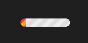
代码如下
|
1
2
3
4
5
6
7
8
9
10
11
12
13
14
15
16
17
18
19
20
21
22
23
24
25
26
27
28
29
30
31
|
<template>
<div class="parentBox">
<div class="contantBox"></div>
</div>
</template>
<style lang="less" scoped>
.parentBox {
height: 100%;
background: rgb(31, 31, 31);
padding: 100px;
.contantBox {
width: 120px;
height: 20px;
border-radius: 20px;
background: repeating-linear-gradient(
135deg,
#f03355 0 10px,
#ffa516 0 20px
)
0/0% no-repeat,
repeating-linear-gradient(135deg, #ddd 0 10px, #eee 0 20px) 0/100%;
animation: cartoon 2s infinite;
}
@keyframes cartoon {
100% {
background-size: 100%;
}
}
}
</style>
|
7. 进度条分隔式 loading
实现效果
代码如下
|
1
2
3
4
5
6
7
8
9
10
11
12
13
14
15
16
17
18
19
20
21
22
23
24
25
|
<template>
<div class="parentBox">
<div class="contantBox"></div>
</div>
</template>
<style lang="less" scoped>
.parentBox {
height: 100%;
background: rgb(31, 31, 31);
padding: 100px;
.contantBox {
width: 120px;
height: 20px;
-webkit-mask: linear-gradient(90deg, #000 70%, #0000 0) 0/20%;
background: linear-gradient(rgb(73, 255, 57) 0 0) 0/0% no-repeat #ddd;
animation: cartoon 2s infinite steps(6);
}
@keyframes cartoon {
100% {
background-size: 120%;
}
}
}
</style>
|
8. 圆球连接式 loading
实现效果

代码如下
|
1
2
3
4
5
6
7
8
9
10
11
12
13
14
15
16
17
18
19
20
21
22
23
24
25
26
27
28
|
<template>
<div class="parentBox">
<div class="contantBox"></div>
</div>
</template>
<style lang="less" scoped>
.parentBox {
height: 100%;
background: rgb(31, 31, 31);
padding: 100px;
.contantBox {
width: 120px;
height: 24px;
-webkit-mask: radial-gradient(circle closest-side, #000 94%, #0000) 0 0/25%
100%,
linear-gradient(#000 0 0) center/calc(100% - 12px) calc(100% - 12px)
no-repeat;
background: linear-gradient(#25b09b 0 0) 0/0% no-repeat #ddd;
animation: cartoon 2s infinite linear;
}
@keyframes cartoon {
100% {
background-size: 100%;
}
}
}
</style>
|
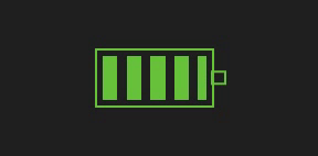
9. 电池充电式 loading
实现效果
代码如下
|
1
2
3
4
5
6
7
8
9
10
11
12
13
14
15
16
17
18
19
20
21
22
23
24
25
26
27
28
29
30
31
32
33
34
35
36
37
38
39
40
41
42
|
<template>
<div class="parentBox">
<div class="contantBox"></div>
</div>
</template>
<style lang="less" scoped>
.parentBox {
height: 100%;
background: rgb(31, 31, 31);
padding: 100px;
.contantBox {
width: 80px;
height: 40px;
border: 2px solid rgb(103, 194, 58);
padding: 3px;
background: repeating-linear-gradient(
90deg,
rgb(103, 194, 58) 0 10px,
#0000 0 16px
)
0/0% no-repeat content-box content-box;
position: relative;
animation: cartoon 2s infinite steps(6);
}
.contantBox::before {
content: "";
position: absolute;
top: 50%;
left: 100%;
transform: translateY(-50%);
width: 10px;
height: 10px;
border: 2px solid rgb(103, 194, 58);
}
@keyframes cartoon {
100% {
background-size: 120%;
}
}
}
</style>
|
10. 球体分隔式 loading
实现效果

代码如下
|
1
2
3
4
5
6
7
8
9
10
11
12
13
14
15
16
17
18
19
20
21
22
23
24
25
26
|
<template>
<div class="parentBox">
<div class="contantBox"></div>
</div>
</template>
<style lang="less" scoped>
.parentBox {
height: 100%;
background: rgb(31, 31, 31);
padding: 100px;
.contantBox {
width: 60px;
height: 60px;
border-radius: 50%;
-webkit-mask: linear-gradient(0deg, #000 55%, #0000 0) bottom/100% 18.18%;
background: linear-gradient(#f03355 0 0) bottom/100% 0% no-repeat #ddd;
animation: cartoon 2s infinite steps(7);
}
@keyframes cartoon {
100% {
background-size: 100% 115%;
}
}
}
</style>
|
11. 水球波纹式 loading
实现效果
代码如下
|
1
2
3
4
5
6
7
8
9
10
11
12
13
14
15
16
17
18
19
20
21
22
23
24
25
26
27
28
29
30
31
32
33
34
35
36
37
38
39
40
41
42
43
44
45
46
47
|
<template>
<div class="parentBox">
<div class="contantBox"></div>
</div>
</template>
<style lang="less" scoped>
.parentBox {
height: 100%;
background: rgb(31, 31, 31);
padding: 100px;
.contantBox {
--r1: 154%;
--r2: 68.5%;
width: 60px;
height: 60px;
border-radius: 50%;
background: radial-gradient(
var(--r1) var(--r2) at top,
#0000 79.5%,
#269af2 80%
)
center left,
radial-gradient(var(--r1) var(--r2) at bottom, #269af2 79.5%, #0000 80%)
center center,
radial-gradient(var(--r1) var(--r2) at top, #0000 79.5%, #269af2 80%)
center right,
#ccc;
background-size: 50.5% 220%;
background-position: -100% 0%, 0% 0%, 100% 0%;
background-repeat: no-repeat;
animation: cartoon 2s infinite linear;
}
@keyframes cartoon {
33% {
background-position: 0% 33%, 100% 33%, 200% 33%;
}
66% {
background-position: -100% 66%, 0% 66%, 100% 66%;
}
100% {
background-position: 0% 100%, 100% 100%, 200% 100%;
}
}
}
</style>
|
12. 半圆线条式 loading
实现效果

代码如下
|
1
2
3
4
5
6
7
8
9
10
11
12
13
14
15
16
17
18
19
20
21
22
23
24
25
26
27
28
29
30
31
|
<template>
<div class="parentBox">
<div class="contantBox"></div>
</div>
</template>
<style lang="less" scoped>
.parentBox {
height: 100%;
background: rgb(31, 31, 31);
padding: 100px;
.contantBox {
width: 120px;
height: 60px;
border-radius: 200px 200px 0 0;
-webkit-mask: repeating-radial-gradient(
farthest-side at bottom,
#0000 0,
#000 1px 12%,
#0000 calc(12% + 1px) 20%
);
background: radial-gradient(farthest-side at bottom, #514b82 0 95%, #0000 0)
bottom/0% 0% no-repeat #ddd;
animation: cartoon 2s infinite steps(6);
}
@keyframes cartoon {
100% {
background-size: 120% 120%;
}
}
}
</style>
|
13. 球体内小球跳跃式 loading
实现效果
代码如下
|
1
2
3
4
5
6
7
8
9
10
11
12
13
14
15
16
17
18
19
20
21
22
23
24
25
26
27
28
29
30
31
32
33
34
35
36
37
38
39
40
41
42
43
44
45
46
47
48
49
50
51
52
53
54
55
56
57
58
59
60
61
62
63
64
65
66
67
68
69
70
71
72
73
74
75
76
77
78
79
80
81
82
83
84
85
86
87
88
89
90
91
92
93
94
95
96
97
98
99
100
101
102
103
104
105
106
107
108
109
110
111
112
113
114
115
116
117
118
119
120
121
122
123
124
125
126
127
128
129
130
131
132
133
134
135
136
137
138
139
140
141
142
143
144
145
146
147
148
149
150
151
152
153
154
155
156
157
158
159
160
161
162
163
164
165
166
167
168
169
170
171
172
173
174
175
176
177
178
179
180
181
182
183
184
185
186
187
188
189
190
191
192
193
194
195
196
197
198
199
200
201
202
203
204
205
206
207
208
209
210
211
212
213
214
215
216
217
218
219
220
221
222
223
224
225
226
227
228
229
230
231
232
233
234
235
236
237
238
239
240
241
242
243
244
245
246
247
248
249
250
251
252
253
254
255
256
257
258
259
260
261
262
263
264
265
266
267
268
269
270
271
272
273
274
275
276
277
278
279
280
281
282
283
284
285
286
287
288
289
290
291
|
<template>
<div class="parentBox">
<!-- 第一种 -->
<div>
<figure>
<section>
<div></div>
</section>
<section>
<div></div>
</section>
<section>
<div></div>
</section>
<section>
<div></div>
</section>
<section>
<div></div>
</section>
<section>
<div></div>
</section>
<section>
<div></div>
</section>
<section>
<div></div>
</section>
</figure>
</div>
<!-- 第二种 -->
<div>
<figure>
<section>
<div></div>
</section>
<section>
<div></div>
</section>
<section>
<div></div>
</section>
<section>
<div></div>
</section>
<section>
<div></div>
</section>
<section>
<div></div>
</section>
<section>
<div></div>
</section>
<section>
<div></div>
</section>
</figure>
</div>
<!-- 第三种 -->
<div>
<figure>
<section>
<div></div>
</section>
<section>
<div></div>
</section>
<section>
<div></div>
</section>
<section>
<div></div>
</section>
<section>
<div></div>
</section>
<section>
<div></div>
</section>
<section>
<div></div>
</section>
<section>
<div></div>
</section>
</figure>
</div>
<!-- 第四种 -->
<div>
<figure>
<section>
<div></div>
</section>
<section>
<div></div>
</section>
<section>
<div></div>
</section>
<section>
<div></div>
</section>
<section>
<div></div>
</section>
<section>
<div></div>
</section>
<section>
<div></div>
</section>
<section>
<div></div>
</section>
</figure>
</div>
</div>
</template>
<style lang="less" scoped>
.parentBox {
height: 100%;
background: rgb(31, 31, 31);
padding: 100px;
display: flex;
@keyframes move {
from {
transform: translate(0, 50%);
}
to {
transform: translate(0, 850%);
}
}
figure {
margin: 10px;
width: 40px;
height: 40px;
border-radius: 50%;
position: relative;
background: rgb(240,109,78);
}
section {
width: 10%;
height: 100%;
position: absolute;
left: 45%;
}
section:nth-child(2) {
transform: rotate(22.5deg);
}
section:nth-child(3) {
transform: rotate(45deg);
}
section:nth-child(4) {
transform: rotate(67.5deg);
}
section:nth-child(5) {
transform: rotate(90deg);
}
section:nth-child(6) {
transform: rotate(112.5deg);
}
section:nth-child(7) {
transform: rotate(135deg);
}
section:nth-child(8) {
transform: rotate(157.5deg);
}
figure div {
height: 10%;
border-radius: 50%;
background: #fff;
animation: move 1s ease-in-out infinite alternate;
}
figure:nth-child(1) > section:nth-child(1) > div {
animation-delay: -0.1875s;
}
figure:nth-child(1) > section:nth-child(2) > div {
animation-delay: -0.175s;
}
figure:nth-child(1) > section:nth-child(3) > div {
animation-delay: -0.1625s;
}
figure:nth-child(1) > section:nth-child(4) > div {
animation-delay: -0.15s;
}
figure:nth-child(1) > section:nth-child(5) > div {
animation-delay: -0.9375s;
}
figure:nth-child(1) > section:nth-child(6) > div {
animation-delay: -0.925s;
}
figure:nth-child(1) > section:nth-child(7) > div {
animation-delay: -0.9125s;
}
figure:nth-child(1) > section:nth-child(8) > div {
animation-delay: -0.9s;
}
figure:nth-child(2) > section:nth-child(1) > div {
animation-delay: -0.875s;
}
figure:nth-child(2) > section:nth-child(2) > div {
animation-delay: -0.75s;
}
figure:nth-child(2) > section:nth-child(3) > div {
animation-delay: -0.625s;
}
figure:nth-child(2) > section:nth-child(4) > div {
animation-delay: -0.5s;
}
figure:nth-child(2) > section:nth-child(5) > div {
animation-delay: -0.375s;
}
figure:nth-child(2) > section:nth-child(6) > div {
animation-delay: -0.25s;
}
figure:nth-child(2) > section:nth-child(7) > div {
animation-delay: -0.125s;
}
figure:nth-child(3) > section:nth-child(1) > div {
animation-delay: -0.5s;
}
figure:nth-child(3) > section:nth-child(3) > div {
animation-delay: -0.5s;
}
figure:nth-child(3) > section:nth-child(5) > div {
animation-delay: -0.5s;
}
figure:nth-child(3) > section:nth-child(7) > div {
animation-delay: -0.5s;
}
figure:nth-child(4) > section:nth-child(1) > div {
animation-delay: -0.35s;
}
figure:nth-child(4) > section:nth-child(2) > div {
animation-delay: -0.3s;
}
figure:nth-child(4) > section:nth-child(3) > div {
animation-delay: -0.25s;
}
figure:nth-child(4) > section:nth-child(4) > div {
animation-delay: -0.2s;
}
figure:nth-child(4) > section:nth-child(5) > div {
animation-delay: -0.15s;
}
figure:nth-child(4) > section:nth-child(6) > div {
animation-delay: -0.1s;
}
figure:nth-child(4) > section:nth-child(7) > div {
animation-delay: -0.05s;
}
}
</style>
|
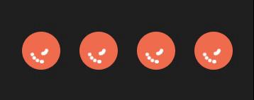
14. 球体内动图式 loading
实现效果
代码如下
|
1
2
3
4
5
6
7
8
9
10
11
12
13
14
15
16
17
18
19
20
21
22
23
24
25
26
27
28
29
30
31
32
33
34
35
36
37
38
39
40
41
42
43
44
45
46
47
48
49
50
51
52
53
54
55
56
57
58
59
60
61
62
63
64
65
66
67
68
69
70
71
72
73
74
75
76
77
78
79
80
81
82
83
84
85
86
87
88
89
90
91
92
93
94
95
96
97
98
99
100
101
102
103
104
105
106
107
108
109
110
111
112
113
114
115
116
117
118
119
120
121
122
123
124
125
126
127
128
129
130
131
132
133
134
135
136
137
138
139
140
141
142
143
144
145
146
147
148
149
150
151
152
153
154
155
156
157
158
159
160
161
162
163
164
165
166
167
168
169
170
171
172
173
174
175
176
177
178
179
180
181
182
183
184
185
186
187
188
189
190
191
192
193
194
195
196
197
198
199
200
201
202
203
204
205
206
207
208
209
210
211
212
213
214
215
216
217
218
219
220
221
222
223
224
225
226
227
|
<template>
<div class="parentBox">
<div class="containerBox">
<!-- 第一种 -->
<div class="canvasBox">
<div class="spinnerOneBox spinnerMaxBox">
<div class="spinnerOneBox spinnerMidBox">
<div class="spinnerOneBox spinnerMinBox"></div>
</div>
</div>
</div>
<!-- 第二种 -->
<div class="canvasBox canvasTwoBox">
<div class="spinnerTwoBox"></div>
<div class="hourHandBox"></div>
<div class="dotBox"></div>
</div>
<!-- 第三种 -->
<div class="canvasBox">
<div class="spinnerThreeBox"></div>
</div>
<!-- 第四种 -->
<div class="canvasBox">
<div class="spinnerFourBox"></div>
</div>
<!-- 第五种 -->
<div class="canvasBox">
<div class="spinnerFiveBox"></div>
</div>
<!-- 第六种 -->
<div class="canvasBox">
<div class="spinnerSexBox p1"></div>
<div class="spinnerSexBox p2"></div>
<div class="spinnerSexBox p3"></div>
<div class="spinnerSexBox p4"></div>
</div>
</div>
</div>
</template>
<style lang="less" scoped>
.parentBox {
height: 100%;
background: rgb(31, 31, 31);
padding: 100px;
.containerBox {
display: flex;
.canvasBox {
align-items: center;
background: #eeeeee;
border-radius: 50%;
display: flex;
justify-content: center;
margin: 1em;
width: 10em;
height: 10em;
// 第一种
.spinnerOneBox {
align-items: center;
border: 0.3em solid transparent;
border-top: 0.3em solid #4db6ac;
border-right: 0.3em solid #4db6ac;
border-radius: 100%;
display: flex;
justify-content: center;
}
.spinnerMaxBox {
animation: spinnerOne 3s linear infinite;
height: 3em;
width: 3em;
.spinnerMidBox {
animation: spinnerOne 5s linear infinite;
height: 2.4em;
width: 2.4em;
.spinnerMinBox {
animation: spinnerOne 5s linear infinite;
height: 1.8em;
width: 1.8em;
}
}
}
}
@keyframes spinnerOne {
0% {
transform: rotate(0deg);
}
100% {
transform: rotate(360deg);
}
}
// 第二种
.canvasTwoBox {
position: relative;
.spinnerTwoBox {
animation: spinnerTwo 1s linear infinite;
background: #4db6ac;
border-radius: 100px;
height: 3em;
transform-origin: top;
position: absolute;
top: 50%;
width: 0.22em;
}
.hourHandBox {
animation: spinnerTwo 7s linear infinite;
background: #4db6ac;
border-radius: 100px;
height: 2em;
transform-origin: top;
position: absolute;
top: 50%;
width: 0.2em;
}
.dotBox {
background: #4db6ac;
border-radius: 100%;
height: 0.5em;
width: 0.5em;
}
}
@keyframes spinnerTwo {
0% {
transform: rotate(0deg);
}
100% {
transform: rotate(360deg);
}
}
// 第三种
.spinnerThreeBox {
animation: spinnerThree 1s linear infinite;
background: #4db6ac;
border-radius: 100%;
width: 3em;
height: 3em;
}
@keyframes spinnerThree {
0%,
35% {
background: #4db6ac;
transform: scale(1);
}
20%,
50% {
background: #80cbc4;
transform: scale(1.3);
}
}
// 第四种
.spinnerFourBox {
animation: spinnerFour 1s linear infinite;
border: solid 7px transparent;
border-top: solid 7px #4db6ac;
border-radius: 100%;
width: 3em;
height: 3em;
}
@keyframes spinnerFour {
0% {
transform: rotate(0deg);
}
100% {
transform: rotate(360deg);
}
}
// 第五种
.spinnerFiveBox {
animation: spinnerFive 1s linear infinite;
border: solid 1.5em #4db6ac;
border-right: solid 1.5em transparent;
border-left: solid 1.5em transparent;
border-radius: 100%;
width: 0;
height: 0;
}
@keyframes spinnerFive {
0% {
transform: rotate(0deg);
}
50% {
transform: rotate(60deg);
}
100% {
transform: rotate(360deg);
}
}
// 第六种
.spinnerSexBox {
background: #4db6ac;
border-radius: 50%;
height: 1em;
margin: 0.1em;
width: 1em;
}
.p1 {
animation: fall 1s linear 0.3s infinite;
}
.p2 {
animation: fall 1s linear 0.2s infinite;
}
.p3 {
animation: fall 1s linear 0.1s infinite;
}
.p4 {
animation: fall 1s linear infinite;
}
@keyframes fall {
0% {
transform: translateY(-15px);
}
25%,
75% {
transform: translateY(0);
}
100% {
transform: translateY(-15px);
}
}
}
}
</style>
|
|


