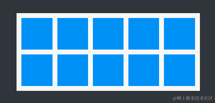
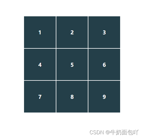
要实现的九宫格效果图如下:
公共样式:
|
1
2
3
4
5
6
7
8
9
10
11
12
13
14
15
16
17
18
19
20
21
22
23
24
25
26
27
28
29
30
31
32
|
div{
width: 300px;
height: 300px;
}
ul{
padding: 0;
width: 100%;
height: 100%;
}
li{
list-style: none;
text-align: center;
line-height: 100px;
margin: 3px;
background-color: #243F49;
color: white;
border: 1px solid white;
font-weight: bolder;
}
<div>
<ul>
<li>1</li>
<li>2</li>
<li>3</li>
<li>4</li>
<li>5</li>
<li>6</li>
<li>7</li>
<li>8</li>
<li>9</li>
</ul>
</div>
|
1.grid网格布局
grid-template-columns 用于定义每一列的宽度; grid-template-rows 用于定义每一行的高度;grid-gap设置网格的行间距、列间距
|
1
2
3
4
5
6
7
8
9
10
11
12
13
|
ul{
padding: 0;
width: 100%;
height: 100%;
/*设置为grid网格布局*/
display: grid;
/*设置三行高度都为100px;*/
grid-template-rows:100px 100px 100px ;
/*设置三行宽度都为100px;*/
grid-template-columns: 100px 100px 100px;
置网格的行间距、列间距都为3px
/*grid-gap: 3px;*/
}
|
2.flex布局
计算好每个li的宽度和高度,总的宽、高度为300px,那么每个li的宽高就为300px/3=100px 但是由于每个li设置了margin为3px那么:
每个li的宽度= 100px - (margin-left + marginr-right)=100-(3+3) = 94px 我们将每个li的宽度设置为94px即可。
每个li的高度=100px - (margin-top + margin-bottom) = 100-6 = 94px 我们将每个li的高度设置为94px即可。
确定了总的div宽高度和每个li的宽高度后用flex布局进行换行。
当然了,先确定三个盒子的高、宽度 *3+ 间距 *2 *3个= 总宽/高度这样的计算顺序更快。
|
1
2
3
4
5
6
7
8
9
10
11
12
13
14
15
16
17
18
19
20
21
22
|
ul{
padding: 0;
width: 100%;
height: 100%;
/*设置布局方式为flex布局*/
display: flex;
/*换行*/
flex-wrap: wrap;
}
li{
/*固定设置每个li的宽度和高度*/
width: 94px;
height: 94px;
margin: 3px;
list-style: none;
text-align: center;
line-height: 100px;
background-color: #243F49;
color: white;
border: 1px solid white;
font-weight: bolder;
}
|
3.float浮动定位
给总的div设置一个固定的宽高,计算总的高、宽度 = 三个盒子3 + 间距2 *3个再设置每个li固定的宽高,利用float来换行,再给父元素overflow:hidden进项清除浮动定位。
每个li的宽高度为94px,margin为3px ,div的总高度、宽度=943+32*3=300px。
|
1
2
3
4
5
6
7
8
9
10
11
12
13
14
15
16
17
18
19
20
21
|
ul{
padding: 0;
width: 100%;
height: 100%;
/*清除浮动*/
overflow: hidden;
}
li{
/*固定设置每个li的宽度和高度*/
width: 94px;
height: 94px;
/*第三种方法:浮动定位进行换行*/
float: left;
margin: 3px;
list-style: none;
text-align: center;
line-height: 100px;
background-color: #243F49;
color: white;
font-weight: bolder;
}
|
4.inline-block+letter-spacing属性/font-size:0
和前面两种一致,先计算宽高度、设置每个li的宽高度,再将li使用dispaly:inline-block换行,再用letter-spacing属性的负值进行减少字符之间的空白
letter-spacing属性是增加(值为正)或减少(值为负)字符间距(字符间的空白);
|
1
2
3
4
5
6
7
8
9
10
11
12
13
14
15
16
17
18
19
20
|
ul{
padding: 0;
width: 100%;
height: 100%;
/*减少字符间的空白*/
letter-spacing: -5px;/*这里使用font-size:0;也可*/
}
li{
/*设置每个li的固定宽度和高度*/
width: 94px;
height: 94px;
display: inline-block;
margin: 3px;
list-style: none;
text-align: center;
line-height: 100px;
background-color: #243F49;
color: white;
font-weight: bolder;
}
|
5.table布局
将父元素设置为dispaly:table布局形式,使得元素以表格形式来显示,再设置单元格的边框间距。再设置相应的表格行形式display: table-row;和单元格形式display: table-cell
|
1
2
3
4
5
6
7
8
9
10
11
12
13
14
15
16
17
18
19
20
21
22
23
24
25
26
27
28
29
30
31
32
33
34
35
36
37
38
39
40
41
|
<style>
ul{
width: 300px;
height: 300px;
/*元素作为块级表格来显示 padding失效*/
display: table;
/*设置相邻单元格的边框间距*/
border-spacing: 5px;
}
li{
list-style: none;
text-align: center;
background-color: #243F49;
color: white;
font-weight: bolder;
/*此元素会作为一个表格行来显示 margin和padding都失效*/
display: table-row;
}
div{
line-height: 90px;
text-align: center;
/*元素以单元格形式来显示 Margin失效*/
display: table-cell;
}
<ul>
<li>
<div>1</div>
<div>2</div>
<div>3</div>
</li>
<li>
<div>4</div>
<div>5</div>
<div>6</div>
</li>
<li>
<div>7</div>
<div>8</div>
<div>9</div>
</li>
</ul>
|
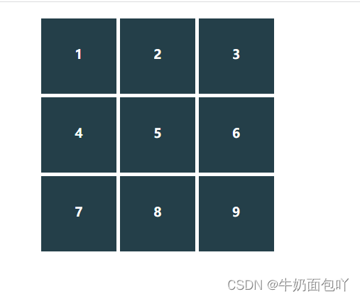
效果图:
|


