1、什么是粘性定位? 粘性定位它基于用户的滚动位置来定位。 粘性定位的元素是依赖于用户的滚动,在position:relative与position:fixed定位之间切换。 它的行为就像position:relative;而当页面滚动超出
1、什么是粘性定位?
例如:
设置了以上元素,在屏幕范围(viewport)视口滚动到元素top距离小于10px之前,div为相对定位。之后元素将固定在与顶部距离10px的位置,直到viewport视口回滚到10px以内。 特点:
2、原理
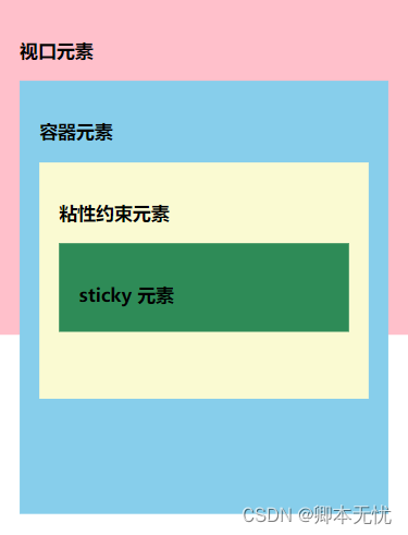
视口元素:显示内容的区域。会设置宽高。一般会设置 overflow:hidden。 容器元素:离 sticky 元素最近的能滚动的祖先元素。 粘性约束元素:粘性定位的父元素。有时也会出现粘性约束元素就是容器元素的情况。 sticky 元素:设置了 position: sticky; 的元素。 滚动时,sticky 元素设置的 left, right, top, bottom 的值相对的是容器元素。当粘性约束元素滚出视口时,sticky 元素也会滚出视口。 3、可能存在的不生效的情况3.1 未指定 top, right, top 和 bottom 中的任何一个值此时,设置 position: sticky 相当于设置 position: relative。 要生效,要指定 top, right, top 或 bottom 中的任何一个值。 3.2 垂直滚动时,粘性约束元素高度小于等于 sticky 元素高度当粘性约束元素滚出视口时,sticky 元素也会滚出视口。粘性约束元素比 sticky 元素还小,sticky 元素没有显示固定定位状态的机会。 水平滚动时,粘性约束元素宽度小于等于 sticky 元素宽度时,也不会生效。 3.3 粘性约束元素和容器元素之间存在 overflow: hidden 的元素示例如下:
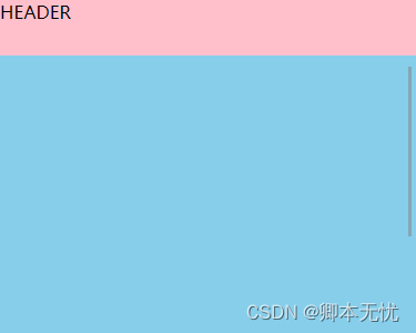
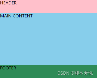
4、应用示例4.1 头部固定头部导航栏开始时相对定位顶部,当页面元素发生滚动时,变为和 fixed 类似的固定定位。
4.2 页脚固定页脚固定效果,开始时页脚为固定定位效果,当页面滚动超过页脚时,页脚定位效果变为相对定位效果,可用于显示一些底部信息或广告。
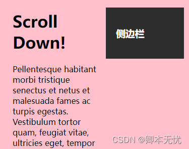
4.3 侧边栏固定当页面产生滚动,位置超过侧边栏的 顶部阈值 后,侧边栏变为固定定位,可用于实现侧边导航栏或侧边提示信息及广告展示。
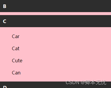
4.4 列表描点仅使用 css 就可实现页面滚动锚点固定效果,可用于实现通讯录滚动、日志记录滚动、其他分类列表滚动效果。
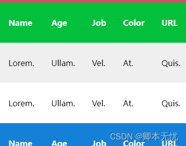
4.5 表格表头固定对 table 元素的 th 或 tr 设置 position: sticky; 可以实现表格头部或某行固定,也可将多个表格合并到一起,当滚动到当前表格是,固定头部自动变为当前表格的表头。
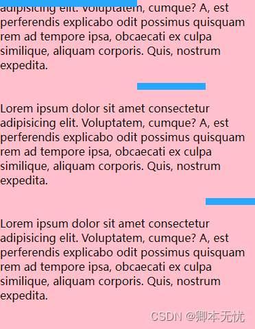
4.6 页面进度条(简易)利用 position: sticky; 定位,可以实现页面浏览进度条效果,以下是简易进度条的演示,实际实现中可将未滚动到顶部的元素设置为透明色,滚动到顶部时变为蓝色。
|


2021-04-14
2023-10-11
2021-04-29
2023-11-01
2018-01-07

