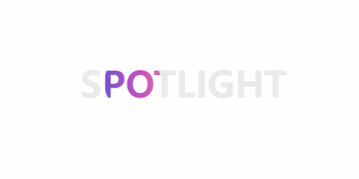
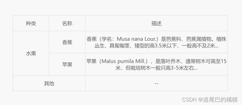
使用 -webkit-background-clip 和 clip-path ,并配合 animation 属性,实现一个好看聚光灯效果。
可适用于页面加载或展示页面大标题内容。
核心代码部分,简要说明了写法思路;完整代码在最后,可直接复制到本地运行。
核心代码
html 代码
|
1
|
<div class="spotlight18" data-cont="spotlight">spotlight</div>
|
主体部分一个 div 标签。
css 部分代码
|
1
2
3
4
5
6
7
8
9
10
11
12
13
14
15
16
17
18
19
20
21
22
23
24
25
26
27
28
29
30
31
|
.spotlight18{
color: #eaeaea;
font-size: 40px;
font-weight: 900;
text-transform: uppercase;
position: relative;
}
.spotlight18:before{
width: inherit;
height: inherit;
content: attr(data-cont);
clip-path: ellipse(32px 32px at 0 50%);
color: transparent;
background-image: linear-gradient(90deg, #4158D0 0%, #C850C0 30%, #FFCC70 66%, #56e28d 100%);
-webkit-background-clip: text;
position: absolute;
top: 0;
left: 0;
animation: spotlight18 8s linear infinite;
}
@keyframes spotlight18{
0%{
clip-path: ellipse(32px 32px at 0 50%);
}
50%{
clip-path: ellipse(32px 32px at 100% 50%);
}
100%{
clip-path: ellipse(32px 32px at 0 50%);
}
}
|
用 background-image 的 linear-gradient 拉出渐变背景,让文字颜色透明 color: transparent ,然后配合 -webkit-background-clip: text 给文字实现渐变效果,最后加上动画属性 animation 并设置 clip-path 参数就可以啦。
注意:这里使用的是 -webkit-background-clip ,而不是 background-clip 。
完整代码如下
html 页面
|
1
2
3
4
5
6
7
8
9
10
11
12
13
|
<!DOCTYPE html>
<html lang="zh">
<head>
<meta charset="utf-8">
<link rel="stylesheet" href="style.css">
<title>聚光灯效果</title>
</head>
<body>
<div class="app">
<div class="spotlight18" data-cont="spotlight">spotlight</div>
</div>
</body>
</html>
|
css 样式
|
1
2
3
4
5
6
7
8
9
10
11
12
13
14
15
16
17
18
19
20
21
22
23
24
25
26
27
28
29
30
31
32
33
34
35
36
37
38
39
40
|
/** style.css **/
.app{
width: 100%;
height: 100vh;
background-color: #ffffff;
position: relative;
display: flex;
justify-content: center;
align-items: center;
}
.spotlight18{
color: #eaeaea;
font-size: 40px;
font-weight: 900;
text-transform: uppercase;
position: relative;
}
.spotlight18:before{
width: inherit;
height: inherit;
content: attr(data-cont);
color: transparent;
background-image: linear-gradient(90deg, #4158D0 0%, #C850C0 30%, #FFCC70 66%, #56e28d 100%);
-webkit-background-clip: text;
position: absolute;
top: 0;
left: 0;
animation: spotlight18 8s linear infinite;
}
@keyframes spotlight18{
0%{
clip-path: ellipse(32px 32px at 0 50%);
}
50%{
clip-path: ellipse(32px 32px at 100% 50%);
}
100%{
clip-path: ellipse(32px 32px at 0 50%);
}
}
|
页面渲染效果

|


